# Introducing visualizations: Transform your workflow data into shareable reports
>
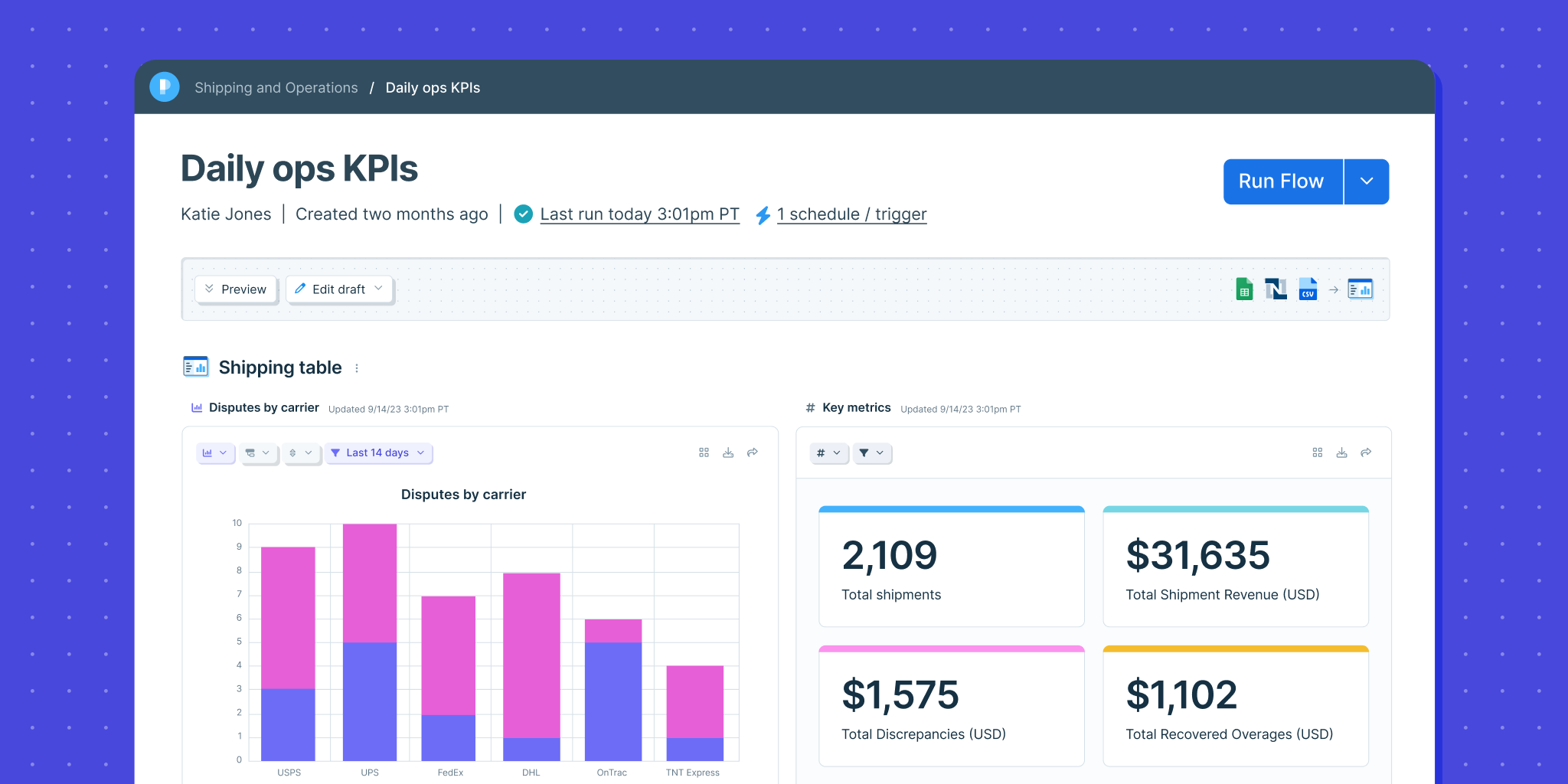
It’s a big day in the evolution of Parabola: we’ve added the ability to report on your data, empowering you to show your work more easily with data visualizations.
With visualizations in Parabola, you can:
Keep everything in one secure platform – from the logic of your workflows to your reporting, to feel confident in the quality of your data and minimize manual work gathering information across systems and spreadsheets.
Share important data with stakeholders through easy to read metrics that contextualize the output of your workflows and elevate your team’s work.
Power agile reporting processes to transform ad-hoc analyses – like comparing data week over week – into automated, durable reports.
Take your data processes to the next level by building beautiful, shareable reports to share your work and make better decisions.