Check out this Parabola University video for a brief intro to tables.
How it works
The Visualize step is a tool for creating tables, charts, and metrics from the output of your flows. These views of data can be arranged and shared directly in Parabola from the flow dashboard page.
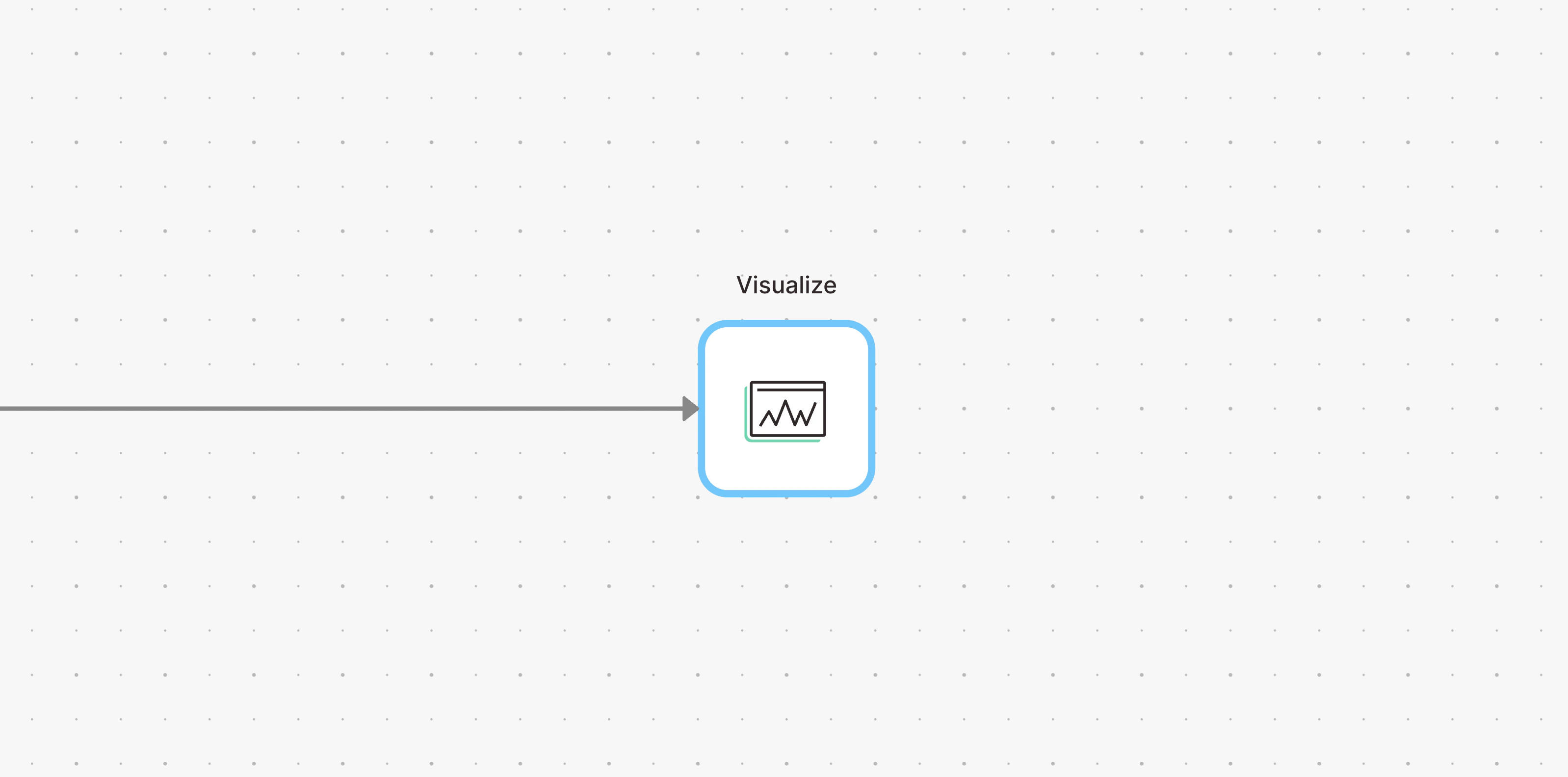
To create a Visualization, connect any step in your flow to a Visualize step:
Data connected to a Visualize step will be usable to create any number of views. Those views are automatically added to your flow dashboard, where they can be arranged and customized.
Once you’ve added views to your flow dashboard, you can:
- Visualize your data in the form of tables, featured metrics, charts, and graphs.
- Arrange a dashboard of multiple views, utilizing a tabbed or tiled layout.
- Analyze the entire page of views using quick filters.
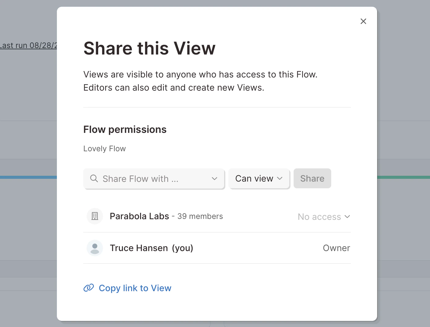
Sharing tables with teammates
Anyone with access to your flow will be able to see the flow dashboard:
- “Can edit”: any teammate with edit permissions can create and edit data views. Any changes to views will be visible immediately to anyone else who has access to the flow.
- “Can view”: teammates with view permissions can see all data views, but cannot make changes.
To share a view, you can either share the entire dashboard with your teammate (see instructions here), or click “Share” from a specific table view. Sharing the view will give your teammate access to the flow (and it’s dashboard), and link them directly to that specific view.
Sharing dashboards outside your team (external sharing)
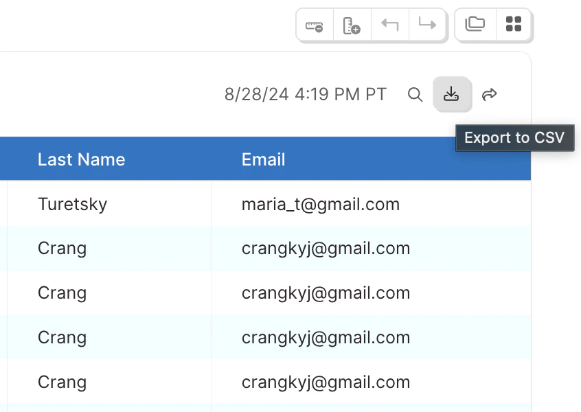
Any visualization can be exported as a CSV. Simply click on the “Export to CSV” button at the top right of your table or chart.
Creating and managing views
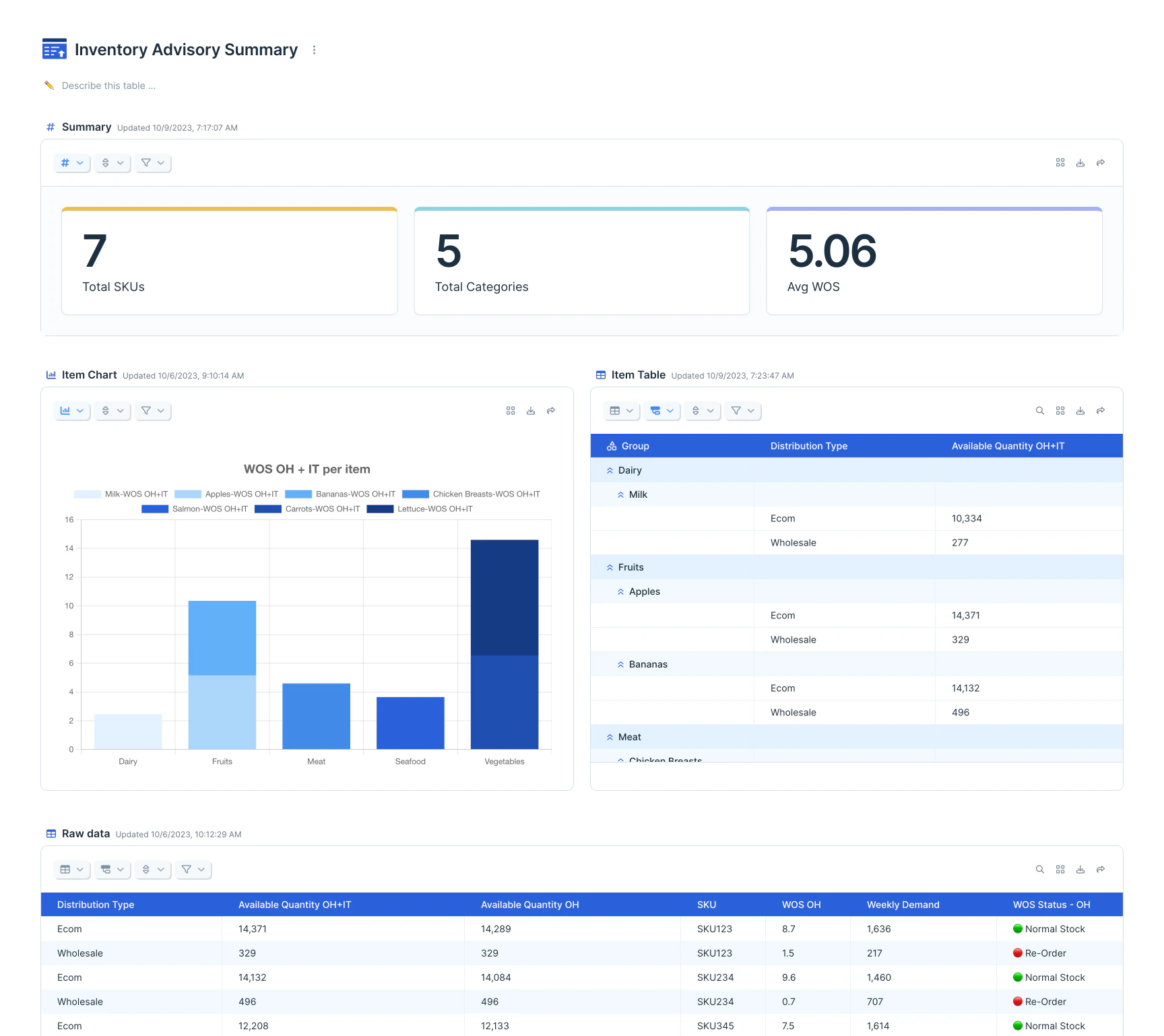
Views are individual visualizations, accessible from the Visualize step, or on the flow dashboard. The data connected to a Visualize step acts as a base dataset, which you can customize using views. Views can be visualized as tables, featured metrics, charts, and graphs.
Ready for a deeper dive? This Parabola University video will walk you through some of the configurations available to fine-tune how you see your data.
Page layout
Arrange data views on the page with either a tab or tile layout.
Tabs will appear like traditional spreadsheet tabs, which you can navigate through. Drag to rearrange their order.
Tiles enable you to see all views simultaneously. You can completely customize the page by changing view height and width, and drag-and-drop to rearrange.
Helpful tips:
- Views will refresh their results if: the flow runs, the base data is updated, and/or settings are changed
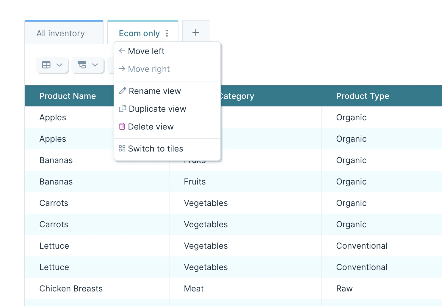
- Click the overflow menu next to the name of a view to move, rename, duplicate, or delete it. Use the same menu to switch the page layout between tabs and tiles
- Add new views by clicking the plus icon to the right of the last tab view, or by clicking the large “Add view” button below the last tile view. If you have too many tab views to see the icon, use the tab list menu on the right side of the table
- Duplicated and new tab views will show up in the private views section, so you may need to scroll down to see your new view
View types
From the “Table/chart options” menu, you can select from several types of visualizations.
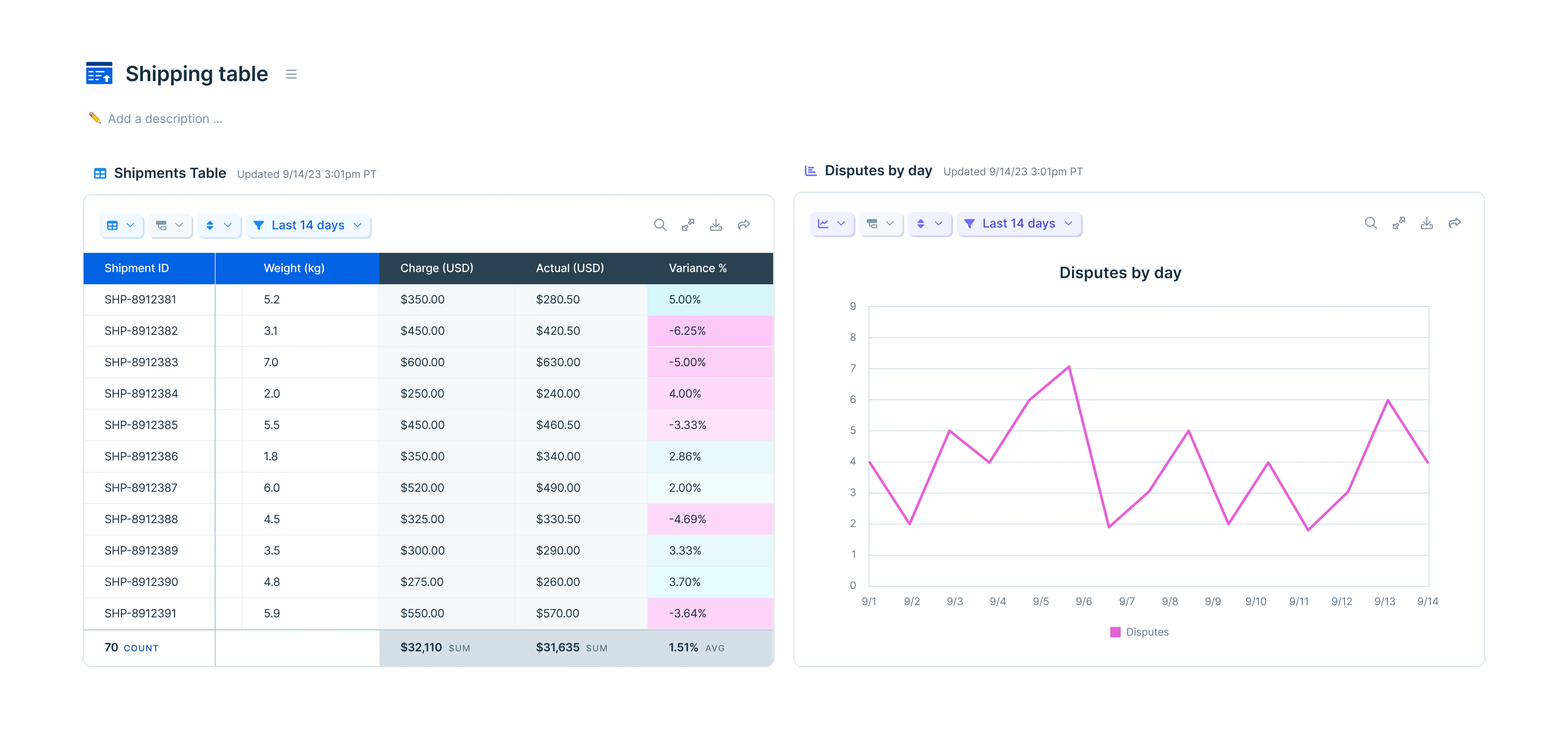
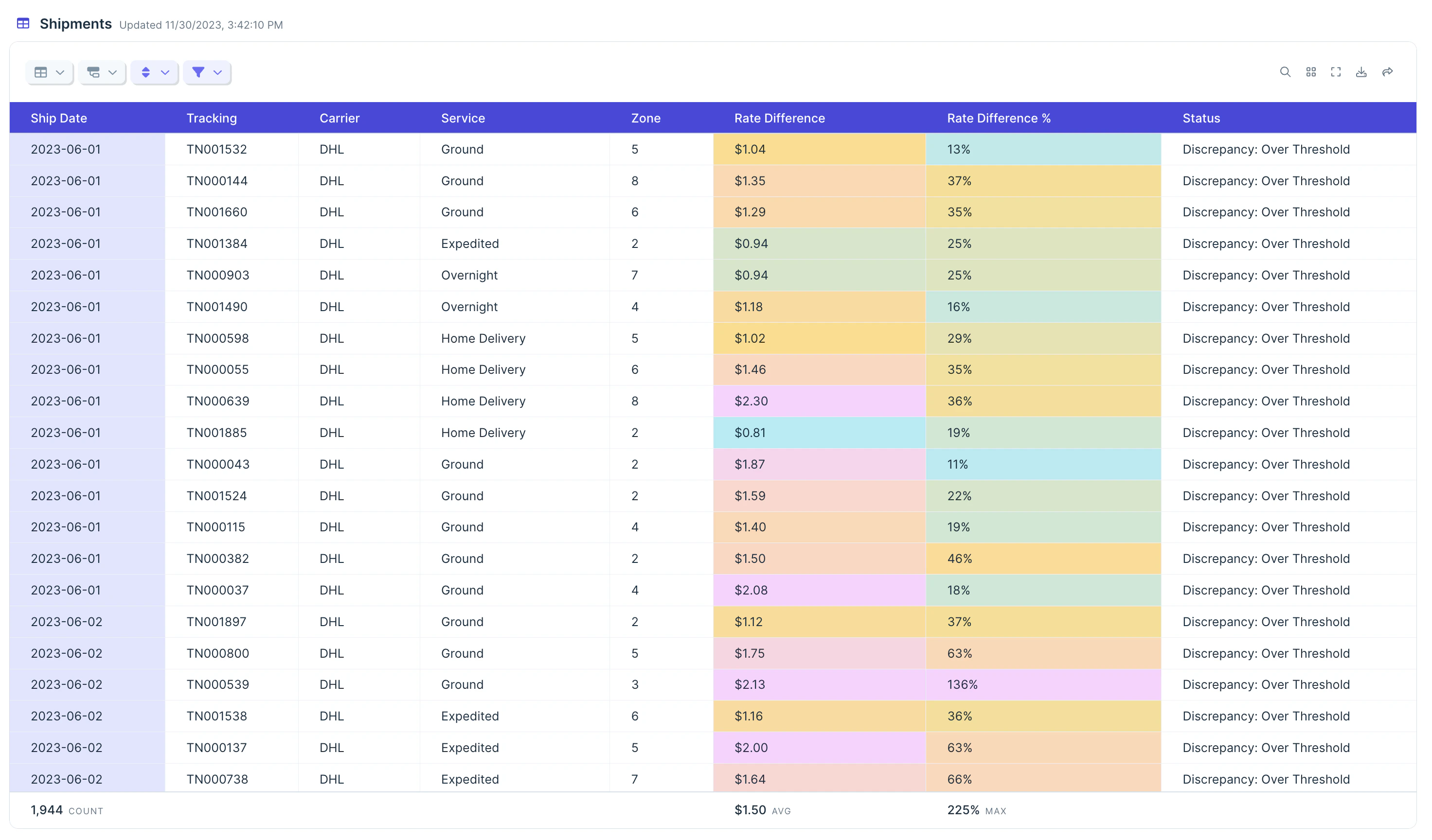
tables
By default, visualizations display as tables. This format works well to show rows of data that are styled, calculated, grouped, sorted, or filtered.
In the below image, the table options menu is at the top left, below the “All Inventory” tab. This is where you can access options to format and style columns, or to add aggregation calculations.
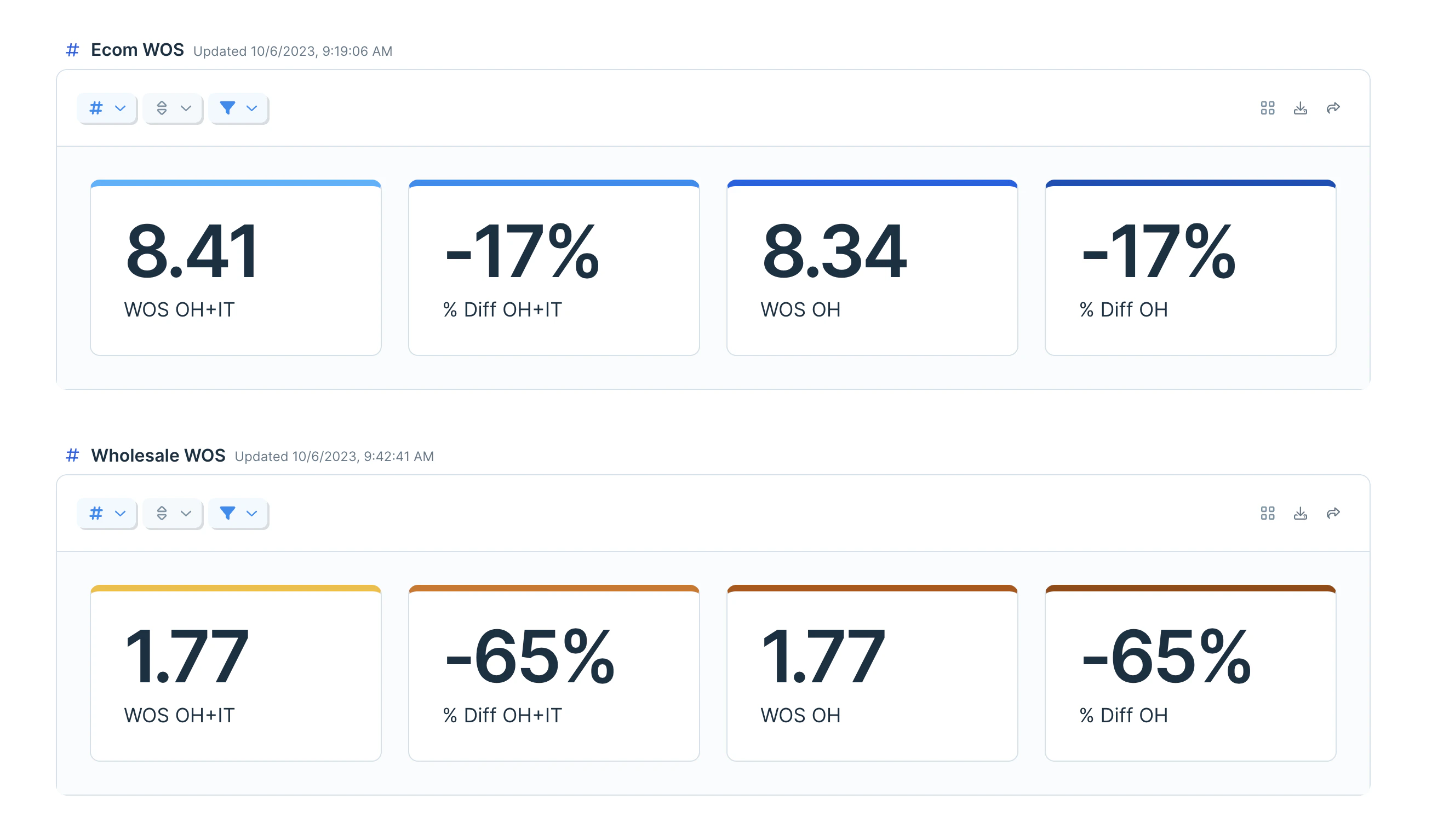
Featured metrics
Featured metrics allow you to display specific column calculations from the underlying table.
Metrics can be renamed, given a color theme, and formatted (date, number, percent, currency, or accounting). The metrics options menu is in the same placement as above, represented with a ’#’ symbol.
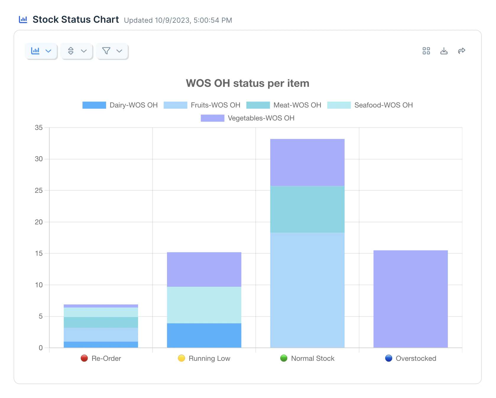
Charts and graphs
Parabola supports several chart types:
- Column chart
- Line chart
- Area chart
- Scatter chart
- Mixed chart (multiple types combined)
Within the chart options menu, represented below as a mini bar graph, you can customize chart labels, color themes, gridlines, and legend placement.
X axis
Charts have a single value plotted on the horizontal X axis, along the bottom of the chart. Date or category values are commonly used for the X axis
Use the grouping option on the X axis control to aggregate values plotted in the chart. For example, if you have a week’s worth of transactions, and you want to see the total number of transactions per day, you would set your X axis to the day of the week, and group your data to find the sum. Ungrouped values will be plotted exactly as they appear in your dataset.
Use the X axis options dropdown within the chart options menu to further fine-tune your formatting.
Y axis
Charts can have up to two Y axes, on the left, right, or both. Additionally, each Y axis can key to any number of data values, called series.
Adding multiple series will show multiple bars, lines, or dots, depending on which chart you are using. The above image shows a chart using one Y axis, but several series with stacking enabled under the “Categories / stacking” dropdown.
When you add a second Y axis, it will add a scale to the right side of the graph. Any series that are plotted in the second Y axis will adhere to that scale, whereas any series on the first Y axis will adhere to the first scale. Your charts are limited to two scales, but each series can be aggregated individually, so you can compare the mean of one data point with the sum of another, and the median of a third.
Imagine using multiple Y axes to plot two sets of data that are related, but exist on different numerical scales, such as total revenue in one axis, and website conversion rate in another axis.
Categories and stacking
Many charts and graphs have category and stacking options. Depending on your previous selections with the X and Y axes, and the chart type, some options will be available in this menu.
- “Categorize by …” will allow you to further split a Y axis value according to a subcategory that exists in your dataset. For example, you could categorize total revenue by store location to see a bar of total revenue for each store location.
- The “Categorize and stack by …” option will function as above, and further stack your subcategories into a single bar – i.e. producing an overall column showing the total revenue, but with different colored segments for each store location.
- The “Stack series” option will take multiple series on the X axis and stack them into a single bar, so that you can aggregate multiple columns together.
Helpful tips
- Add a title to charts and graphs from the “Table/chart options” menu
- Clicking on an item in the legend will temporarily hide the series on the graph. Click again to make it reappear
- All charts and graphs will export as CSV files that mirror the base table data
View controls
View controls can be selected from the icons in the control bar on any view.
Column calculations
You can perform the following calculations on a column:
- Count all: Counts the number or rows in the entire table, and for any groups
- Count unique: Counts the number of unique values in the specified column for the entire table, and for any groups. Unique values are case-sensitive and space-sensitive
- Count empty: Counts the number of blank cells in the specified column for the entire table, and for any groups. Cells with just a space character, or other invisible characters, are not considered empty or blank
- Count not empty
- Sum: Totals all numeric values in the specified column for the entire table, and for any groups. Cells that are blank or contain non-numeric values are skipped. If no result can be produced, a - - value will be shown
- Average: Creates an average by totaling all numeric values in the specified column for the entire table, and for any groups, and dividing the total by the total number of values used. Cells that are blank or contain non-numeric values are skipped. If no result can be produced, a - - value will be shown
- Median: Finds the value where one half the values are greater and half are less in the specified column for the entire table, and for any groups. Cells that are blank or contain non-numeric values are skipped. If no result can be produced, a - - value will be shown
- Minimum (Min): Finds the smallest value in the specified column for the entire table, and for any groups. Cells that are blank or contain non-numeric values are skipped. If no result can be produced, a - - value will be shown
- Maximum (Max): Finds the largest value in the specified column for the entire table, and for any groups. Cells that are blank or contain non-numeric values are skipped. If no result can be produced, a - - value will be shown
Only one metric can be calculated per column.
Grouping
tables can be grouped up to 6 times. (After 6 groups, the ’+ Add grouping’ option will be disabled.) Groups are applied in a nested order, starting at the first group, and creating subgroups with each subsequent rule.
Use the sort options within the group rules to determine what order the groups are shown in. Normal sort rules will be used to sort the rows within the groups.
Sorts
Click the “Sort” button to quickly add a new sort rule (or the view options menu). These sorts define how rows are arranged in the view.
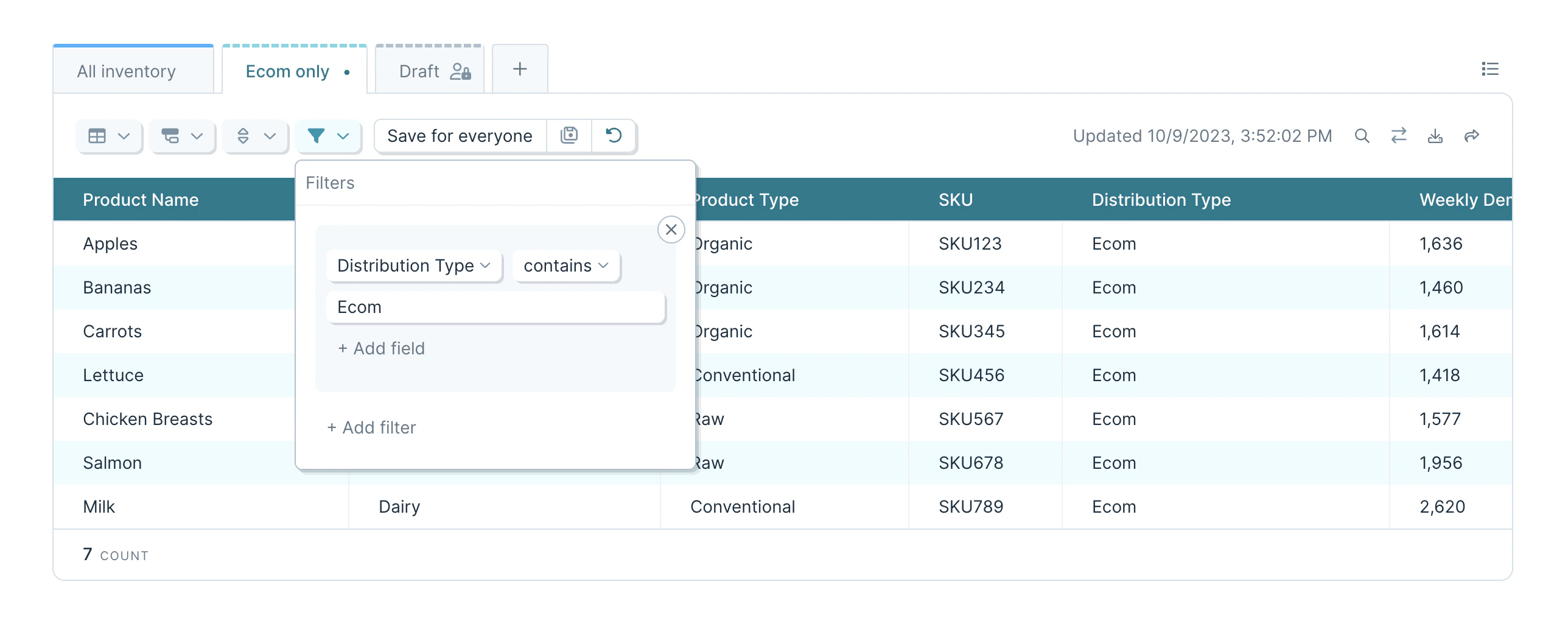
Filters
Click the “Filter” button to quickly add a new filter rule (or the view options menu). These filters define which rows are kept in the view.
Filters work with dates – select the “Filter dates to…” option, and utilize either relative ranges (e.g. “Last 7 days”) or specify exact ones.
Columns, metrics, and axes can be formatted to change how their data is displayed and interpreted. Click the left-most of your configuration buttons, the “Table/Chart Options” button, to apply formatting to any column, metric, or axis. You can select auto-format, or choose from a list of categories and formats within those categories.
In charts, the X-axis will be auto-formatted, and you can change the format as needed. All series in each Y-axis will share the same format. Axis formatting can be adjusted by clicking the gear icon next to the axis name.
Formats will be used to adjust how data is displayed in the columns of a table, in the aggregations applied to groups and in the grand total row, and to featured metrics. When grouping a formatted column, the underlying, unformatted value will be used to determine which row goes in which group.
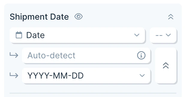
When working with dates, the format is autodetected by default. If your date is not successfully detected, click the 3 dots next to the output format field and enter a custom starting format.
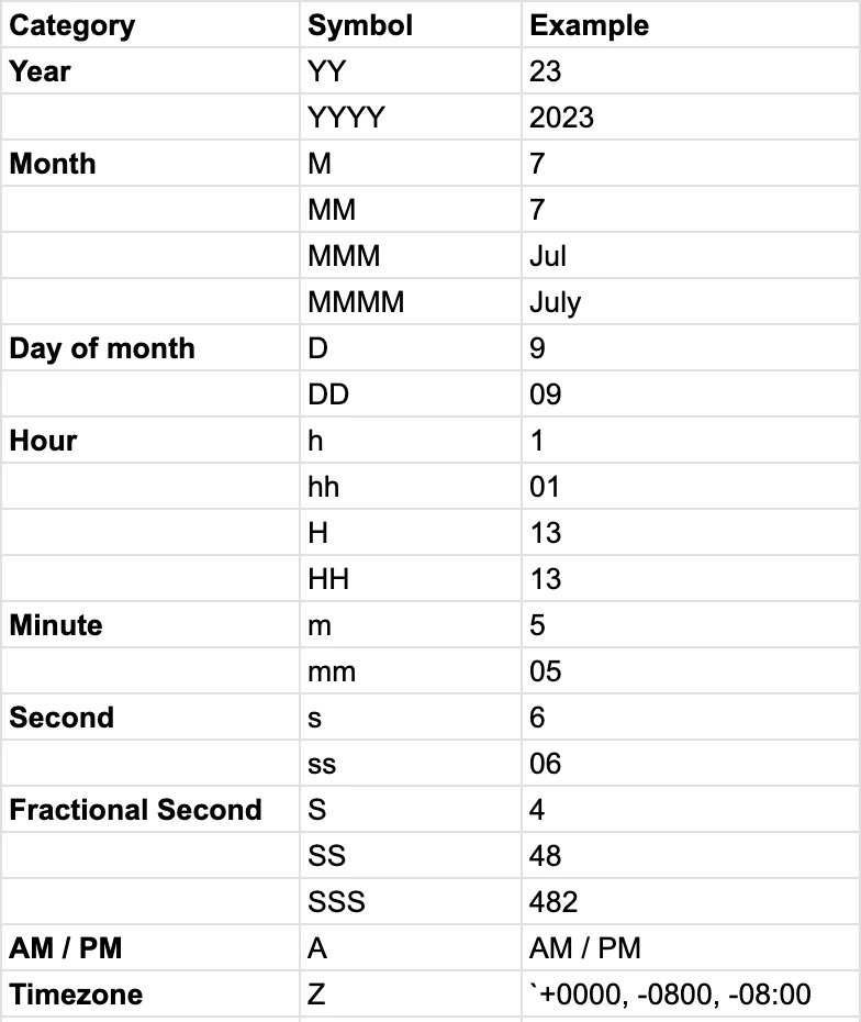
Valid options are:
If the output format uses a token that is not found in the input , e.g. converting MM-DD to MM-DD-YYYY, then certain values will be assumed:
- Day - 1
- Month - January
- Year - 2000
Dates that do not adhere to the starting format will remain unformatted in your table.
Hiding Columns
Use the “Table/Chart Options” to hide specific columns from your table view.
Columns can be used for sorting, grouping, and filtering even when hidden. Those settings are applied before the columns are hidden for even more control over your final Table.
Hidden columns will not show up in search results, unless the option for “Display all columns” is enabled.
Hidden columns can be filtered by quick filters.
Hidden columns will be present in CSV exports downloaded from the view.
Freezing Columns and Rows
Use the “Table/Chart Options” to freeze the first (left-most) column or the first row by using the checkboxes at the top. A frozen column or row will “stick,” and other columns and rows will scroll behind them.
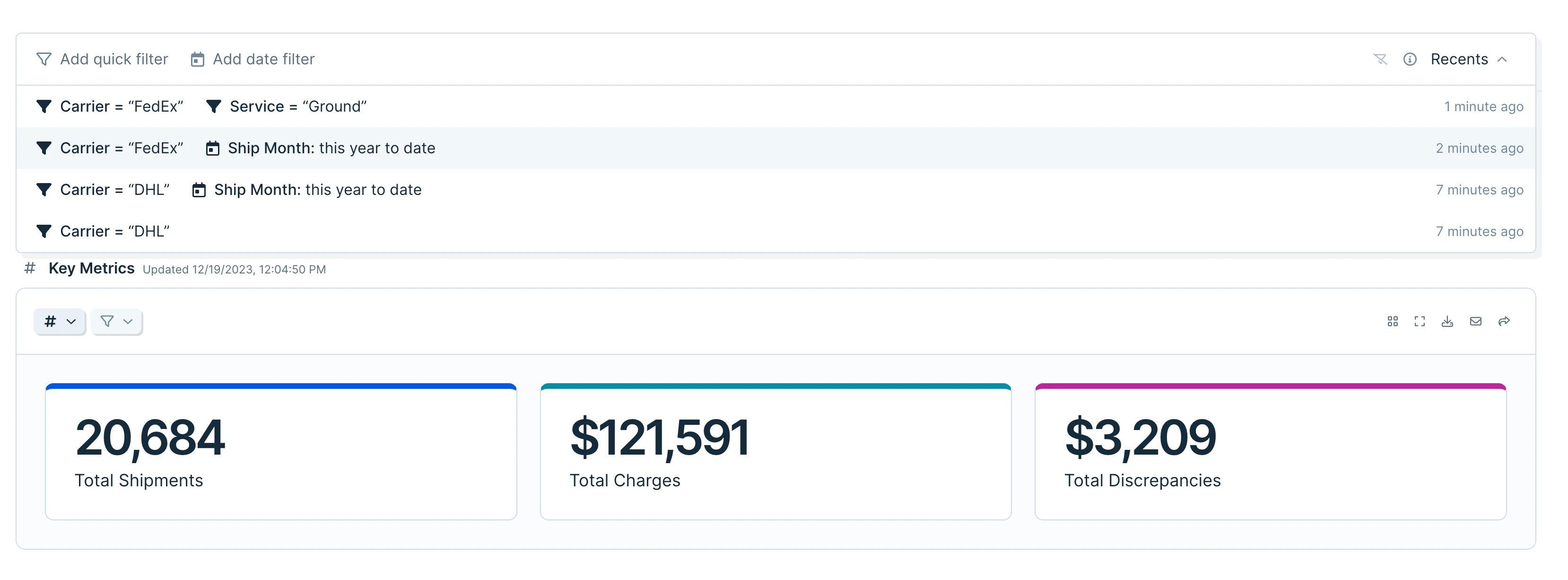
Quick filters
Click “Quick Filter” in the top right corner of the dashboard to toggle the filter bar pictured below. Using “Add quick filter” or “Add date filter,” you can filter data in specific columns across every view on the page. These filters are only applied for you, and will not affect how other users see this flow. Refreshing the page will reset all quick filters.
After 8 seconds, the combination of quick filters will be saved in the “Recents” drawer on the right side of the filter bar. Your recent filters are only visible to you, and can be reapplied with a click.
Quick filters can only be used if you have at least one table on your flow. Above the first table on your published flow page, click to add a filter. The filter bar will then follow you as you scroll.
Multiple quick filters are combined using a logical “and” statement. These filters are applied in conjunction with any filters set on individual views.
Use the clear filters icon to remove all currently applied filters.
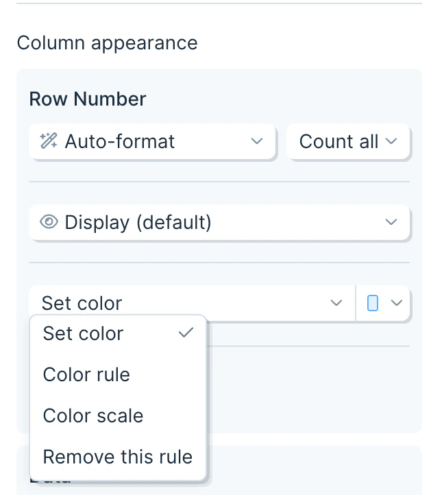
From the table Options menu, use the “add color rule” button to apply formatting to the columns of your table view.
There are 3 types of formatting that can be added:
- Set color
- Color rule
- Color scale
(The same menu can be used to remove any existing colors applied to a column.)
Set color
Applies a chosen color to a column entirely. All cells will have a color applied.
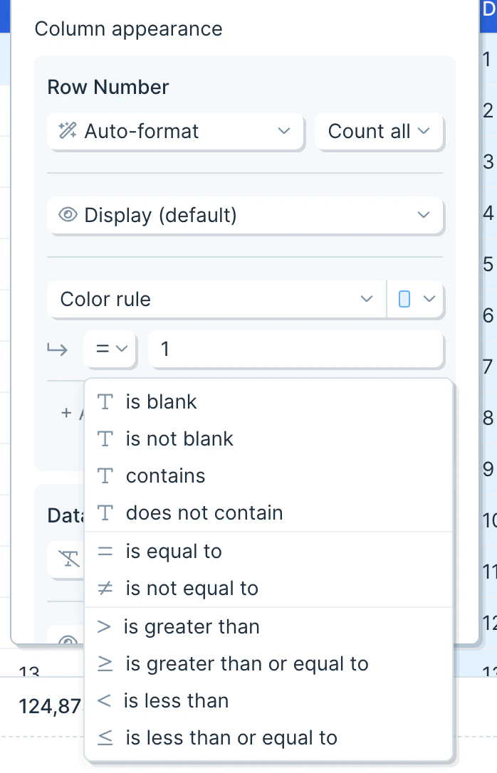
Color rule
Uses a conditional rule to color specific cells. The following operators are supported:
Color scale
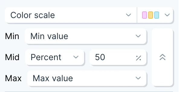
Applies a 2 color or 3 color scale to every cell in the column. All cells will have a color applied.
When using two colors, by default the first color will be applied to the minimum value and the second color will be applied to the maximum value. When using three colors, by default, the middle color will be applied to the value 50% between the smallest and largest value in the column.
Cells with values between the minimum, maximum, and middle value (if using 3 colors) will blend the colors they are between, creating a smooth gradient.
When setting a custom value for the maximum or minimum on a color scale, any value in the table that is larger than the maximum or smaller than the minimum will have the the maximum color or minimum color applied, respectively.
Click the ellipsis menu next to the format dropdown to access controls to adjust how the scale is applied.
Switch each breakpoint to use a number, percent, or the default min/max value.
Scales can be applied to columns containing dates, numbers, currency, etc.
Applying multiple rules
Multiple rules can be applied to the same column. They will be evaluated top down, starting with the first rule. Any cells that are not colored as a result of that rule move on to the next rule, until all rules have been evaluated, or all cells have been assigned a color. A cell will show the color of the first rule that evaluates to true for the value in that cell.
After a set color or color scale is applied, no further rules will be evaluated, as all cells will have an assigned color after those rules.
Migration from “Column Emphasis”
Existing table views may have columns with column emphasis applied. Those columns will be migrated automatically to use a set color formatting rule. Last modified on July 16, 2026