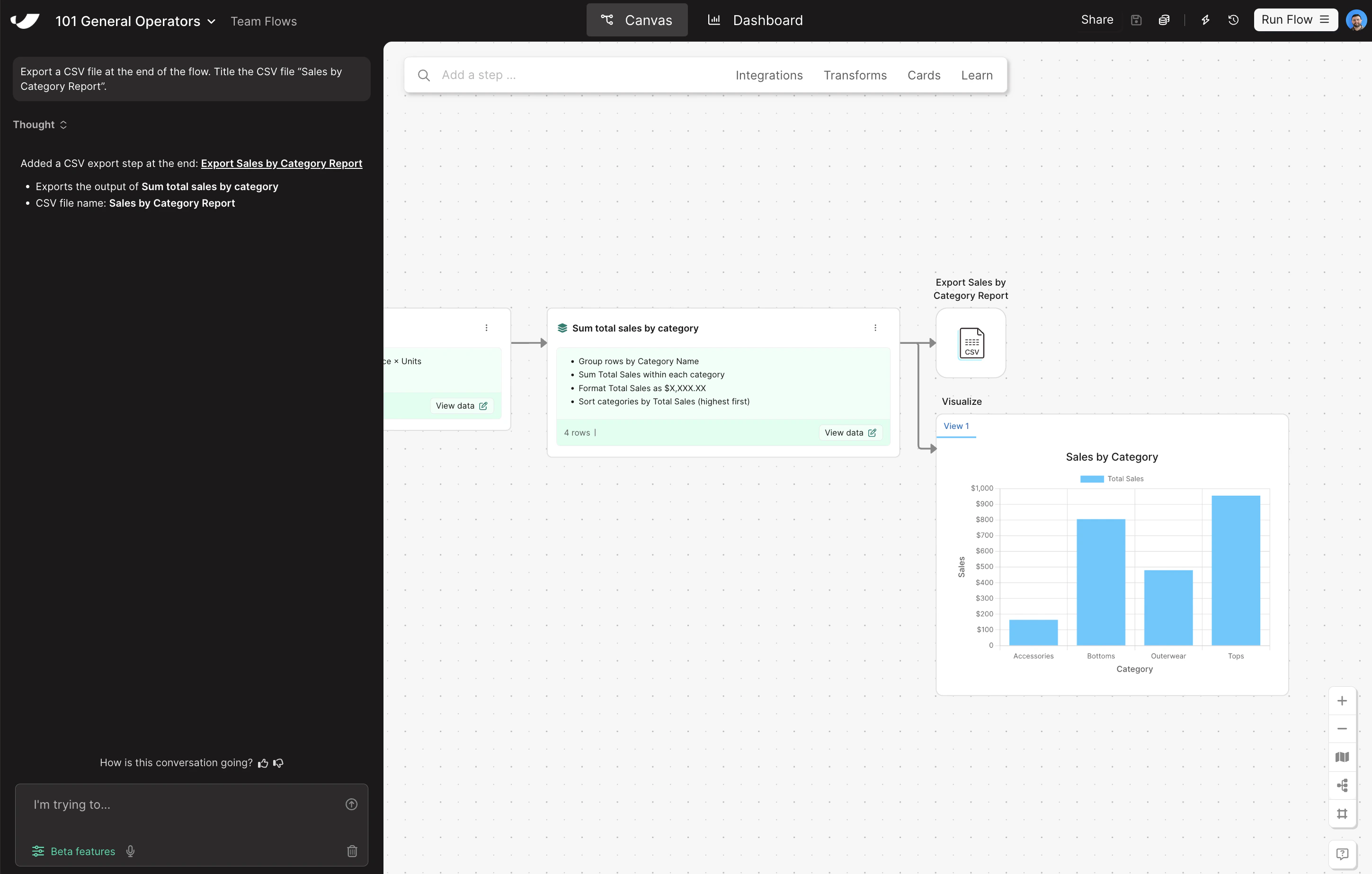
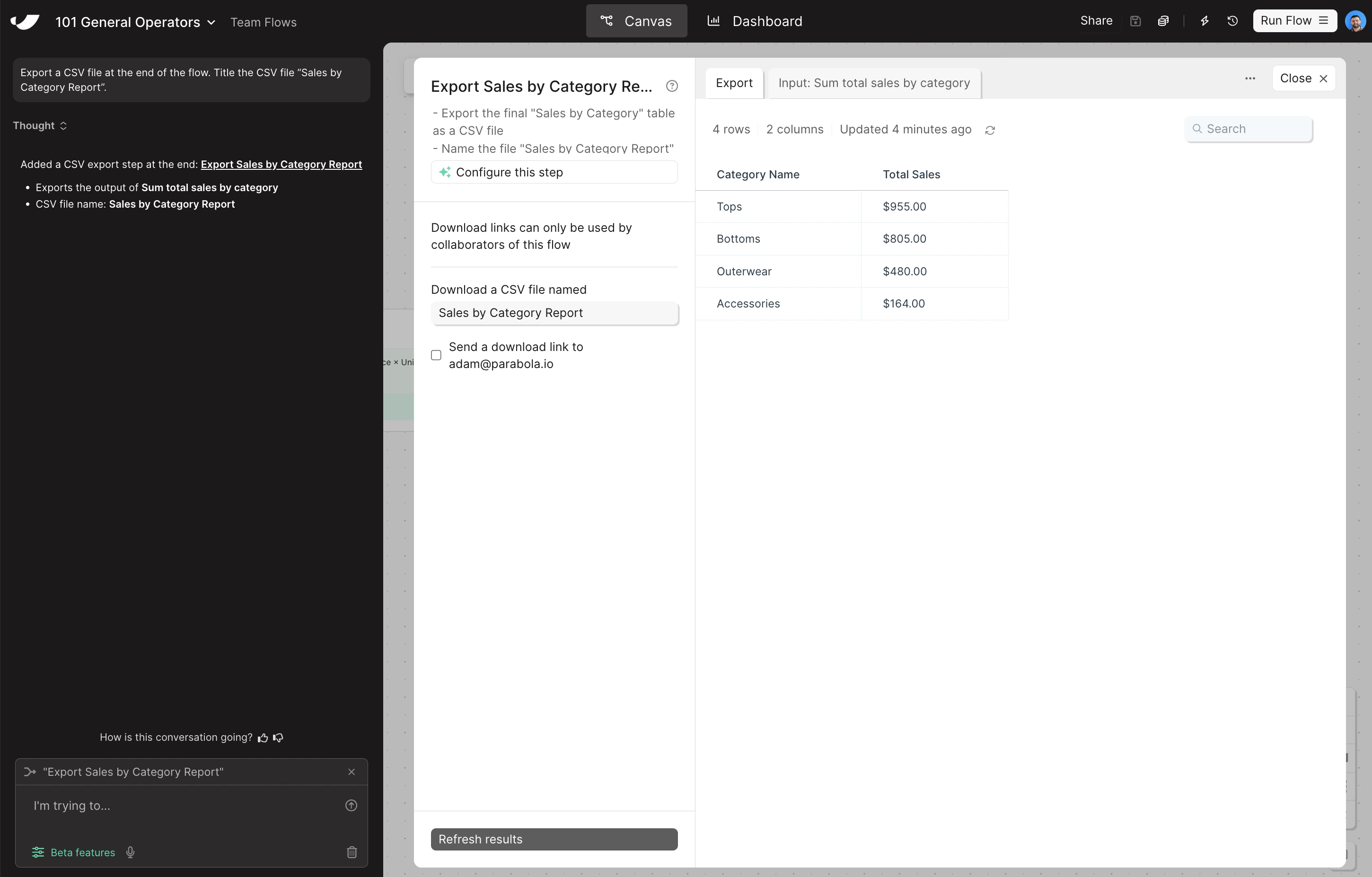
Building challenge
Your data is ready — now export it as a CSV and build a quick visualization so your Sales by Category Report is easy to read at a glance.
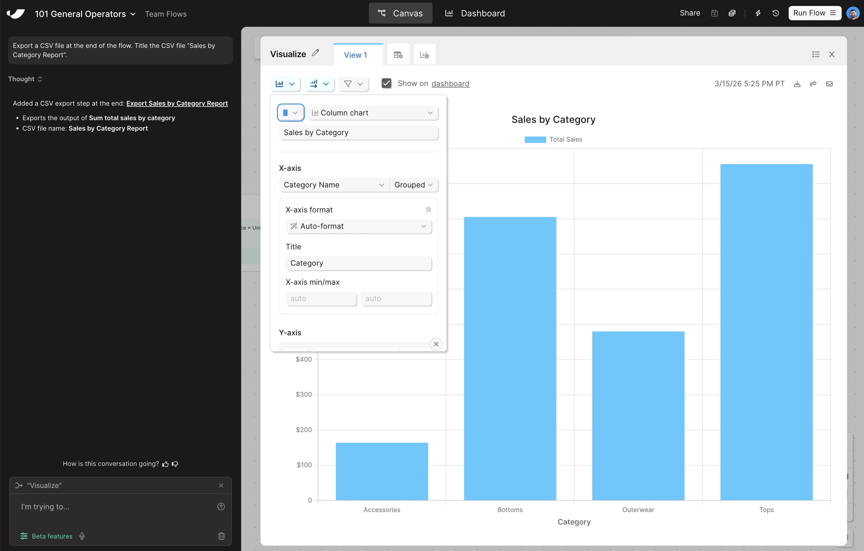
Add a Visualization step and configure it as a column chart
- Search for the Visualize step and drag it onto the canvas below your Generate CSV file step
- Grab an arrow from your previous data transformation step and connect it to your Visualize step so data is flowing in
- Open the step and change the chart type to Column chart. Title the chart “Sales by Category” and set the X-axis to Category Name
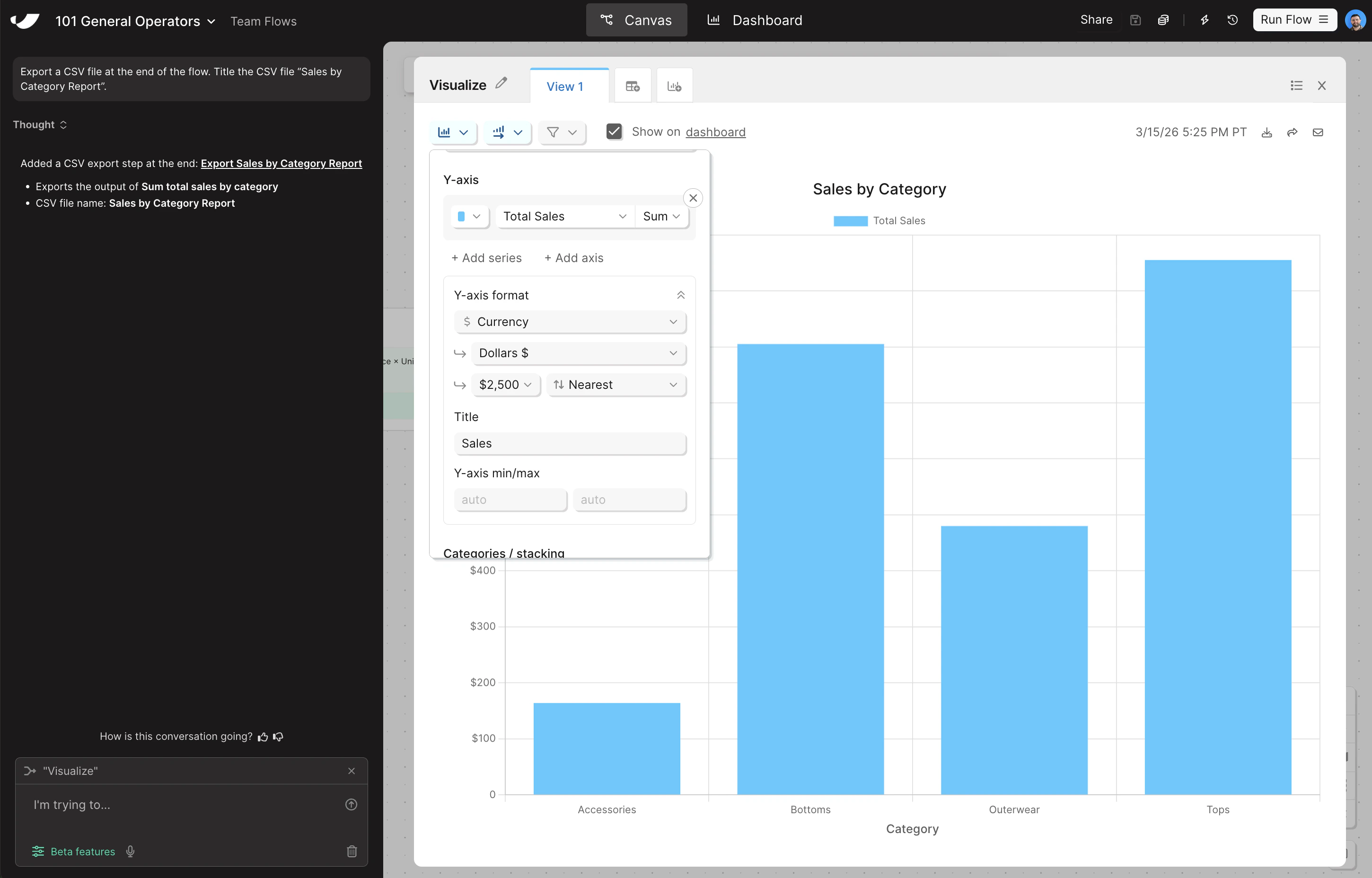
- To configure the Y-axis, click Add Series, set Total Sales as the Y-axis, and format your Y-axis as currency
- Change the aggregation method on Total Sales from Count to Sum, and give both your X and Y axes a title
Check your work
Check your work
The steps added to your canvas and their exact documentation may differ from what you see below — every AI response is unique. The important thing is that your resulting data set matches what you see here.