Building challenge
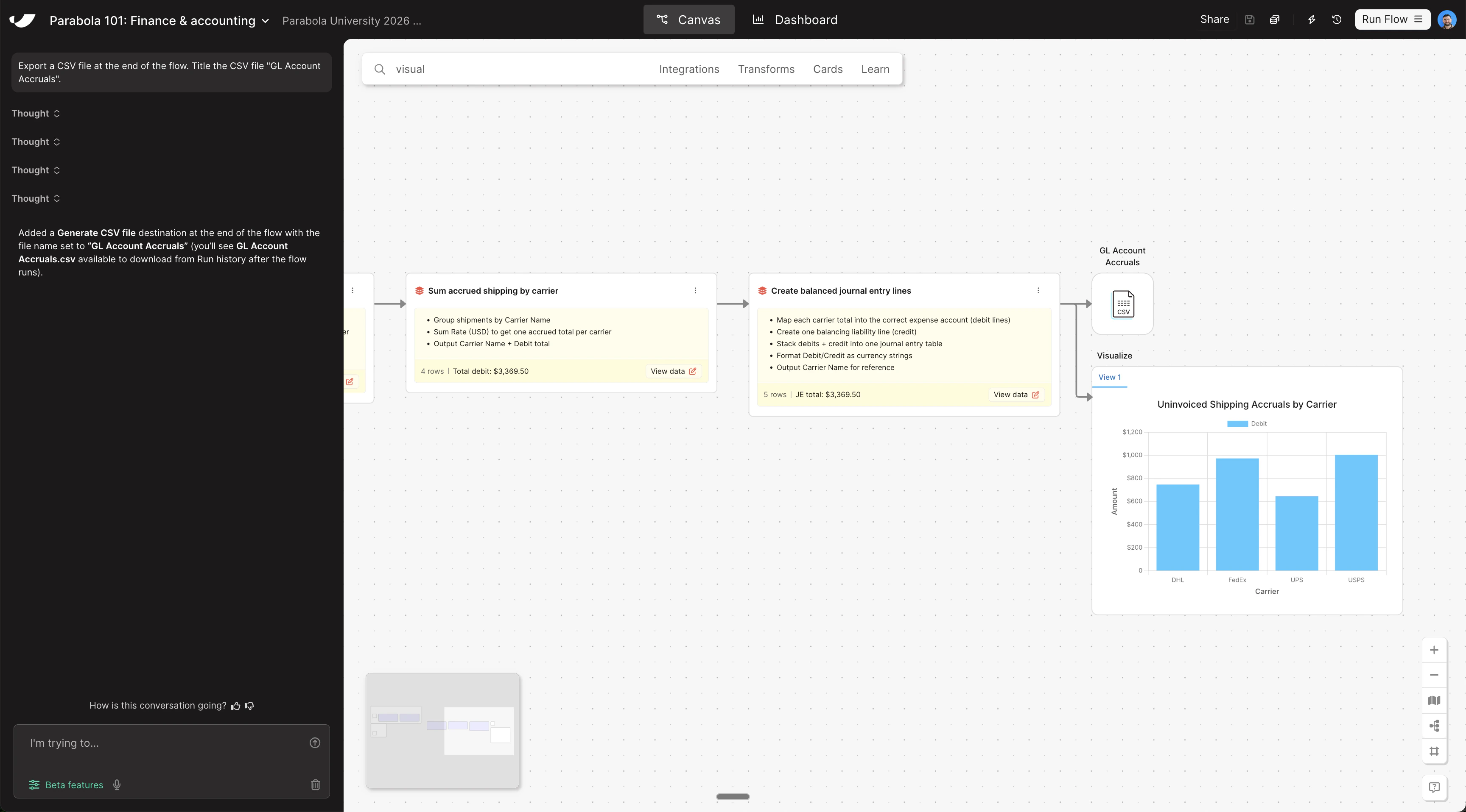
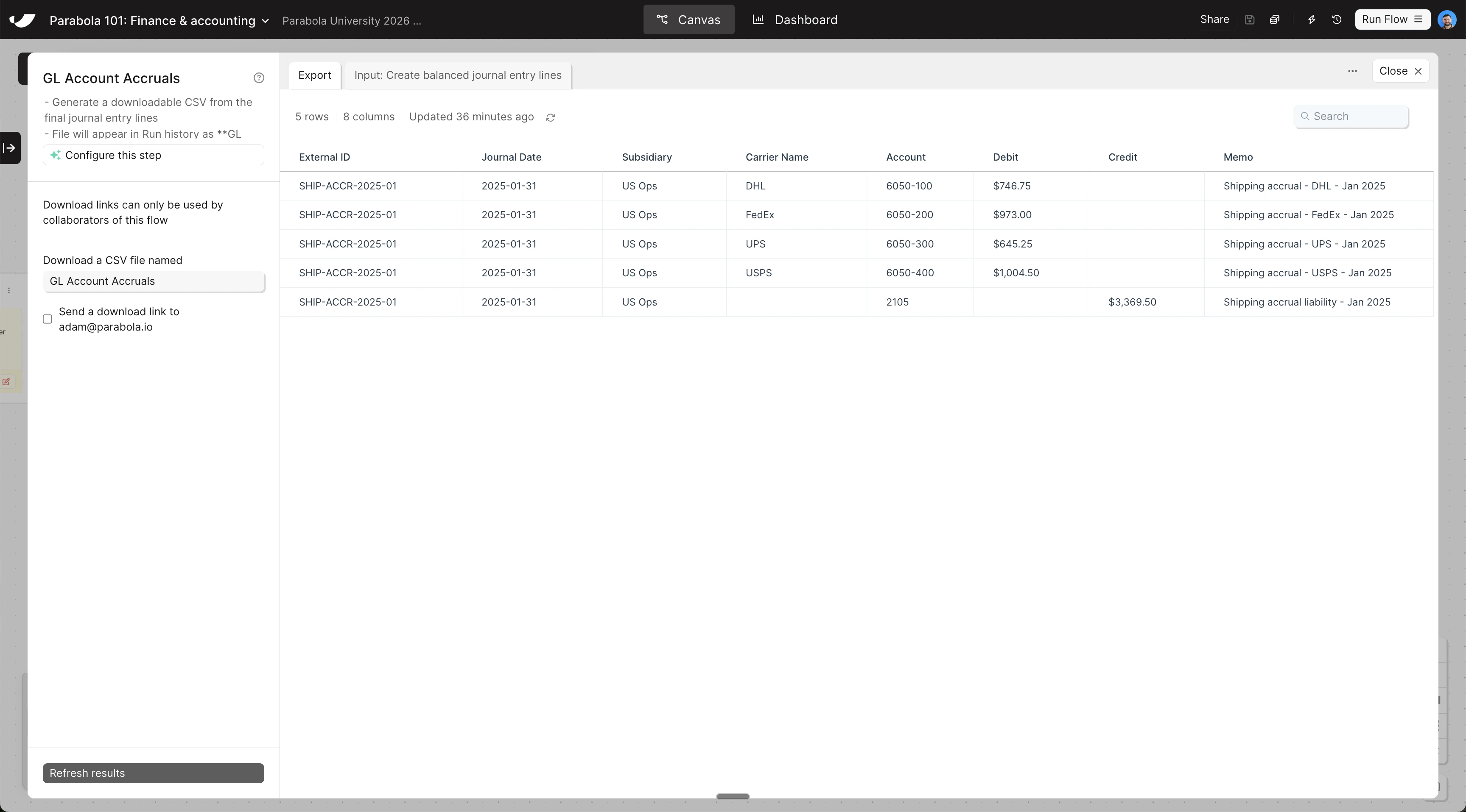
Your accruals data is ready — now export it as a CSV for ERP upload and build a visualization to review totals by carrier at a glance.
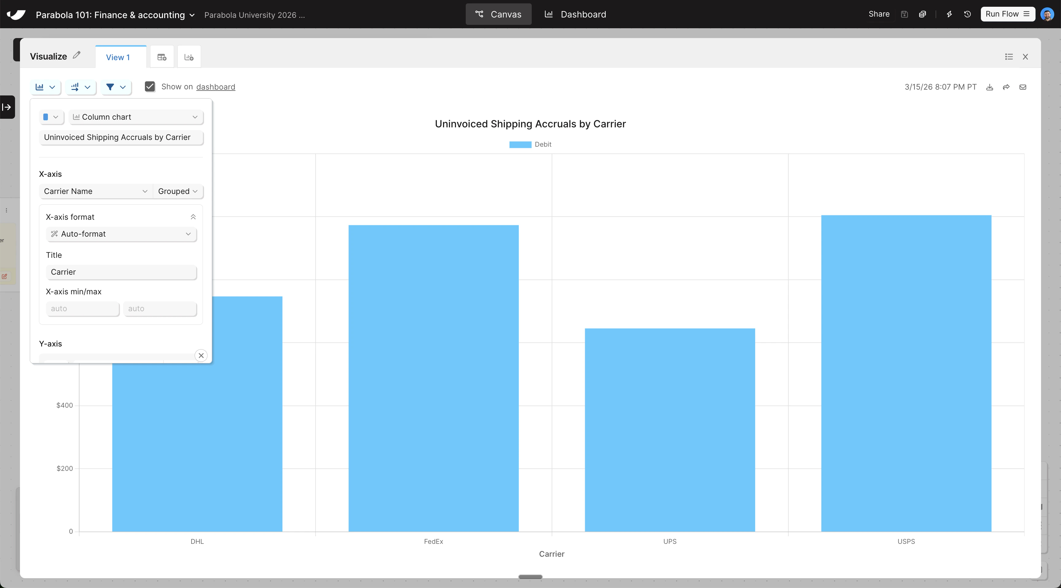
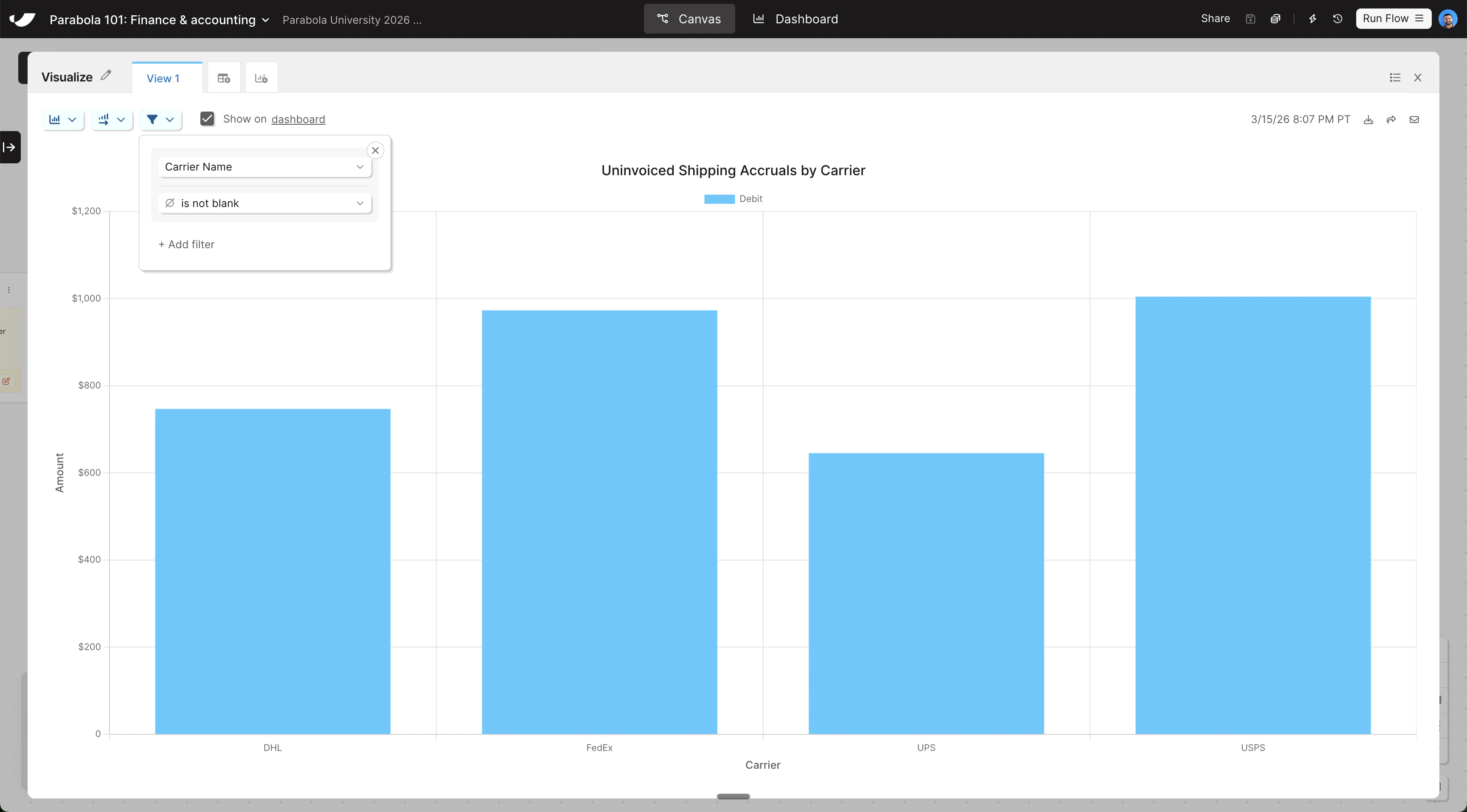
Add a Visualization step and configure it as a column chart
- Search for the Visualize step and drag it onto the canvas below your Generate CSV file step
- Grab an arrow from your previous data transformation step and connect it to your Visualize step so data is flowing in
- Open the step and change the chart type to Column chart. Title the chart “Uninvoiced Shipping Accruals by Carrier” and set the X-axis to Carrier Name
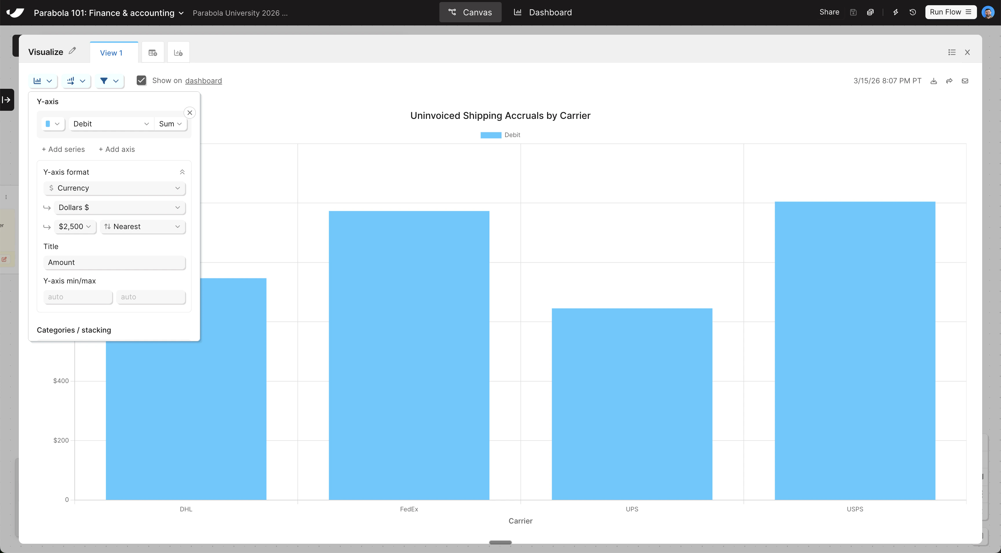
- To configure the Y-axis, click Add Series, set Debit as the Y-axis, and format your Y-axis as currency
- Change the aggregation method on Debit from Count to Sum, and give both your X and Y axes a title
- Add a filter rule to only show columns where Carrier Name is not blank
Check your work
Check your work
The steps added to your canvas and their exact documentation may differ from what you see below — every AI response is unique. The important thing is that your resulting data set matches what you see here.