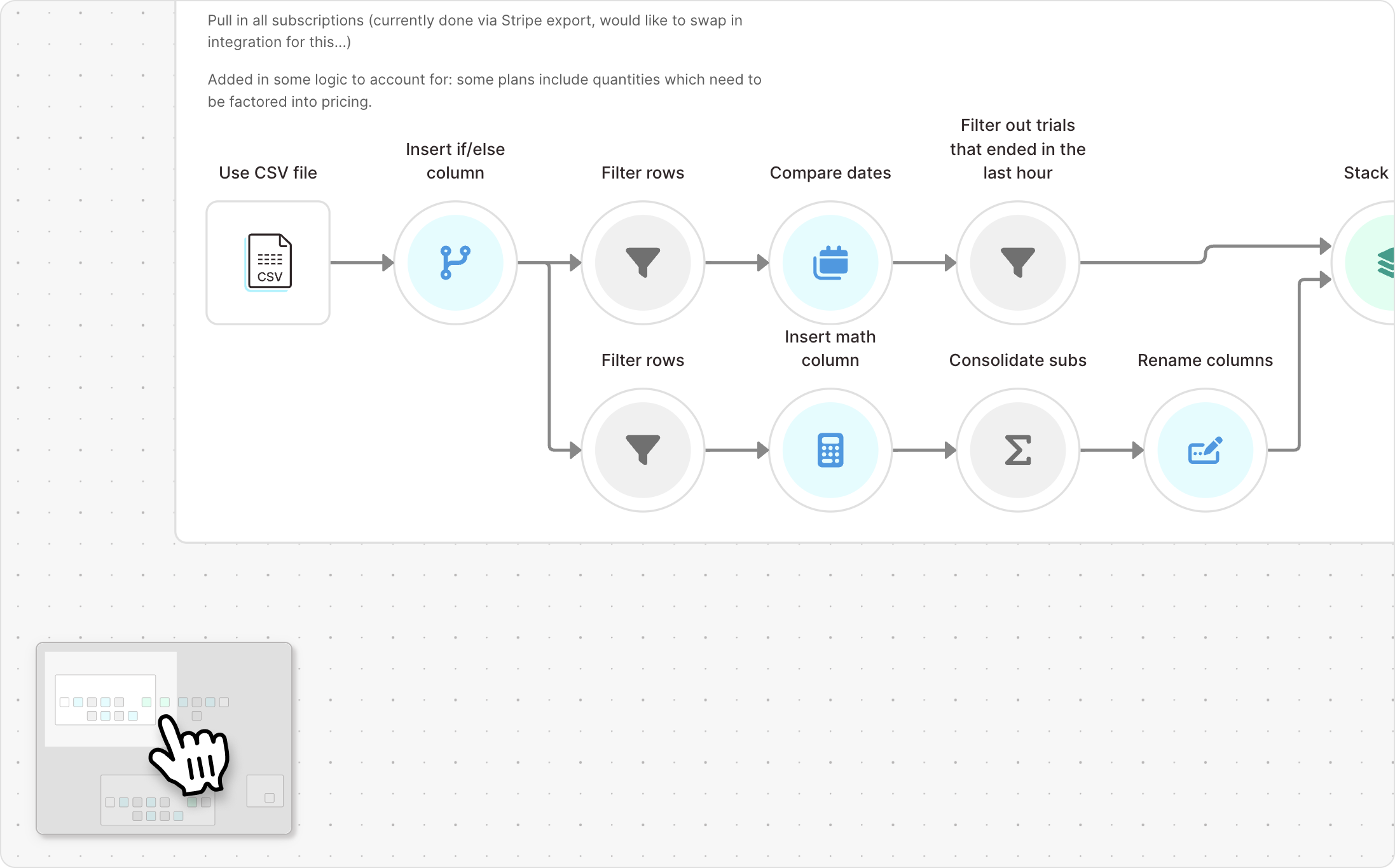
Calculate dates dynamically
Improvement
Improvement
Improvement
In the Add date & time step, you can now use a {merge tag} to dynamically calculate dates based on the value in another column.
This is especially useful for SLA analysis: calculate your “Ship by date” by offsetting the “Order date” based on the number of “Days to ship.”

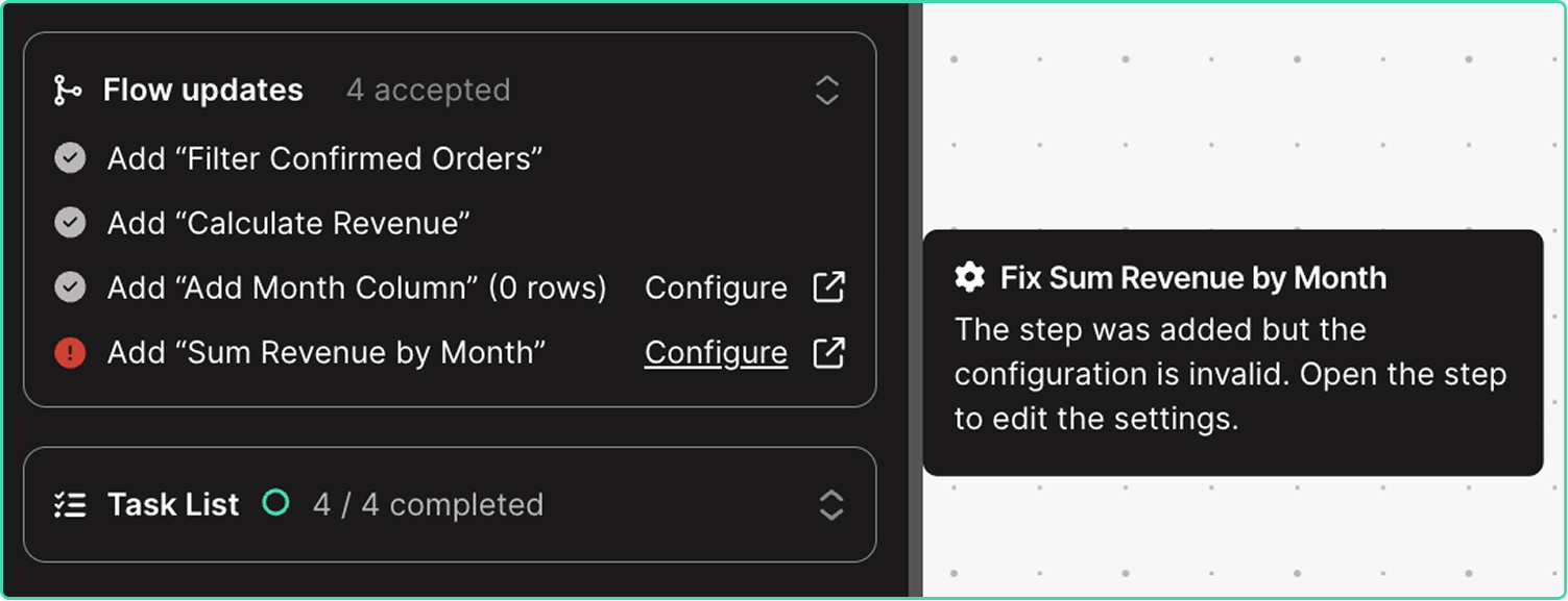
Enhanced visibility into agent updates
Improvement
Improvement
Improvement
The easiest way to build in Parabola is by sending chat messages, prompting Parabola to add and update steps directly on the canvas. You can now track the status of AI-implemented changes in the chat and immediately take action on steps requiring updates.
10+ new integrations, now live
New
New
New
Accessing operational data should be fast and easy. To bring that aspiration to life, we’re excited to introduce 13 new integrations with 20+ more launching before EOY:
- ERPs: Fulfil and Microsoft Dynamics (Finance & Operations)
- Carriers & shipment tracking: Fedex, UPS, EasyPost, and Jitsu
- WMSs: ShipMonk, ShipBob, Stord, InfoPlus
- Return platforms: Frate Returns
- Ticketing: Zendesk
- PO management: Sage Supply Chain Intelligence
Click here to explore docs & demos.

🔊 30+ new integrations are coming to Parabola
New
New
New
Once your data is connected, building flows in Parabola becomes pretty magical. And as you connect more sources, your flows become more powerful and informed.
But that first step—connecting your sources—is often the hardest step in the process.
Over the next two months, we're rolling out 30+ highly-requested integrations spanning ERPs, return platforms, WMS systems, data warehouses, and CX tools.
Up first: use our new UPS and Fedex integrations to track shipments, store historical data for scorecarding, and action on errors and exceptions in real-time.
Want to keep up with the launches? Follow Parabola on LinkedIn to stay in the loop.

Perform advanced math calculations
Improvement
Improvement
Improvement
We’ve upgraded the Add math column and Add if/else column steps to support more complex formulas. You can now perform advanced calculations using new functions like abs(), round(), min(), max(), mean(), median(), std(), and more.

Prevent failing flows from pausing
Improvement
Improvement
Improvement
Within a flow’s settings, you can now set a flow to continue running even after 10 consecutive failed runs.
Send unbranded emails from Parabola
Improvement
Improvement
Improvement
Within the “Email a file attachment” step, you can now use a plain text option to remove Parabola branding from the body of an email.
Dynamically name Google Drive files
Improvement
Improvement
Improvement
You can now insert merge tags in the “Send to Google Drive” to dynamically name files as they’re created.
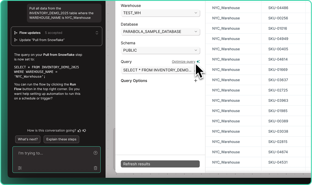
Write and optimize queries with AI
New
New
New
Across all database steps, you can now “Write” and “Optimize” queries using plain language. Skip the SQL headaches and let Parabola handle your query complexity.
Quickly connect your go-to accounts
Improvement
Improvement
Improvement
After saving an integration account, users can now specify a “default” account across their integrations. Once set, your default account is automatically selected every time you drop a new step in any flow.
Note: Defaults are set at the user-level, so every user can select their own defaults.

Build with AI every step of the way
Improvement
Improvement
Improvement
Say goodbye to the blank canvas. Describe what you need or choose a use case, and let AI help you execute tasks with smart, contextual suggestions guiding you from start to finish.
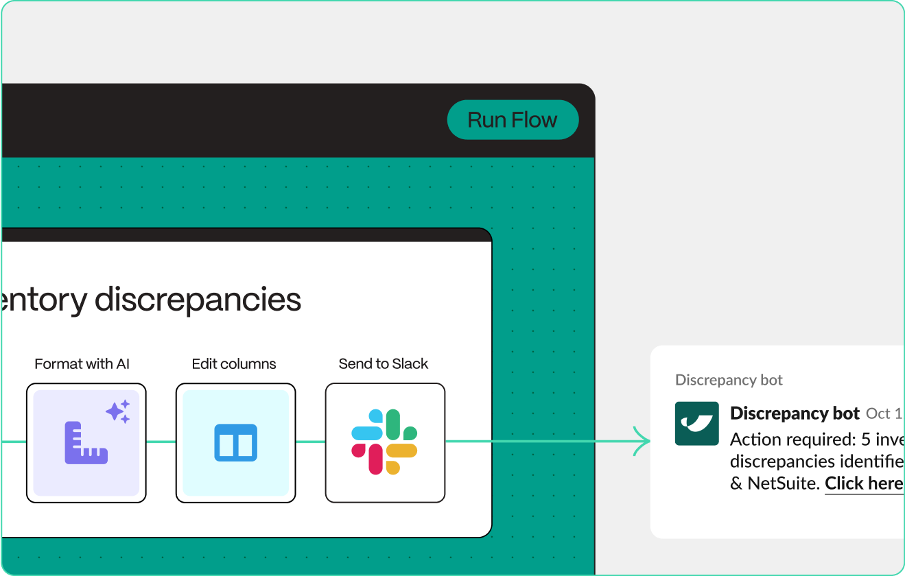
Real-time updates, straight to Slack
New
New
New
With our new Send to Slack step, you can connect your systems to Slack in seconds to keep tabs on the important data running throughout your stack.
Automatically DM users or send channel updates, include CSV files and images, and customize messages with variables to share the right data, at the right time.
Check out the announcement post to learn about how brands like Bandit and Vacation Inc. are putting this step to work!
Connectivity for XLSB and XLSM files
Improvement
Improvement
Improvement
You can now import .XLSB and .XLSM files using the Pull from Excel and Extract from email steps—expanding the collection of supported file formats.
Intuitively combine datasets
Improvement
Improvement
Improvement
A long-standing behavior has been updated: arrows connected to the Combine tables step can now be disconnected and reattached without breaking the step configuration. This means smoother adjustments when reorganizing upstream steps, regardless of connection order.
More resilient and flexible FTP connections
Improvement
Improvement
Improvement
The Pull from FTP step now runs successfully even when folders are empty—using headers from the last file processed. The Send to FTP step also supports a new dynamic file naming option: {timestampDash}. Learn more here.
Connect your flow with the web
New
New
New
Parabola can now search the web to give you more accurate, informed answers. Get up-to-date intel on API docs, error codes, third-party data nuances, and more so you can build faster without jumping between tabs.
%2520small%25204.gif)
Optimize prompts and trust your Custom transforms
Improvement
Improvement
Improvement
The Custom transform step just got three major upgrades. Use the new Optimize this prompt✨ button to instantly improve your prompts and improve results. Now 3x more reliable with clearer, more actionable error messages so you can fix and fine tune faster.
Learn more in the new Parabola University lesson.

Stop flow runs and get back to building
New
New
New
You can now cancel a flow mid-run and make updates instantly. If you spot a mistake or a run takes longer than expected, hit the “Stop run” button and get back to building without the wait.
Spot changes instantly
Improvement
Improvement
Improvement
Parabola now highlights exactly what changed in each step. New and edited columns are automatically spotlighted in a refreshed data grid, so you can easily follow your data with less scrolling and searching.
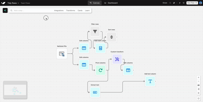
Tidy flows with a click
New
New
New
With the new auto-layout button, you can instantly organize your flow—making it easier to manage and share with teammates.
Vibe-automate flows with more control
Improvement
Improvement
Improvement
Parabola makes real-time updates to your flows as you chat, often adding multiple steps after a single message. Build without fear using the new “Undo” button, available in chat after every flow update.
Clean and structure Excel files with AI
New
New
New
Turn messy spreadsheets into clean, structured tables. Try it out in the Extract from email step or when uploading an Excel file.
Drag-and-drop file upload
New
New
New
Skip the “Pull from” steps. Just drag a file onto the canvas—Excel, PDF, CSV, or JSON—and your data’s ready to go.
Smoother chat experience
Improvement
Improvement
Improvement
We’ve made a few improvements to make our new AI chat interface feel easier to use. Plus, send messages directly from the canvas and use the shortcut [ to open and close the sidebar.
New team usage reports
New
New
New
“Which Flows use our Snowflake credentials? Who has access to those Flows? How many of those Flows have run in the last 30 days?”
Admins: answer all these questions—and more—using the new “Usage reports” on the billing page. Contact your account manager for more information (available on Advanced plans only).

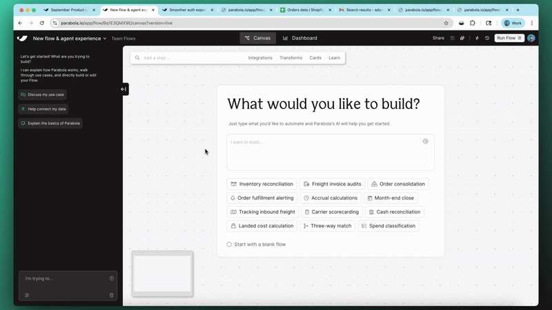
Welcome to the new Parabola
New
New
New
Today, we're introducing a completely new way to build in Parabola. It’s the clearest expression of what we’ve always set out to build.
At its core is a new AI-powered chat interface that makes building, troubleshooting, and documenting Flows feel conversational. Simply type what you want to automate, and watch it come to life.
Try it now and watch your ideas turn into outcomes 100x faster. We can’t wait to hear what you think.
.gif)
Flow faster with the quick-action toolbar
New
New
New
It’s easy to get into a “flow state” while building in Parabola—pun intended.
The more you build, the easier it gets to mentally map out your next few steps. With our latest update, we’re slashing the amount of time it takes to go from knowing what you want to build and actually getting those steps on the canvas.
Next time you’re in Parabola, search for steps and keywords directly on the canvas to quickly map out the structure of your Flow and bring your ideas to life, faster.

Create custom transform steps (!!!) with AI
New
New
New
We just released our most powerful AI step to date—making it 10x easier and faster to build Flows in Parabola.
With our new Custom transform step, you can create your own custom Parabola transformation steps by simply typing out instructions using plain language. The days of stringing together dozens of steps to work through complex logic are over—and in its place, we’re introducing our most flexible step ever.
🎁 Interested in trying out the step with a chance to win $250 or Parabola swag? To celebrate this launch, we’re running a contest through next Friday (4/11) to see the creative ways our customers solve complex problems with this step.
To learn more about the contest, see a demo, and explore potential use cases, check out our product launch doc. We think you’re going to love it…excited to hear your feedback!
Understand what data flows through your Flows
Improvement
Improvement
Improvement
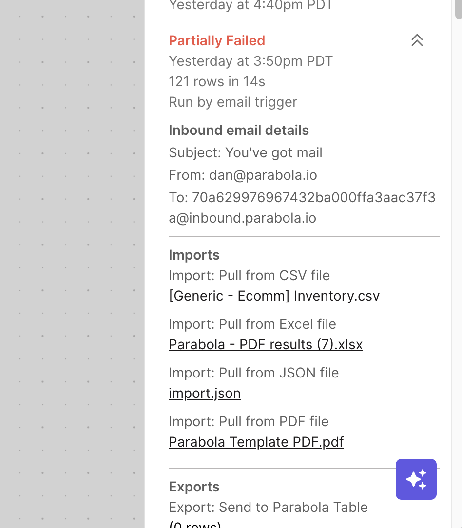
Building on our recent update to show all previous Flow runs, we're adding even more context to each Flow run.
Your Flow run history panel now displays details about any email or webhook sent to the Flow, along with downloadable links for any files ingested into the Flow.
You'll always know exactly which email and file were associated with each run.
We've also reorganized the logs for better readability. These improvements are reflected in Flow run summary emails as well.
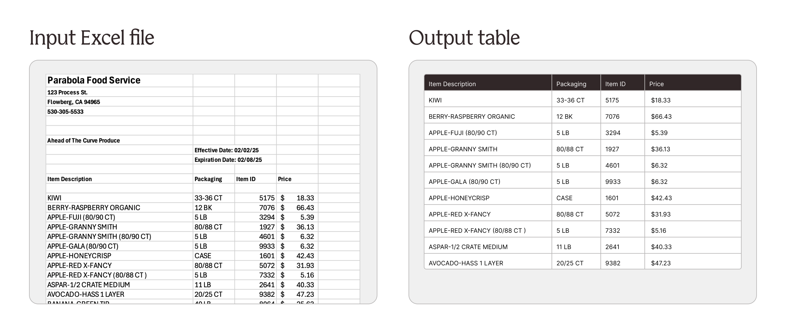
Parse simple tables from spreadsheets with AI
New
New
New
Working with files like Excel, CSV, or Google Sheets often means working with formats that change over time. The table you need might start on the 10th row in this file, and the 15th row in that file. This can make building Flows difficult and brittle.
With the new “Find table with AI” option, you can use AI to automatically find the table in your spreadsheet — allowing fast and flexible parsing of Excel files, CSVs, and Google Sheets.
Use this option in our Pull from Inbound Email, Excel, CSV, File Queue, and Google Drive steps.
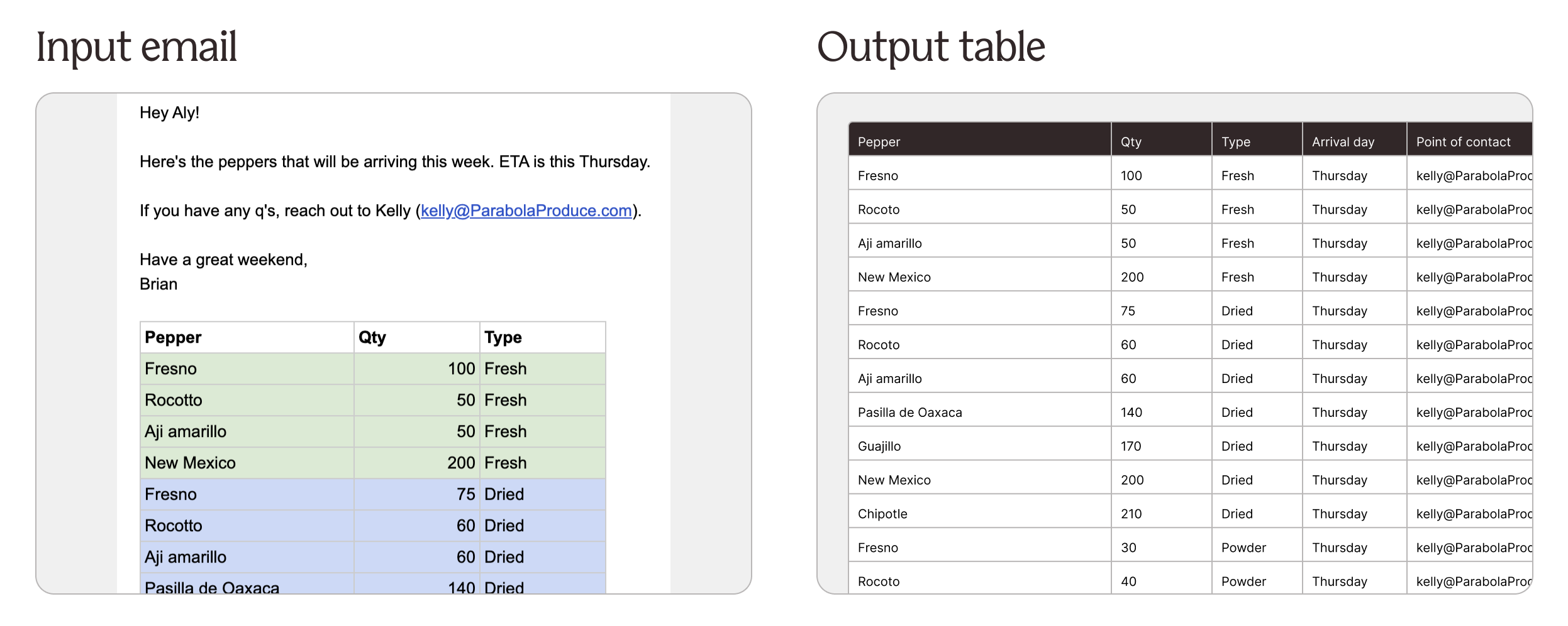
Extract data from email bodies using AI
New
New
New
Emails are a primary communication channel for business critical information. Staying on top of the latest replies and syncing information from emails into other systems is tedious and manual.
With the new “Extract data with AI” option, you can use AI to automatically extract tables and key values from email bodies to create structured output.
Find this option in the “Pull from inbound email” step when pulling in the “Email content”.
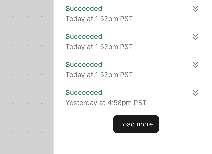
View all previous Flow runs
Improvement
Improvement
Improvement
A small yet useful update has been shipped to the Flow run history panel.
Use the "Load more" button to go back further in time to see every run that a Flow has performed. Each click loads an additional 20 previous runs.
Improved Extract, Categorize, and Standardize with AI steps
Improvement
Improvement
Improvement
Hundreds of Parabola customers use AI to make sense of unstructured data and build powerful, streamlined Flows.
AI steps in Parabola are now not only faster to set up and run, but also deliver more accurate results. The recent upgrade includes three major highlights:
- A new testing experience: A fast feedback loop is key to successfully configuring AI steps. You’ll now see the ability to test your settings on a certain number of rows, directly inside of any AI step (just click the ⚙️ icon).
- Speed and scale improvements: AI steps now run 2x faster allowing them to support larger amounts of data.
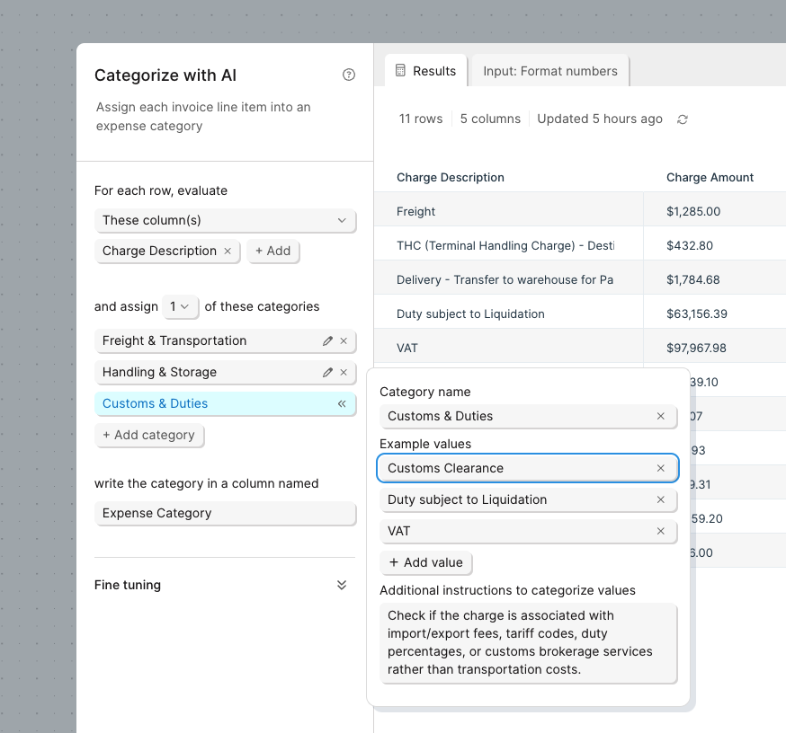
- Enhanced prompting for Extract and Categorize: Similar to our PDF parser, our Extract and Categorize steps now allow you to provide example values and column-specific instructions to improve the accuracy of your results.
From your messiest documents to your tidiest ERP reports, leverage these improvements to extract, categorize, and standardize data with the power of AI.
Limit rows while you build
Improvement
Improvement
Improvement
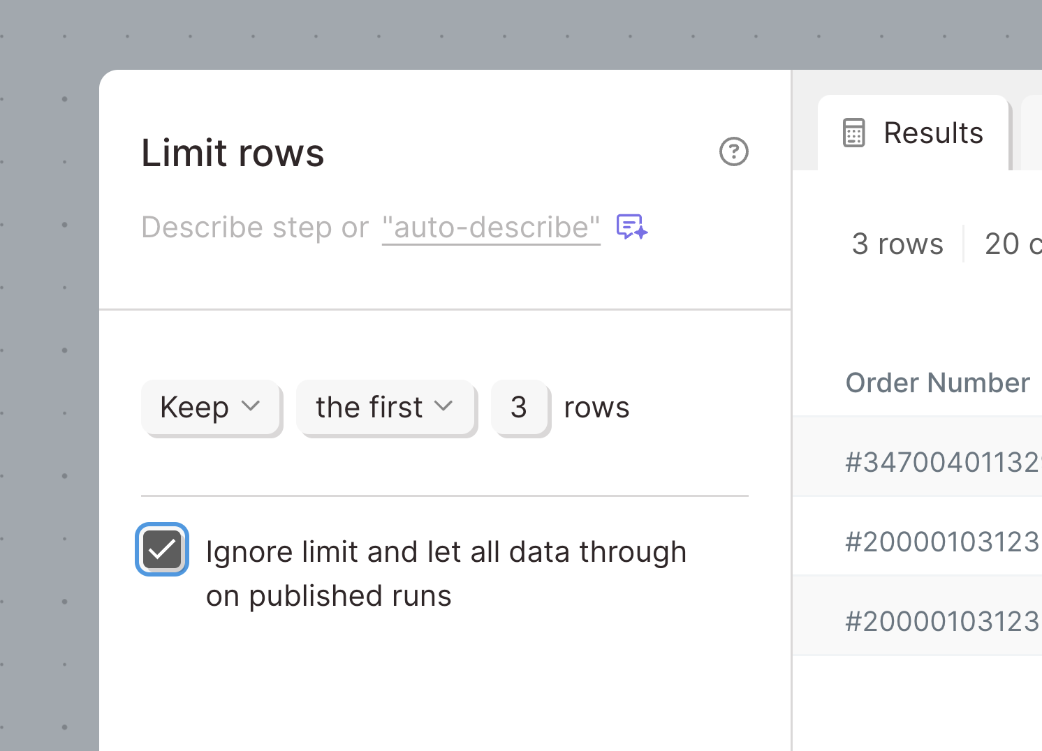
When building in Parabola, there are times when you want to process some data, but not necessarily the entire dataset — like when you’re setting up an API call, joining large datasets, or using an AI transform.
With the latest upgrade to the "Limit rows" step, you can choose to limit your dataset just while you build — but remove the limit and use the entire dataset when the Flow actually runs. That means no more waiting on thousands of API calls or a complex "Find overlap" step while you build.
Check it out and let us know what you think!
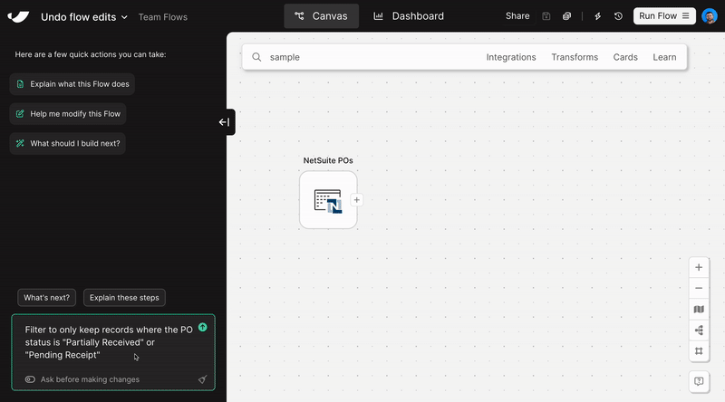
Pull in custom fields from NetSuite
Improvement
Improvement
Improvement
The Pull from NetSuite step has been updated to pull in custom fields and display them in the same way they appear in your saved searches. Prior versions of the step could pull in some custom field data, but it was difficult to use in a Flow.
Now, custom fields will appear as additional columns along with any other supporting data returned by NetSuite.
Email and download Excel files
New
New
New
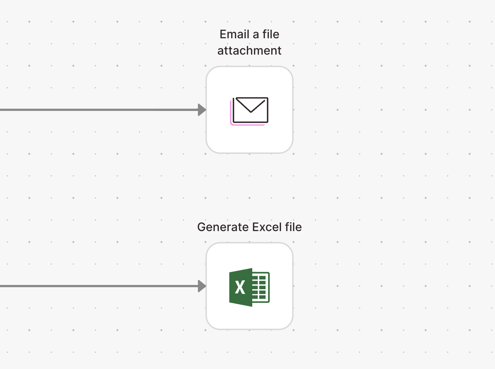
Flows are now more flexible with the addition of Excel file exports.
- Use the Email a file attachment to automatically email Excel files
- Use the Generate Excel file step to create downloadable Excel files
Both steps support multiple input arrows to create multi-sheet workbooks.
📣 Saving, sharing, and managing accounts just got a whole lot easier
Improvement
Improvement
Improvement
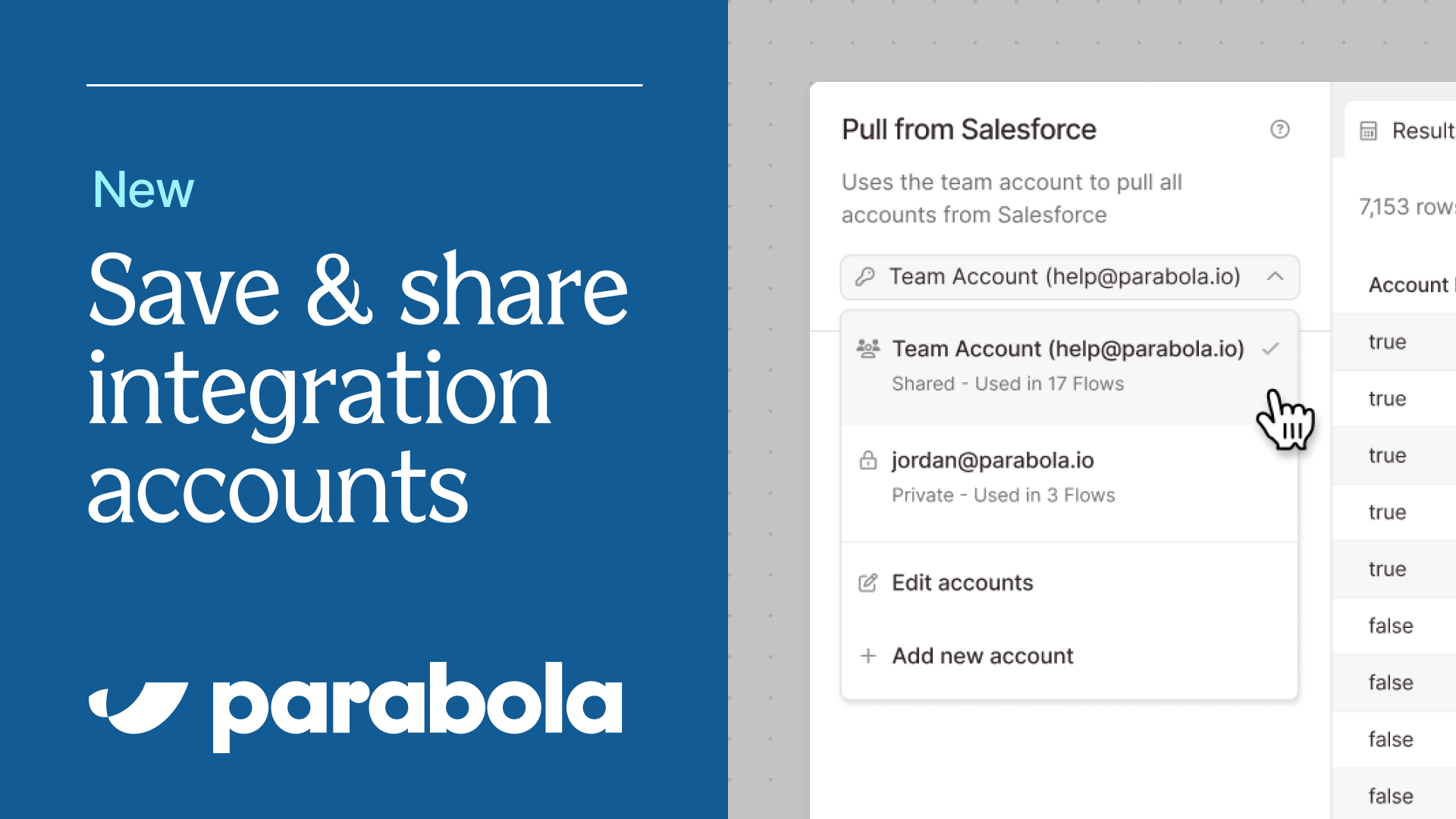
We’re excited to share a major upgrade to the way you and your team manage integrations in Parabola 🎉
With this release, you’ll have the ability to save and share integration accounts across your organization – making it easier for you to…
- Manage and re-authenticate accounts (if an authentication expires, you only need to update it in one place, and all Flows using that account will be updated)
- Improve visibility into integration accounts across your organization
- Share integration accounts across your team
- Manage permissions for specific accounts
For a brief overview of the upgrade, check out this quick video, and explore our announcement doc for more information and optional migration details. We think you'll really enjoy the new system!
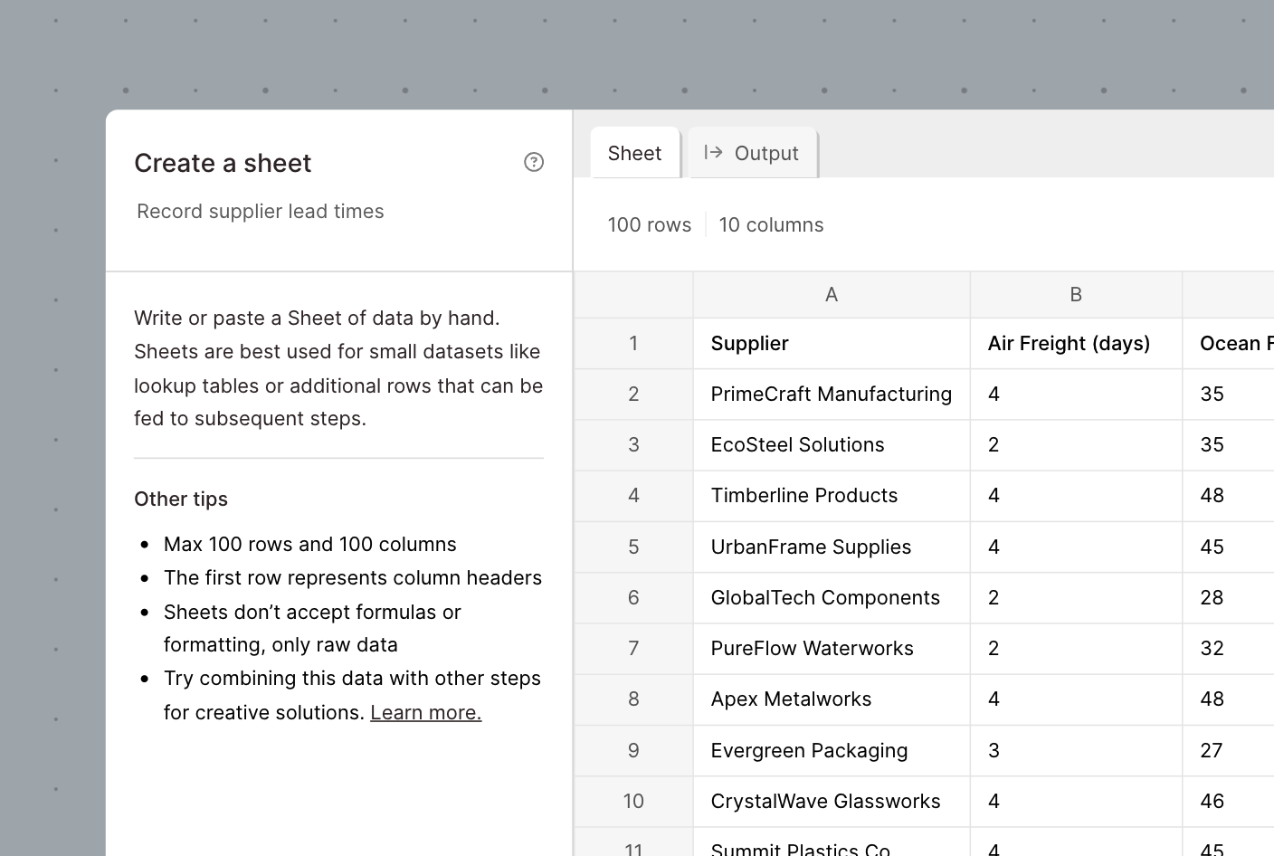
Create, save, and update spreadsheets in Parabola
New
New
New
If you've ever used Parabola, you've probably wanted to edit specific cells of data or 'just create a reference table' more than once while building.
With the new "Create a sheet" step, you can write or paste data directly into a spreadsheet interface and use that data throughout your Flow. This is particularly useful for situations where you want to create a dynamic reference table, test different scenarios/variables, and want to cut out working across Google Sheets and Parabola.
Check out the "Create a sheet" source step and our How To documentation to learn more!
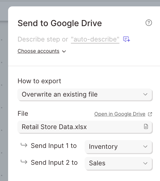
Create Excel and CSV files in Google Drive
New
New
New
To further Parabola's integration with the Google ecosystem, we're excited to release a new Send to Google Drive step which supports...
- Creating Excel files with multiple tabs
- Creating CSV files
- Creating and updating Google Sheet files
This step will live alongside our existing Send to Google Sheets step to provide flexibility as you build. Check out the details in our product documentation and reach out with any questions!

Visualizations on the canvas, dynamic dashboarding, and live Flow editing with more powerful drafts
New
New
New
Three major updates in one 📊 here’s a breakdown of the release:
- Visualizations on the canvas: You can now drop dynamic visualizations (like charts, graphs, and tables) directly on the canvas to see reports update in real-time as you build.
- Dynamic dashboarding capabilities: It’s now even easier to graduate from Spreadsheet Land and create BI-quality dashboards with a faster feedback loop.
- Live editing & powerful drafts: You can now edit Flows in real-time without needing to create drafts for every change — just directly edit the live version of your Flows, and watch updates automatically save.
Check out the video below for a full overview of the new functionality — and to see these features in action, explore this collection of free demo Flows. Happy building!
AI-generated process documentation for your Parabola Flows
New
New
New
We’re excited to share that Parabola Flow documentation is getting a major boost 📝
Parabola Flows now use AI to analyze every step in a Flow, automatically adding process documentation as you build. Gone are the days of writing out a detailed SOP only for your process to change the next day!
Next time you build in Parabola, you’ll see that the new “documentation” section of every Step will be automatically updated as you build.
Learn more about the details in this blog post.

Navigate complex flows with our new mini-map
New
New
New
We're excited to introduce the mini-map, a new feature designed to help you navigate large and complex flows with ease. The mini-map provides a compact, interactive overview of your entire Parabola flow, allowing you to quickly orient yourself and move between different sections of your workflow.
You can toggle the mini-map on or off using the map icon in the zoom toolbar.
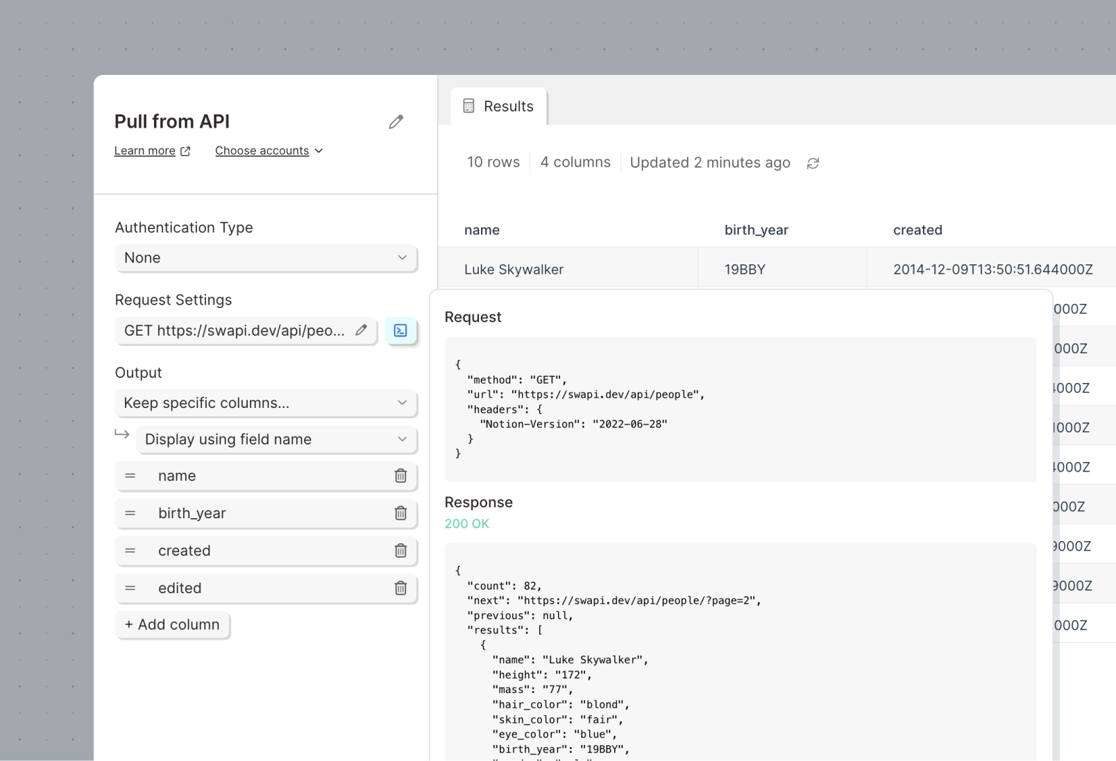
An easier and more powerful way to connect to APIs
Improvement
Improvement
Improvement
Connecting to APIs in Parabola is easier than ever: The Pull from API, Enrich with API, and Send to API steps have been redesigned to make configuration and testing a breeze.
- Connection settings all in one place: Our redesigned connection panel gives you more space when you need it, and no worry when you don’t.
- View the request and response: Use new controls to view the full request and response data sent between Parabola and the API for faster testing and iteration.
- Just point and click: With the new output settings, keep the columns you need from the API, and forget the rest.


Parse multiple PDF formats with AI using a single step
Improvement
Improvement
Improvement
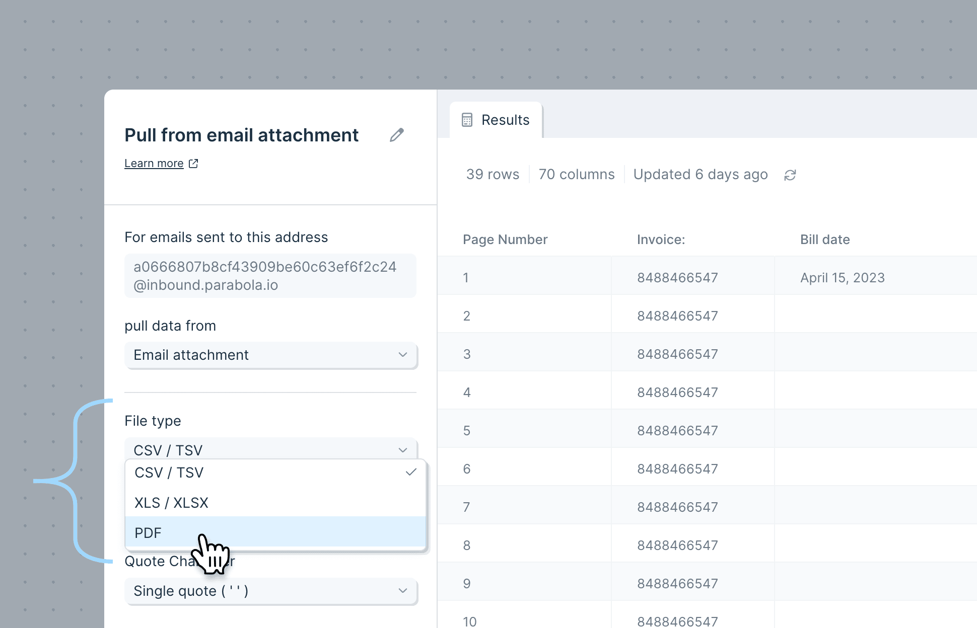
We’re excited to announce a new feature in our PDF AI parser that allows you to parse multiple formats of PDFs with greater control and precision - all in one “Pull from email attachment” step!
You can now set specific rules (called “formats”) for different types of PDFs that you receive via email, using a new mode that lets you configure multiple PDF formats — for example, invoices from different vendors — and pull key pieces of information from each.
To route PDFs to specific formats, you can create rules based on the file name, subject line, or other email metadata.
.png)
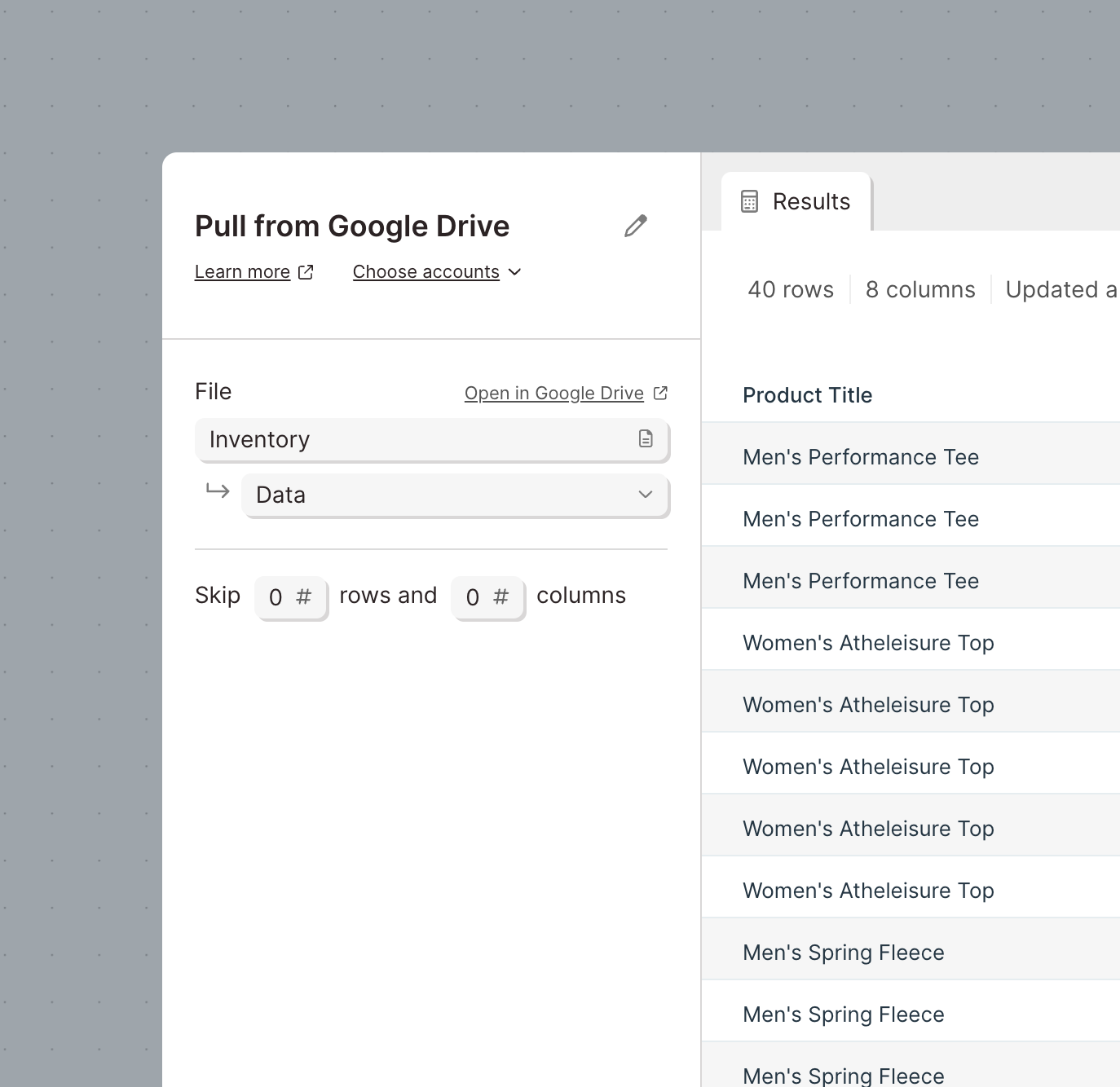
Pull in Google Sheets, CSV, and Excel files from Google Drive
Improvement
Improvement
Improvement
Our Pull from Google Sheets step has been upgraded to pull more types of files from Google Drive. In addition to accessing Google Sheets, this step can be used to pull in CSV and Excel files stored in your Google Drive.

Pull URLs from emails
Improvement
Improvement
Improvement
We’ve updated the Pull from inbound email step with options to pull in the full HTML representation of the body of an email, as well as a parsed list of URLs contained within the body.
This list of URLs can be used to isolate URLs from an email, fetch a document from that URL, and then process that document via the Pull from file queue step.

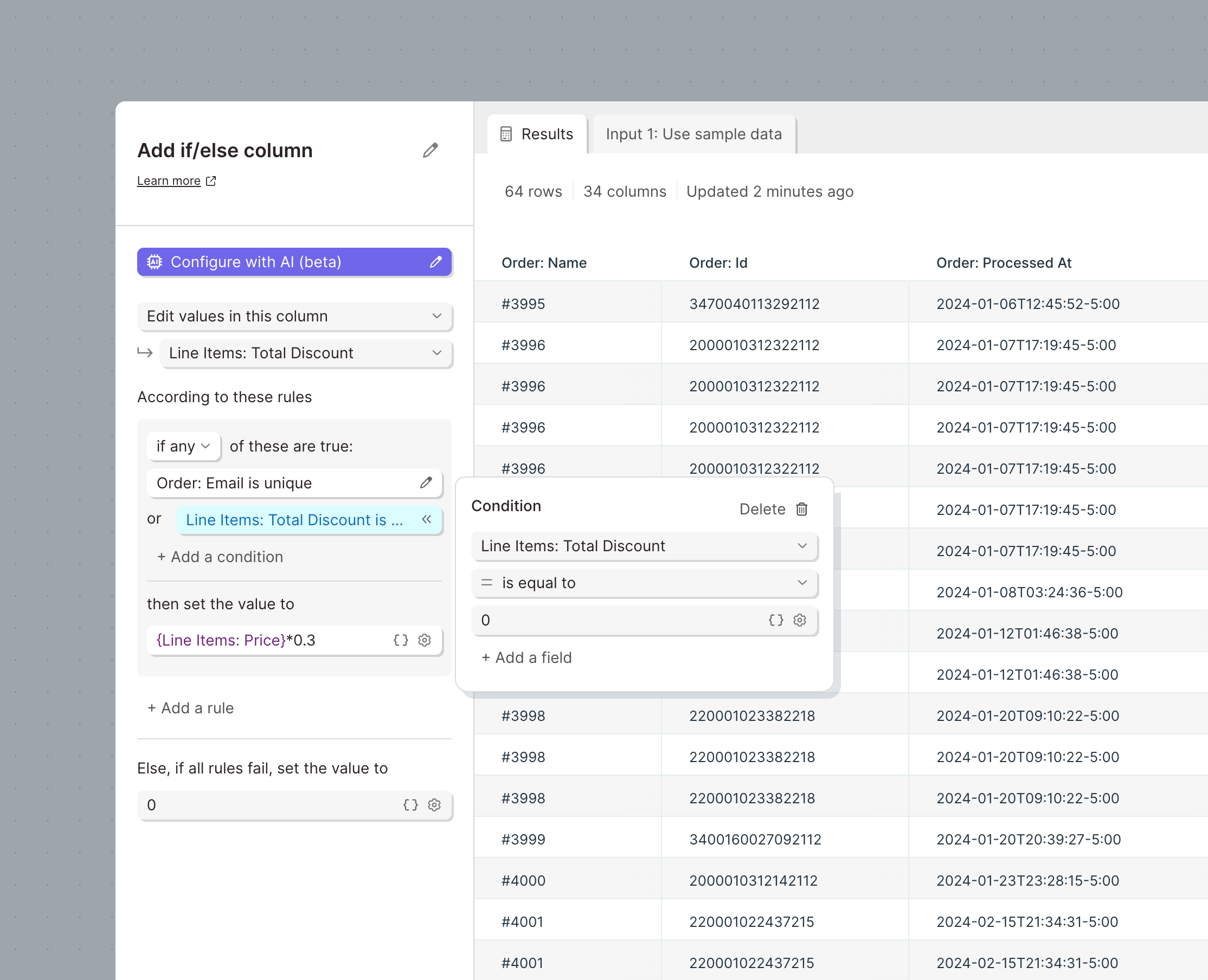
Huge updates to the Filter rows and Add if else column steps
Improvement
Improvement
Improvement
Filtering rows and if else logic are at the heart of every Parabola Flow. We’ve given both steps a massive upgrade to make them faster, easier to use, and more powerful
Both steps have access to series of new operations:
- Filter dates to… (filter dates relative to now or a set date)
- Is unique (is the value in each row unique within that column)
- is not unique (is the value in each row not unique within that column)
- Text is equal to (equals but assumes text - faster than “is equal to”)
- Text is not equal to (equals but assumes text - faster than “is not equal to”)
- Text starts with (matches the first part of a cell)
- Text ends with (matches the last part of a cell)
- Text length is (length of cell = #)
- Text length is greater than (length of cell > #)
- Text length is less than (length of cell < #)
- Text matches pattern (regex match)
- Text does not match pattern (inverted regex match)
- Is between (between two numbers)
- Is not between (not between two numbers)
Text field level options - accessible via the settings cog icon on the right side of any text field:
- Each text field can be toggled to evaluate what has typed in as a math expression, instead of just text. You can type numbers or reference them from columns using {merge tags}
- Each text field can be toggled to match based on the casing provided, or ignore the casing of the text
Add If else column step-specific updates:
- Choose to replace value in an existing column, as opposed to only create values in a new column
- Add additional criteria to a single condition. This was already supported in the Filter rows step. For example, define a list of items that a field may be equal to.
- To accommodate all of these amazing features, the Add if else column step has a new design that is more compact and easier to read
Updates to email trigger Flow failures
Improvement
Improvement
Improvement
Parabola Flows can be set up to be triggered to run via an email. When an email is sent to a Parabola Flow, the Flow will try to enqueue the new run. If that enqueueing fails, an email is sent back to editors of the Flow alerting them that a certain email could not be processed.
With this change, that email also:
- Contains the name of the file attached that caused the issue (such as the wrong file type)
- Sends to the email address who sent the original email in to Parabola
New options to run Flows from other Flows
Improvement
Improvement
Improvement
Use the updated options in the Run another Parabola Flow to run Flows in sequence. The new options are:
- Run once per row
- Run once per row with a file URL
If Flow 1 tells Flow 2 to run, these options will allow Flow 1 to finish running before Flow 2 has finished. In the existing options, Run once and wait, and Run once per row and wait, the step will wait for Flow 2 to finish before it can finish.
Using the Run once per row with a file URL option will add runs to the file queue of Flow 2.
.png)
Pull files into Parabola from URLs
New
New
New
Use the new Pull from file queue source step to access and parse files at the end of URLs.
The file queue works like a webhook or email trigger, but can be triggered via an API call (webhook) or the Run another Parabola Flow step.
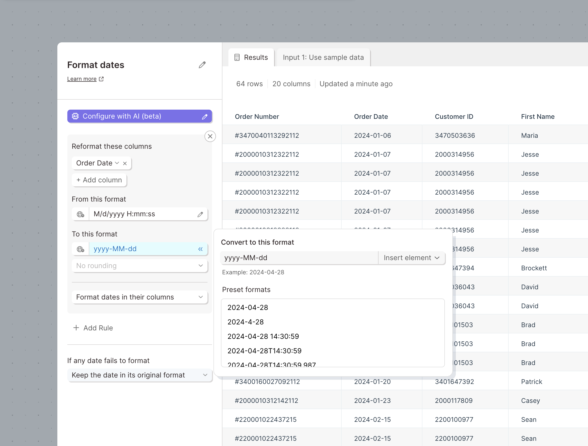
Work with dates in an easier, more powerful way
Improvement
Improvement
Improvement
Use the updated Format dates step to easily change the format of dates, convert between timezones, round dates, and more.
This update completely overhauls the step with a new powerful date engine, updated interactions and design, and AI auto-detection.
We've added support for converting between timezones and precisely rounding dates.
Configure steps using the AI co-builder
New
New
New
Introducing, the AI co-builder. Configure steps quickly and easily using AI to transform simple prompts into complex rules and settings.
To use the AI co-builder:
- Click the “Configure with AI” button to access the co-builder.
- Enter instructions for how to configure the step and click “Configure it for me”
- Once the AI has determined the right configuration, any existing settings will be replaced with the new settings.
The AI co-builder only runs when you click to configure the step. During subsequent runs, the step will not use AI to create results.
Now available in limited steps during the beta:
- Replace with regex
- Filter rows
- Format dates
- Find & replace
- Add if / else column

Introducing Parabola University: Learn, Build, and Grow
New
New
New
We're thrilled to launch Parabola University, a dedicated space on our website featuring video tutorials that guide you through creating effective Flows. What's more, you can access these helpful videos directly from the menu bar while you're building Flows.
New Look, Refreshed Experience: Welcome to Our Rebrand
Improvement
Improvement
Improvement
Our website and product interface have undergone a stunning transformation! Explore the new colors, styles, and overall look and feel that reflect our commitment to making your experience more vibrant and user-friendly. It’s not just a makeover; it’s an upgrade to how you interact with Parabola.

Colorful, collapsible cards and streamlined navigation
Improvement
Improvement
Improvement
We've released a few new features to make sharing and getting around Flows easier.
🎨 Colorful, Collapsible Cards: Dive into our latest update where you can now compress parts of your Flow with collapsible cards and organize them with vibrant, colorful banners. It's easier than ever to manage and share your workflow.
🧹 Simplified Flow Navigation: Alongside, we’ve refined the navigation to smoothly toggle between Published and Draft versions of your Flow, ensuring a cleaner and more intuitive experience.

Access files sent to Parabola Flows with new URLs
New
New
New
The Pull from Email Attachment step now supports creating URLs to access the files that have been sent to a Flow.
When this option is enabled, the step can be configured to create URLs that are publicly accessible, accessible only to members of your Parabola team, or accessible to teammates who have access to the Flow.

Send more types of API requests
Improvement
Improvement
Improvement
More API request body formatting options
The "Protocol" dropdown in request body of all three API steps has been replaced with a "Format" dropdown.
In addition to JSON and GraphQL, Parabola now supports plain text, form-data, and x-www-form-urlencoded formatting types.
When using these options, if an API step does not already have a "Content-Type" header included, we will also now automatically add the right one, according to the last selection in the "Format" field.
This is available on all API steps - Pull from AP, Enrich with API, and Send to API

Merge tag support in header values
Utilize merge tags, columns referenced by name and wrapped in {curly braces}, within the value field of a custom header to merge in values for each API call from the input data.
Available in the Enrich with API and Send to API steps.

Builder 2.0 is here!
Improvement
Improvement
Improvement
We've completely overhauled the Flow builder to give you more performance, faster building, and more intuitive features.
Canvas
- Infinite canvas so you can build as far and wide as you’d like
- Better defined grid for improved spacing throughout your Flow
- Better performance for even your largest Flows
- Improved zoom and fit controls on the canvas
Steps and arrows
- Smoother arrow connection
- Updated design of step controls
Cards
- Place steps anywhere inside of cards
- Hold shift, click, and drag to multi-select steps inside of cards
- Move many steps in, out, and between cards
- Updated design of card controls

Integration with Microsoft SharePoint & OneDrive
New
New
New
Brand-new integration, hot off the press: we now support connecting to Microsoft SharePoint and OneDrive!
We want all teams to be able to access their data as easily as possible. With these new steps, you can access any XLS and CSV files in SharePoint or OneDrive. Pull your files into a Flow, create new files, or update existing files.
This integration is available to all customers. Please refer to our documentation for more details!

Introducing (really) Smart PDF Parsing with AI
New
New
New
Our latest release is next-level: it converts even your gnarliest PDFs into usable data, with really simple configuration.
Now combining two elements of AI—battle-tested OCR and cutting edge multi-modal LLMs—Parabola does all the hard work transcribing and importing your data for you, so there’s no setup required on your end.
Want to learn more about this new capability? Learn more
We’ve made two big upgrades to our Google Sheets steps
Improvement
Improvement
Improvement
1. The next time that you authenticate a Google Sheets step, you will see an updated experience. Instead of selecting files from a dropdown, you can use the native Google Drive file selector to find your file by searching or navigating through your Drive.
.png)
(Note: you will need to reauthorize existing Google Sheets steps in order to select a new file.)
2. When sending data to Google Sheets, you can now select a folder in which to create the new sheet(s), as opposed to always creating the file in the root of the drive.
We hope these upgrades make connecting to and using Google Sheets within Parabola easier and more delightful!
To take advantage of these changes, be sure to refresh your Flow.
Email CSV Attachment step now supports dynamic content
Improvement
Improvement
Improvement
By popular demand, our Email a CSV Attachment step now supports dynamic values. Values can be used in any field: the email subject, body, recipients, and even the file name of the attachment. Simply reference the desired column using merge tags {}, and the email will automatically insert the first row from that column. All the details here!
Sequence Flows and share data between them
Improvement
Improvement
Improvement
You can now connect the Send to Parabola Table step to any other step, and in particular, the Run another Flow step.
By connecting these two steps, a Flow can first send data to a Table and then run other Flows that pull data from that Table. This ensures that connected Flows run in the correct sequence and that data is passed directly between them.
.png)
Pull multiple email attachments, and visibility into pending Flow runs
Improvement
Improvement
Improvement
We’re delighted to announce that you can now process multiple attachments from a single email, using the “Pull from email attachment” step.
Previously, email-triggered Flows would always run with the first valid attachment received. Now, you can configure your Flow to run with each valid attachment received on a single email. So if you expect to receive one email with multiple CSVs, XLS, or PDF files, a single Flow can process them all, sequentially!
Check out all the details here.
We’ve also given you more visibility and control over your “queue” of pending Flow runs. For triggered Flows, you’ll see how many runs are pending, and you can manage how runs are added and executed.

Define custom formats for dates in Tables
Improvement
Improvement
Improvement
Specify the format of any date column within a Table to improve the accuracy when changing its format.
.png)
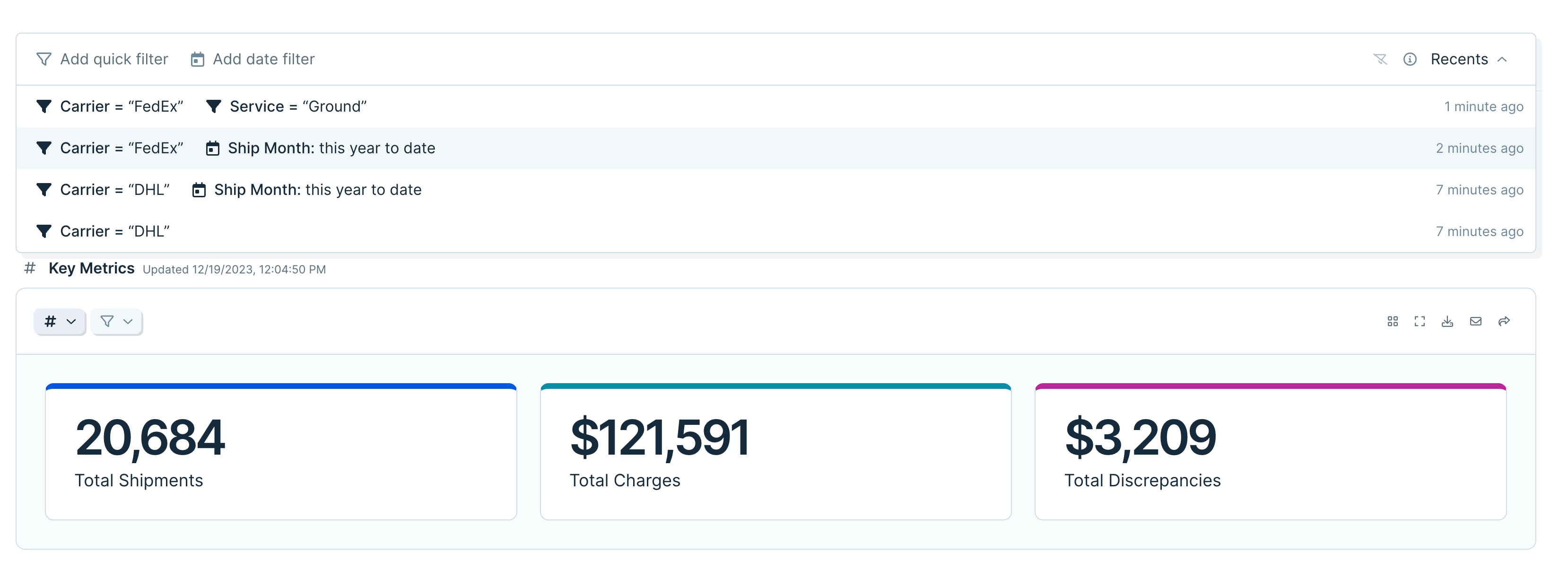
Access and re-use previous quick filters
Improvement
Improvement
Improvement
Use the new “Recents” drawer in quick filters to access sets of filters that you have previously applied to tables and charts.
If you find yourself repeatedly filtering the same Flow, you’ll now be able to reapply those filters with one click.
We’ve also made filters easier to manage by adding a “clear” button, allowing you to instantly remove all applied filters.
Calculate NETWORKDAYS with Compare Dates step
Improvement
Improvement
Improvement
The Compare Dates step can now calculate the difference between dates in terms of weekdays only, akin to the NETWORKDAYS function in spreadsheets. To use, select “weekdays” as your unit of measurement, and compare two dates (either two columns, or one column to current time). Here’s the handy documentation.
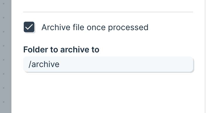
Process entire folders of files using FTP
Improvement
Improvement
Improvement
We’ve released a small but mighty feature to the Pull from FTP step!
The new “Archive file once processed” setting allows this step to cycle through a list of files in a folder, moving them after each one has been processed into a different folder.
Using this setting, you can build Flows that check folders for new files and process them one by one until the folder is empty.
Send data to Snowflake
New
New
New
We now support sending data to Snowflake!
Snowflake is an essential repository for storing and accessing business data. Paired with our Pull from Snowflake step, Flows can be used to automate and collaborate on critical processes.
Read more in our documentation.
Send to Snowflake is available to customers on our Advanced Plan. Please contact us or schedule a call if you’re interested in them for your team!
Parabola Tables: now with Append, hiding, freezing, and links
New
New
New
Hot on the tails of our exciting release of visualizations, we’ve added three new features to Parabola Tables to make them more powerful for reporting.
Append and upsert
From the Send to Parabola step, you can now decide whether your data should:
- Overwrite on each run (existing functionality)
- Append new data to the bottom or top of your Table (new!)
- Update existing rows (new!)
This is great for anyone who is continuously adding new or updated data to their Tables, like week-over-week reporting.
Hiding and freezing
When looking at a Table on your published Flow page, you can now hide specific columns. These hidden columns can still be used within filters, sorts, or groupings for even more control over your final Table.
The first column and/or first row can also be frozen in place, so they “stick” while scrolling vertically or horizontally.
Use these to tailor Table views to exactly what you and your teammates want to see.
Automatic links
Any URLs in your Flow descriptions, Table descriptions, or even the cells within Tables will now be clickable.
Internally, we’ve found it incredibly helpful to add documentation links in our descriptions, and to easily access data that lives in another tool.
Introducing visualizations: Transform your workflow data into shareable reports
New
New
New
It’s a big day in the evolution of Parabola: we’ve added the ability to report on your data, empowering you to show your work more easily with data visualizations.

With visualizations in Parabola, you can:
- Keep everything in one secure platform – from the logic of your workflows to your reporting, to feel confident in the quality of your data and minimize manual work gathering information across systems and spreadsheets.
- Share important data with stakeholders through easy to read metrics that contextualize the output of your workflows and elevate your team’s work.
- Power agile reporting processes to transform ad-hoc analyses – like comparing data week over week – into automated, durable reports.
Take your data processes to the next level by building beautiful, shareable reports to share your work and make better decisions.
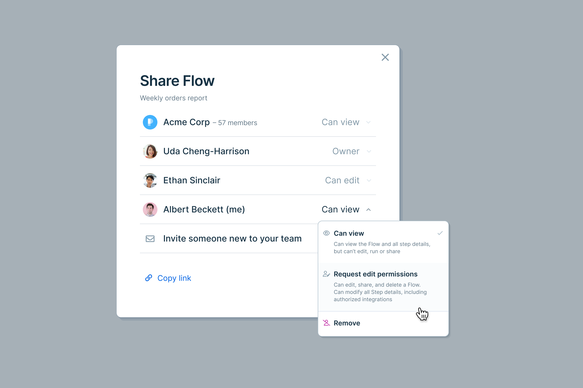
Request edit permissions to a Flow
New
New
New
Flow collaborators with view permissions can now request edit permissions at any time. Your request will be sent to Flow editors (or team admins, if necessary) for approval, and you’ll be notified via email as soon as your request is granted. The next time you open the Flow, you’ll have edit permissions!
You can initiate an edit request from two places within a Flow:
- The “Share” modal
- The viewer tool tip (hover over the “eye” icon)

Add descriptions to Tables to give your team more context
Improvement
Improvement
Improvement
Custom Tables descriptions are now available on every Table, making it easier for Flow editors to provide context and instructions. Add descriptions to let your team know what data they can expect to find in each Table, how to best utilize it, and more.

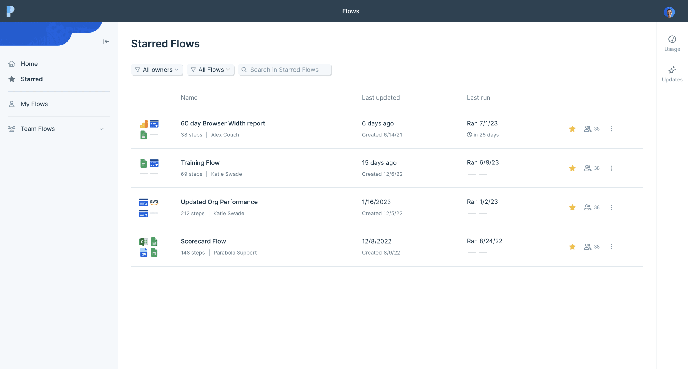
"Star" Flows for quick access
New
New
New
Introducing Starred Flows! 🌟 Star any Flow that you want to favorite or bookmark, and access them from the designated "Starred" sidebar (right beneath "Home"). Star Flows for quick access, like Flows that you're actively working on, or ones that you check regularly.
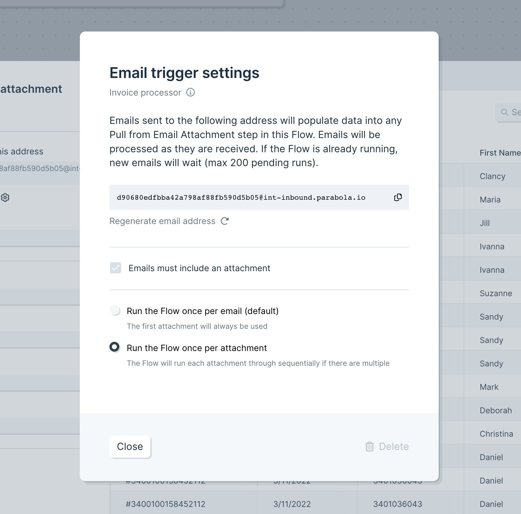
Trigger Flows and pull in data from emails without attachments
Improvement
Improvement
Improvement
We’re excited to release a small but powerful change to how Parabola interacts with emails. Flows can now be configured to accept emails without attachments. Great for using a Flow to parse the body of an email, or for email triggered runs that are more flexible.
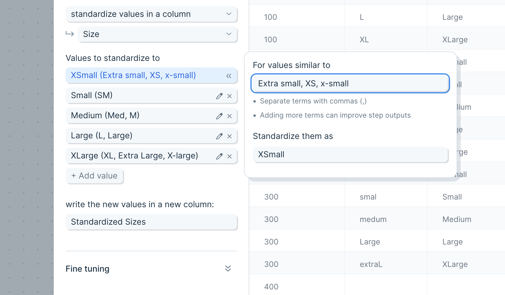
Introducing: Standardize with AI
New
New
New
We’ve added a new member to the Parabola AI family!
Introducing: Standardize with AI.
Use the Standardize step to clean up messy, error-prone data. This step uses examples that you provide to either rename columns, or standardize a column of values.
For example:
- Clean a table where the names of columns are not always consistent, such as packing lists from multiple vendors. Convert columns with names like “Product ID,” “sku,” and “Style” into “SKU”
- Take a list of clothing items with inconsistent size names and standardize those names. Convert sizes with names like “Med,” “M,” and “mdium” into “Medium”
- Correct words that are misspelled, contain errant spaces, or have undesirable casing.
We hope you leverage this step and our other AI steps (categorize, extract, and experiment) to automate even more and build better Flows.
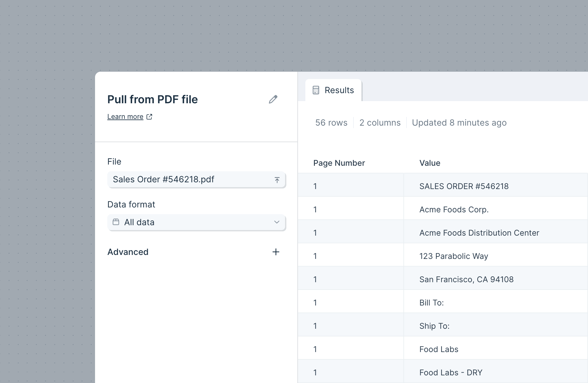
New "Pull from PDF file" step!
New
New
New
We’re excited to announce additional support for working with PDF files in Parabola: a dedicated upload step! Use our new “Pull from PDF file” step to manually select a PDF file to work with.
As with our PDF file support from our Email Attachment step, you can choose from four data types for utilizing the PDF data in your flow. Read more about those settings here. Try combining the Pull from PDF step with our AI steps, like Extract or Categorize, to automatically isolate the relevant information from your file.
This step is available for everyone, starting today!
New and improved published Flow page
Improvement
Improvement
Improvement
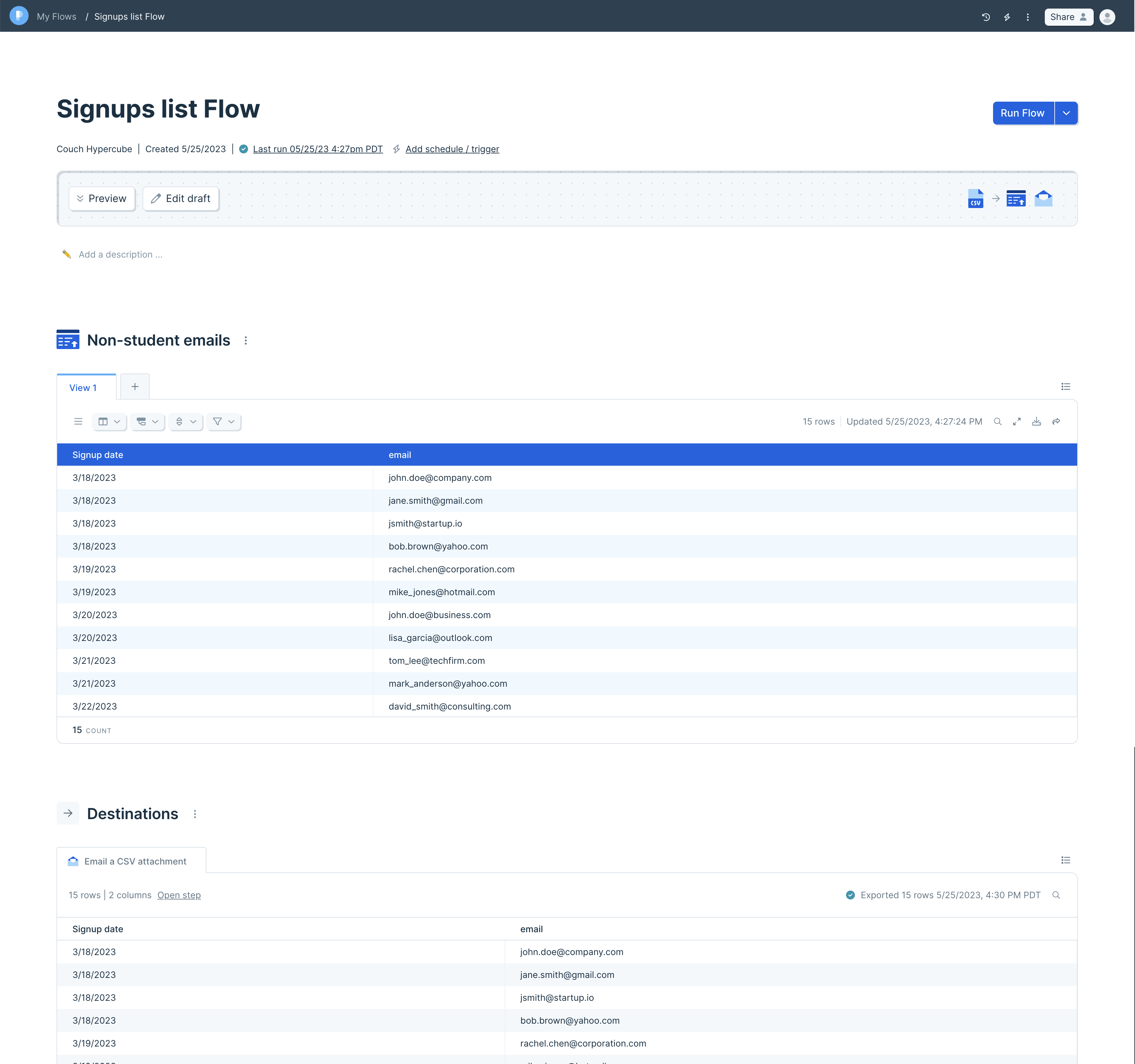
We’ve reworked the Flow page to make Flows more accessible and understandable to those with view-only access.
- Flow descriptions: Custom Flow descriptions are now front-and-center, making it easier for Flow editors to provide guidance and instruction.
- Destinations: The new “Destinations” view allows everyone to see where each Flow sends its data. Now viewers who are new to a Flow can understand where the data is sent when a Flow is run.
- Private drafts: Now, viewers have a safe environment to customize their own private Table tabs. Viewers can highlight, sort, and interact with a Table without altering the Flow or its shared Views.
Whether they’re building Flows or not, your whole team benefits from accessing data that you transform in Parabola.
Pull in data from NetSuite
New
New
New
We now support a new data source in Parabola: NetSuite!
NetSuite is a critical tool for retail and ecommerce companies, serving as a key source of truth for product and resource data. With the Pull from NetSuite step, you can access any saved search from NetSuite and pull that data into your Parabola Flows.
This integration is available to customers on our Advanced Plan. Please contact us or schedule a call if you’re interested in NetSuite for your team!

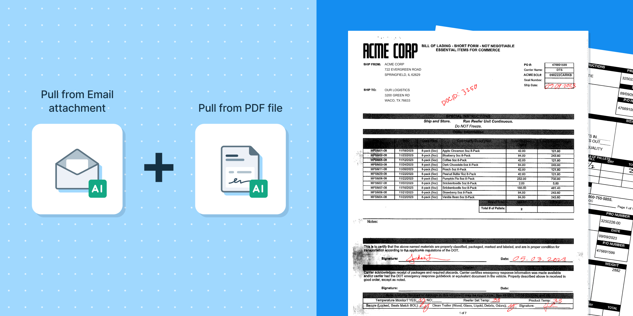
Introducing PDF file support
New
New
New
Parabola can now intake, parse, and automate data from PDFs!
We’ve added support for PDF files to our Pull from Email Attachment step, which enables you to work with PDF files just like tabular data. The Email Attachment step will automatically parse PDF files sent to it, and you can build your Flow utilizing four different data formats, depending on how the PDF is structured (isolate key-value pairs, table data, etc.). You can even trigger a Flow from this step, so that the Flow will automatically run when a new PDF is sent to it.
Our PDF parsing includes OCR, so files with handwriting should be supported, and covers English, French, German, Italian, Portuguese, and Spanish languages.
PDF file support is currently offered to users on our Advanced Plan. Check out the Pricing Page for additional information, and contact us if you’d like a demo!
AI-powered steps now in Parabola!
New
New
New
We are incredibly excited to announce the launch of three new AI-powered steps, available today to all users!
Parabola has always been powerful for working with structured data. But we know that doesn’t represent all of your tasks – many data workflows are still quite manual and burdensome because they deal with messy, unstructured, or variable data (like PDFs, email bodies, etc.).
That’s where AI comes in. With the combined power of AI and Parabola, you can create structure and automate processes. Use our new GPT-powered steps to transform your data:
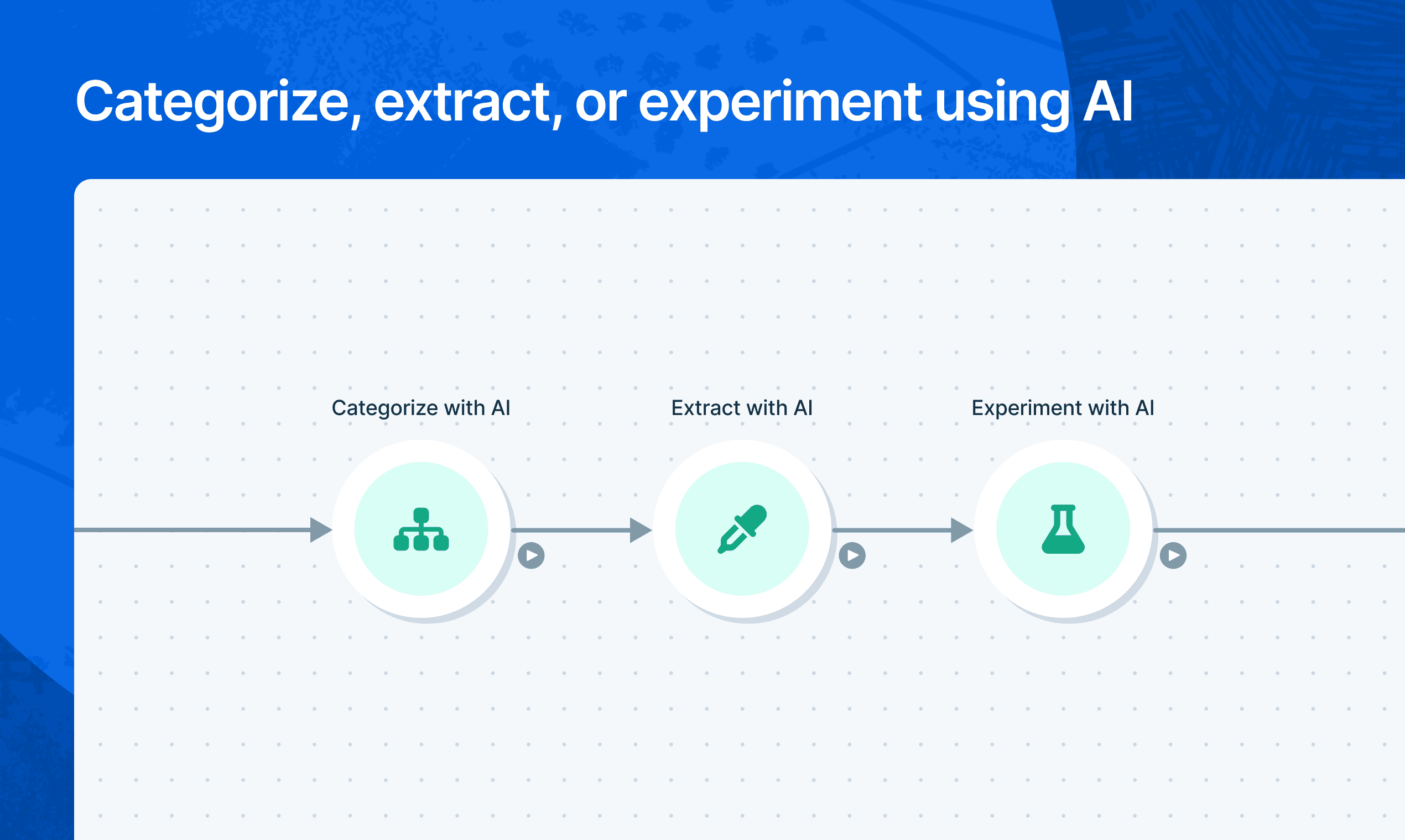
- Categorize: this step evaluates data and categorizes rows into the groups you define.
- Extract: this step extracts specific information from the data you input. By naming the new columns that you want to populate, you tell the step which pieces of info to extract.
- Experiment: this step lets you experiment with prompting the AI to revise your input data in any way. It’s the most flexible AI step.
Check out our linked guides for more details. We’re actively improving these steps every day, so please send us your feedback and needs! 🧠
Redesigned Team page
Improvement
Improvement
Improvement
Pop quiz: which Parabola page was rockin’ our oldest design system?
Answer: the Team page!
Well, no more. The Team page has been given a much-needed overhaul to make it easier to add and manage your teammates.
You’ll now see all members of your account in a list, with their team permissions visible at a glance (e.g. Admin, Editor). Admins can change member permissions by clicking on the permission dropdown, or through the gear icon at the right. You can sort this list by name or by permissions.
To add a new team member, click “Add teammate” at the top of the page.
We’ll be adding more team-level metrics and admin capabilities to this page, so let us know what would be most impactful for you!
A Spring Fling
Improvement
Improvement
Improvement
Happy April, everyone – may it bring both spring showers and flowers! 🌸 Last week our engineering team did something a bit special. We decided to see how many features and improvements we could build in just one week. A little spring fling, if you will. So, by popular demand, we bring you:
Flows page:
- Filters! You can filter by owner and by Flow schedules/triggers on the Home and My Flows pages (Team Flows page to come!)
- The folder tree displayed in your left-hand sidebar is now sorted alphabetically, A-Z
- When you view Team Flows, sorts will apply to both folders and Flows, with folders grouped at top
Tables:
When referencing a Table using the Pull from Table step, you’ll now see both the table and the Flow name, so you can be sure you’ve identified the right one.
Query input:
For steps with query input, like our database integrations, we added a larger query flyout field and auto-complete for query syntax, making it much easier to use.


Sort data better with the improved Sort Rows step
Improvement
Improvement
Improvement
We’ve created a new version of our Sort Rows step, with some great changes under the hood: the updated step can now sort complex data like dates and currencies with greater precision, as well as columns containing mixed types of data.
To take advantage of these changes, replace any existing sort steps in your Flows with a new step!
Better Flow building and step discovery
Improvement
Improvement
Improvement
We’ve completely redesigned how steps and cards are added to Flows! Using the new builder toolbar at the top of your Flows, access any integration, transform, or card template for easy building.
This new toolbar (which we lovingly refer to as “Superbar” 🍫 internally) is a big improvement to one of the most core interaction areas of Parabola. With its spacial layout, color coding, iconography, and tooltips, the builder toolbar is a quick way to find the steps you know you need, and a great way to learn about steps you never knew existed.
Here are the key changes:
- ↗️ Hover over any step or card template to learn what it does. Ever wonder what a certain transform actually does? Now you can see, thanks to illustrative examples for each!
- 💙 Steps are categorized with new icons, names, and colors to better represent what they do. The color categories will also produce some beautiful patterns ✨ in your Flows and should make them easier to read at a glance!
- 🗒️ Cards can be found in their new section, right alongside card templates. They’ve been given more room to explain themselves (so you know what a template does), and are categorized as your templates, or your team’s.
We also revisited the keyboard shortcuts for our power users:
- / or s to open the toolbar and initiate a search (just start typing!)
- Tab between the search, Integrations, Transforms, and Cards tabs
- Use the up, down, left, and right arrow keys to navigate within the lists
- Enter to place the selected step or card on the canvas
- Esc to close the toolbar
(Psst, Flows have even more keyboard shortcuts than this! Check out the full list here)

Group and aggregate data in Tables to create rich reports
New
New
New
Parabola Tables are already a great place to collaborate and create rich, sharable reports.
Today, you and your team can officially ditch your pivot tables and use Parabola Tables to group and aggregate data. Groups can be nested and collapsed, and aggregations can create grand totals and subtotals on groups.
Add these calculations to create intuitive reports right from tables, without the need to edit your Flow logic.

Improved Flow & folder navigation
Improvement
Improvement
Improvement
Sprinkling in a bit of delight as we close out the year… We’ve made Flow and folder navigation much smoother!
- Folders now have “permalinks,” which means that you can easily access Home, My Flows, Team Flows, and sub-folders through dedicated URLs, and go back-and-forth between them using your browser navigation. (Give it a try! https://parabola.io/app/flows/team-flows ) Should feel much, much better.
- Within the Flow builder, you can always see the name of its parent folder! Clicking it will take you directly to that folder. So at a glance, you can be sure of where the Flow lives, and go back and forth between folder and Flow as needed.

Filter, sort, and share custom Table Views
New
New
New
With the initial release of Parabola Tables, your Flow evolved into a home for your data.
Today, you and your teammates can use collaborative Table Views to better understand the output of your Flows and create richer, sharable reports.
To hone in on the exact results you need, filter or sort your data, and then save as a custom view. You can label saved views and apply color themes or emphasize specific columns.

Parabola in the Webflow Marketplace
Improvement
Improvement
Improvement
We’re honored to announce that Parabola is a launch partner in Webflow’s new App Marketplace, announced yesterday at Webflow Conf 2022. You may remember when we launched our Webflow integrations in 2020, and now Webflow users can connect to Parabola directly from the Webflow Marketplace!
Parabola is the best way to populate your CMS with data and dynamically keep it up to date. Here are some automations to get you started.
Accessing Flows together
Improvement
Improvement
Improvement
Have you ever tried to open a Flow, only to get kicked out because someone else already had it open? It can be such a drag…
Well, no more.
As of today, teammates can access a Flow simultaneously!
Whenever a Flow is opened by multiple Editors, the first user will retain edit access, and all others will get a read-only experience. If Parabola detects any changes to the Flow while you’re in the read-only experience, you will be alerted and prompted to refresh.
We hope this enables you to collaborate even more closely on Flows, and we’re so excited about the promise of a truly multiplayer experience.

Parabola Tables: A home for your data
New
New
New
Today, we’re excited to announce Parabola Tables: a brand-new way to view, share, and explore the data your Flows create!
Your Parabola Flows already centralize all of your processes and logic. Now, you can also publish the output of your Flows directly in Parabola.*
The new “Send to Parabola Table” step enables you to create reports that are easily shareable with your entire team. Tables created in a Flow appear on the Live view, and are visible to anyone who is a viewer on your flow.
You can also use data from those tables in any of your other Flows with the “Pull from Parabola Table” step, which unlocks new ways of linking Flows and data sets together.
Check out this video to see this all in action.
Use Parabola Tables to create and share simple reports, dashboards, and custom data sets between Flows. Read more on our blog about how to leverage tables, and what you can to look forward to!
*At launch, you can use unlimited Parabola Tables at no extra charge to your team. After a beta period, we'll move to a usage-based model for Parabola Tables data storage. (You will not be charged retroactively for usage during the beta period.)
.png)

CTE support in Redshift, Postgres steps
Improvement
Improvement
Improvement
Pull from Redshift and Postgres steps now support the use of common table expressions! Use CTEs to make your queries more manageable and easier to read.
Learn more about CTEs in the Postgres documentation here.
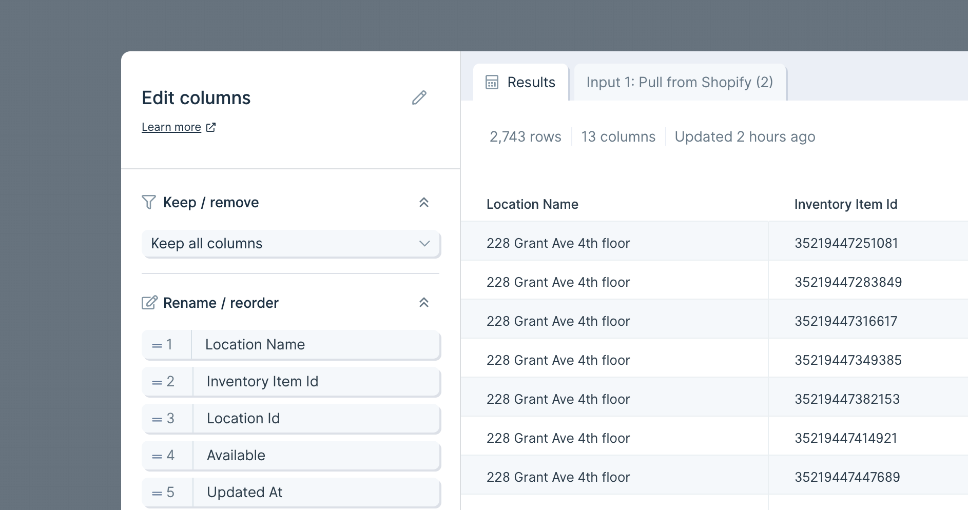
Edit your columns, all from one step
New
New
New
We’ve combined the Select columns, Rename columns, and Reorder columns steps into one, super powerful step: the Edit columns step! Now, from this single step, you can:
- Keep or remove columns
- Guarantee that selected columns are kept even if the input source removes them
- Change the names of your columns
- Update the order of your columns
Note: If you are using the Select columns, Rename columns, or Reorder columns steps in older Flow, they will continue to work. Going forward, you will need to use the new Edit columns to make those column changes.
To read more about this step, check out our Edit columns How To.
Looker, Snowflake, Amazon Seller Central
New
New
New
We now support three new data sources in Parabola: Looker, Snowflake, and Amazon Seller Central!

Looker, Snowflake, and Amazon Seller Central are key to mission-critical business reporting. Looker and Snowflake are essential repositories for storing and accessing data, and Amazon merchants rely on Amazon Seller Central reports to manage their businesses. Now, instead of jumping between tools, you can connect these three data sources into your Parabola Flows!
For more information about each:
These integrations are available to customers on our Advanced Plan. Please contact us or schedule a call if you’re interested in them for your team!
JSON and GraphQL error improvements
Improvement
Improvement
Improvement
Get more insight into certain API errors. Working with APIs can be difficult, which is why we've improved our error messaging for JSON and GraphQL syntax errors. In the past, you may have seen an error that your JSON or GraphQL syntax was invalid, but the error did not give any other information. Now, in all of the API steps, Parabola will show you the request that caused the error, which row it is on, and a small message about where to look for the character that caused the issue.

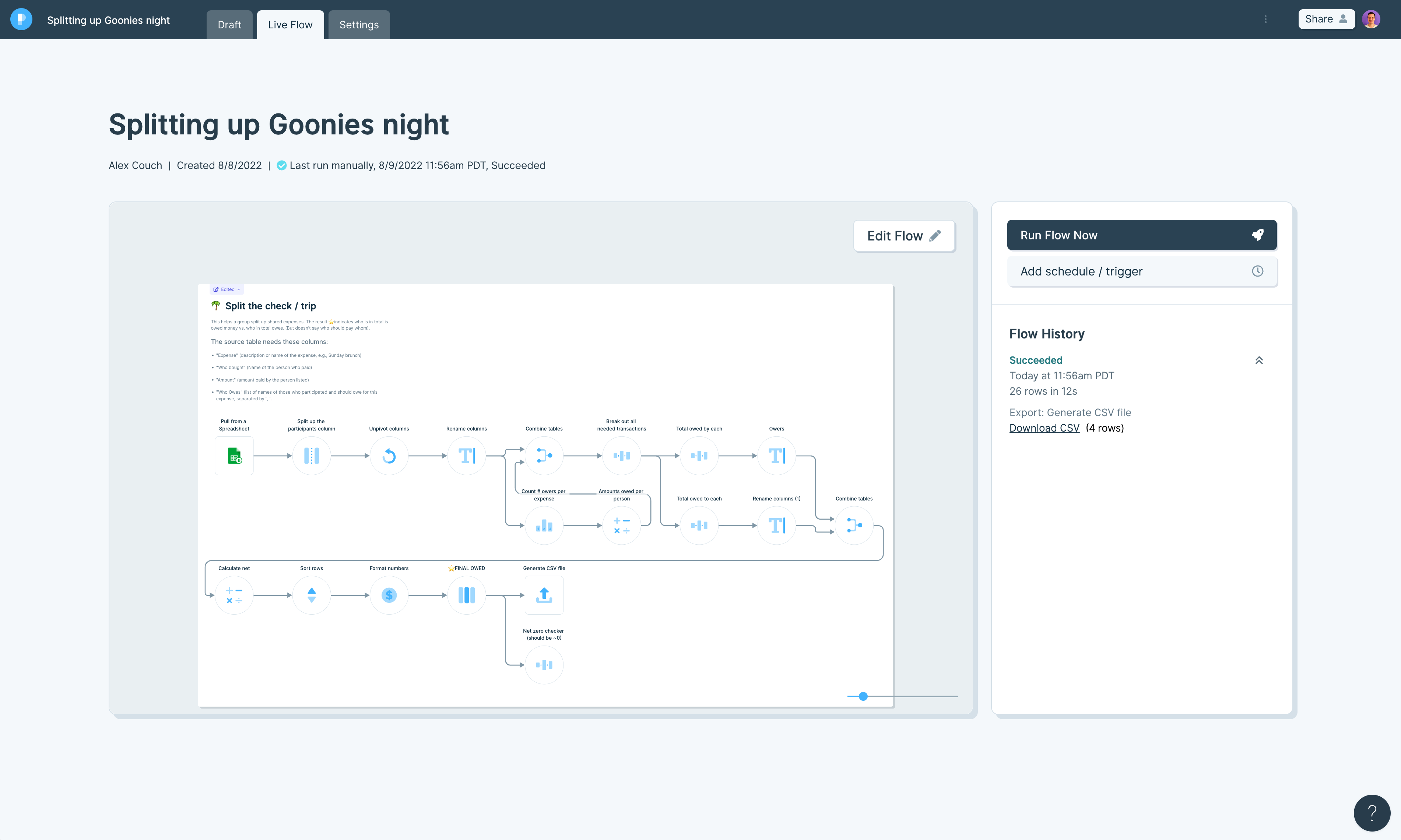
Updates to the Live View of flows
Improvement
Improvement
Improvement
We've updated how the Live View of flows look to be easier to read and use, and to make way for some future additions to these pages.
Updates include a larger title, some information below it about who owns the flow, when it was created, and the status of the last run.
Speaking of runs, those have been moved to a panel next to the preview window, and scheduling has been collapsed into a section above them.
Keep your eyes out for some releases later that will really turn the tables on what this page is used for!
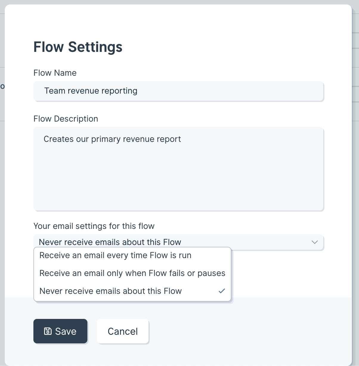
Better flow email settings
New
New
New
Flow email settings are now saved for each editor on a flow. Anyone who has edit access (via individual permissions or team permissions) on a flow can choose what kind of emails they want from that flow. You can choose to receive an email anytime the flow runs, just when it fails or pauses, or no emails at all (which is a new option!).
Access these settings from the settings view of a flow, or the settings modal from the Flows home page.
Flows triggered by emails now use a queue
Improvement
Improvement
Improvement
Flows that have the Pull from Email Attachment step and are triggered by inbound emails now can take advantage of a queue. If your flow is running when another email comes in, we will queue up that email to be processed in the next run. This is the same behavior that flows triggered by webhooks use.
The queue has been upgraded to allow any flow to queue up to 200 pending runs before any new runs are ignored.
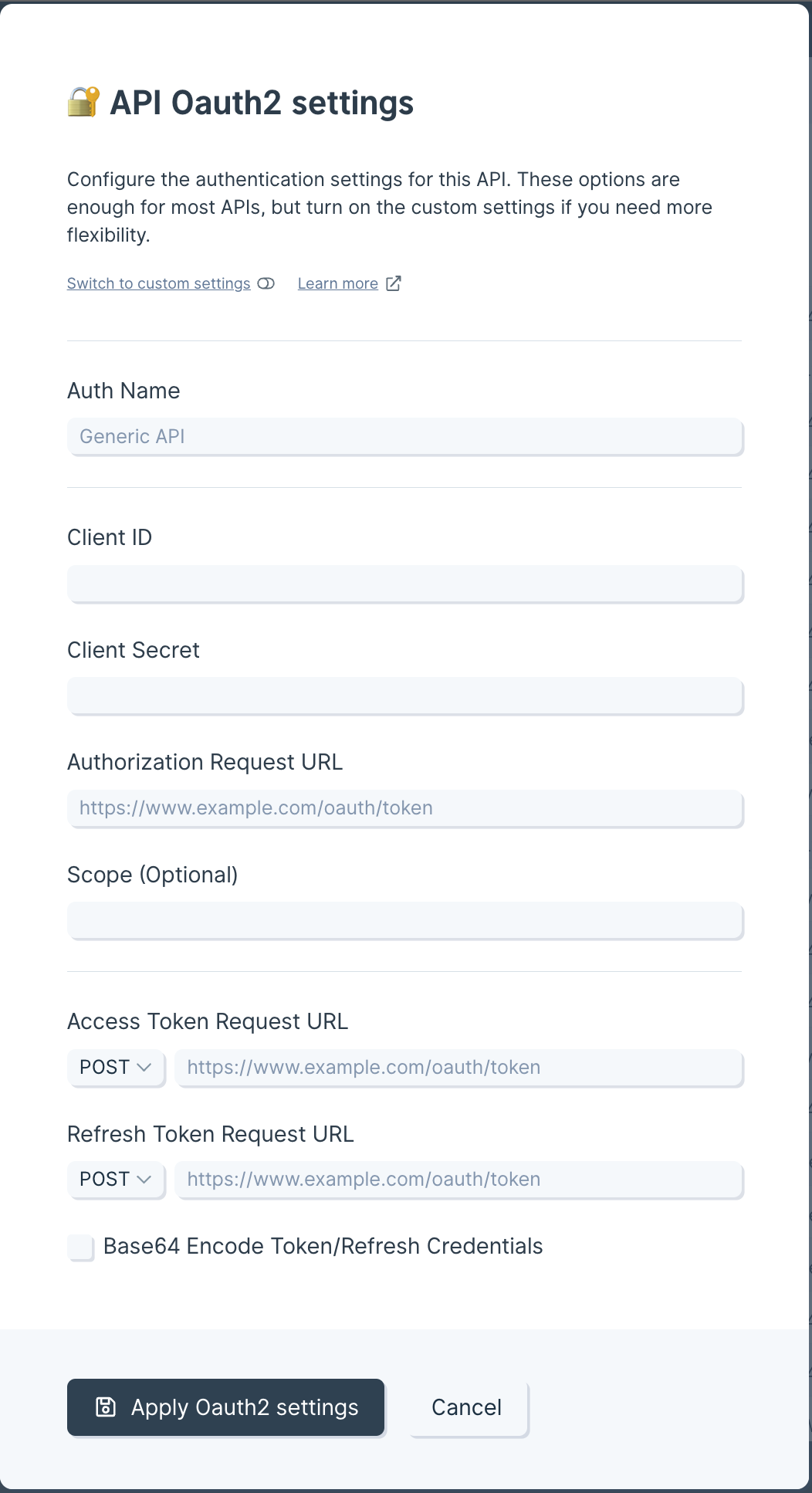
Improved OAuth2.0 Connector
Improvement
Improvement
Improvement
Many APIs use OAuth2.0 to authenticate, which can be difficult to set up. The OAuth2.0 form (used by all three API steps) now has streamlined settings, along with a visual update. The simple version requires fewer fields to be configured and covers most APIs. The form also lets you toggle between the new simple version and the full custom version. When switching, values will be ported back and forth between the two forms.
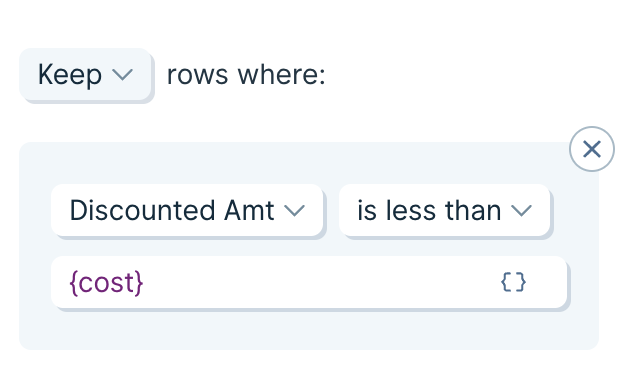
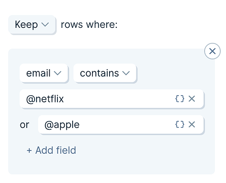
A new an improved way to Filter Rows!
Improvement
Improvement
Improvement
We’ve made two new updates to the Filter Rows step that we think we add even more power to your flows.
Add multiple criteria to single filter
In the past, if you had a large list of criteria that you had to filter against, such as email domains to remove, you needed to add an individual rule for each criteria.
Now, the contains, not contains, is equal to, and is not equal to filter operations will accept multiple criteria fields.
Use merge tags in a filter criteria
Previously, when you needed to compare one column to another, and the filter based on that comparison, you would use an Insert If Else Column step to perform the comparison, followed by a Filter Rows step to then filter based on that comparison (also creating an extra temporary column in the process).
Now, the Filter Rows step will accept merge tags. Enter any column name, wrapped in {curly braces}, to compare columns inside of a filter.