Why we designed so many modals into Parabola

What’s a “modal”?
There are a few ways to define what a “modal” is, but I’ll stay practical: a modal is basically any smaller window that shows up over an interface that you’re using. This object obscures and prevents you from interacting with the site or interface behind the window, thereby putting you into a specific “mode” (hence the word “modal”) until you’re done interacting with this window.
A lot of users and Designers have a negative reaction to Modals, largely due to their use — especially in the Web’s past, but also today — as “pop-ups” that the user hasn’t asked for. But there are two kinds of modals:
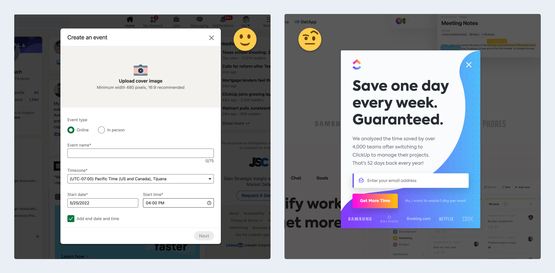
- 🙂 Modals initiated by the user: e.g., I click on an action and a modal appears to let me configure and complete the action (you can see this, e.g., on LinkedIn when you click to add a new Event). These bits of UI have a lot of utility and react to the user’s intent in a way that’s usually not negative. In fact, we’ll discuss later how these come with a lot of advantages.
- 🤨 “Surprise” modals initiated by the system: e.g., a pop-up on a website that suddenly shows up and tells me I should subscribe to their newsletter (when I haven’t asked for that). These are most often “unwelcome surprises” to the user, and they give all modals a bad rap.
Designers commonly conflate these types of modals, projecting the negatives of “surprise” (system-generated) modals onto otherwise-positive user-initiated modals. This shoddy overview from ui-patterns.com is a good example of this conflation and oversimplification … the mostly-negative community ratings at the bottom demonstrate my point.
But I really like modals 🤟, and we’ve found them to be a useful tool in our Design System at Parabola. Some of our rationale for using them is specific to Parabola, but other reasons are simply general UI design considerations. Let’s get into both!
Parabola needs to balance information density with “learnability”
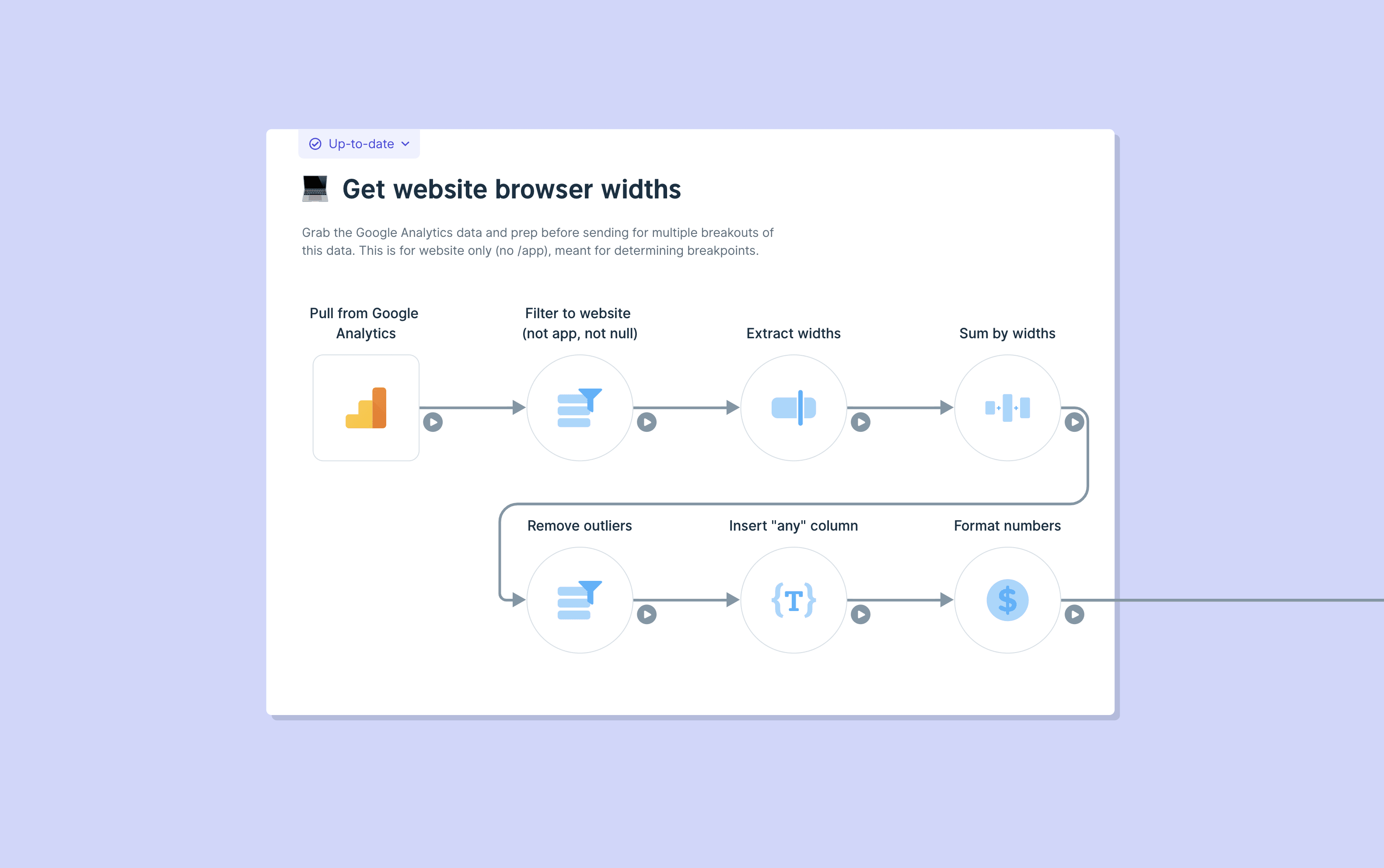
Parabola lets operations managers, analysts, and other knowledge workers automate their work — even the most complex data tasks — through a no-code, drag-and-drop Flow builder. You can see a quick demo of the builder here:
A quick overview and demo☝️ of Parabola. Sign up for free at parabola.io/signup!
Parabola is an excellent tool — there’s a reason I’m so excited to work here! — but there’s no getting around the fact that users have to consume a lot of information to successfully automate a workflow.
- These workflows — the reporting ones, especially — often feature tables of data that contain dozens of columns and thousands of rows of data.
- Codifying human processes is complicated! Moving a workflow from the human brain into a no-code tool, then making that readable by other humans, can result in large Flows with dozens of steps and operations in them.
- Then, replicating individual human tasks — translated to “Steps” in Parabola — requires a lot of detailed decisions from the user, and that tends to generate a lot of UI. (And believe me, we try our very best to Design these experiences with as little UI/UX as possible!)

Between these interaction needs — build a Flow, configure each step, run the result — it creates a lot of information density in even just the builder **portion of our app. We could have approached this challenge with a few interaction systems, but each has it’s merits and pitfalls:
- 🍱 Using a multi-pane system (a la Microsoft Outlook, especially in the old days) lets you view and interact with everything all at once 😅, but leaves you very little room to view and accomplish each task. (We actually do have a few paned experiences in our app, like the New Step Sidebar, and it frankly is a challenging experience due to the limited space)
- 📔 Taking a page/directory approach (a la navigating a website or folder system) allows you to maximize the space you have for each task — e.g., if we had each Step configuration be it’s own “sub-page” in a Flow, we could show a lot of data! — but limits broader context and could make it difficult to navigate between many steps.
- ✅ So, we use varied (and often large) modals today to give ourselves a compromise, balancing the expansive space and task focus that you get from “pages,” while retaining context and limiting the switching costs as you do in a multi-pane system.
Yes, this decision results in some downsides — like the visual weight we incur from having all of these dark shaders around our modals, and a risk of inflaming a “pogo-sticking” UX when users need to move around the builder. But, we’re confident that we can mitigate those issues with other Design choices, and that otherwise the tradeoffs are worth it 👍.
Our design system and UX benefit from using modals
The other reasons we have for leaning on modals are less about Parabola per se, and more about Product/Interaction Design decisions more generally.
🔦 Small, focused experiences
Earlier I mentioned the focus of the task at hand that we see as an advantage of modals over, say, a multi-pane experience. That’s especially true for small, rare interactions that we don’t need a lot of interface for. For example, the average Parabola customer probably updates their credit card between zero and one times during their entire customer lifecycle. It’s a really rare need and a very discrete set of interactions.
Sure, we could support that with a dynamic inline UI (imagine the fancy transitions 🤩!), but that’d add another variable on every other design decision we made on that page (”is the credit card form open, or is it closed?”). Alternatively, we could make a dedicated page for this interaction.

But, for a rare action with simple interaction needs, why would we spend extra resources or extra information architecture on those experiences? Easier to put it into a discrete modal, instead, where this rare UX can be opened, resolved, and closed without a bother.
🧼 Cleaner, clearer states
I think an underrated advantage of modals is that, with certain settings, they can clarify the states of editable content and ultimately save you interaction design and complexity.
The credit card form modal from earlier ☝️ is a good example of this: when you have this modal open, you can’t close it using an “x” (note that there is not one in this type of modal) or by clicking on the gray background. Instead, you actually have to click “Cancel” to cancel changes, or “Save card info” to commit these changes.
Say I was editing my credit card info here, but changed my mind midway through: given this UX, I never have to question whether or not these changes have been saved, or if I’ve already removed my old credit card information by typing new information in that field. We don’t need to throw exit warnings (”Discard pending changes?”) or have states ⚠️ to signal that the form is incomplete. When you’re doing this task, you’re just doing this little task — to do something else, we need to close this out and not leave it in an ambiguous state.

This same logic extends to larger modals, like the “step results” modal in the builder that we looked at earlier. There is even more configuration required in that environment, so modality is important in regulating which user changes are actually committed to the Flow, vs. which are discarded. We even use the dreaded “modal on a modal” when a user tries to leave a step with pending changes
📍 Maintaining a user’s location awareness
When compared to traditional “pages” of information, modals have the advantage of maintaining someone’s location awareness: this certainly benefits us when a user is navigating both vertically and horizontally in the Parabola Flow builder. When they open a step, we open the step result modal, but the builder UI can still be seen underneath. This way, the user knows that they can return at any time, and that they’re still where they thought they were inside this interface.

You can even, ahem, “hack” ☝️ this location awareness to set expectations and maintain interest in your app in early usage. Our new user onboarding experience is partially a set of stepped modals 🧙♂️ that appear over the Flow builder. We’re trying to focus the user on the task at hand (we find this helps in learning a powerful data product), but we’re indicating that when they’re done with these few steps, they’ll be right there in the builder — and it comes true!
👜 Portability of objects/interfaces
Sometimes, we put an action in a modal that is relevant from multiple locations in our product. A great example our “Share Flow” modal, which you could reasonably want to access from anywhere inside of a Flow, or from our Flows page where all of your teams’ Parabola Flows live.

By making this an end-to-end experience inside of a modal, we can just re-use this whole object in as many places as we want, without having to make room for it elsewhere or create new interactions to present it.
📱 Transition to smaller screens (eventually mobile)
This one is a little further out there — we don’t currently have specific plans to bring Parabola’s Flow builder to mobile 😂 — but by using space more economically, modals allow us to support complex UI on smaller screen sizes. If we’d taken a multi-paned approach, we’d have to Design entirely new interactions to deal with smaller screens and, eventually, mobile devices.
Using modals, though, reflects the kind of “vertical” and “one thing at a time” navigation you likely experience on mobile devices already. In mobile apps and sites, you often operate from some sort of “hub”, and then chose item you want to focus on: that item is then “opened” as a full-screen experience where you can only interact with this object. It’s a “mode” that you’re in until you choose to leave it! 🙌
Wrap-up
This is the kind of thing ☝️ that we think through when we’re building Parabola: Design Systems that serve intuitive interactions, that then save users time and empower them in their workplaces. It’s heady work 🧠, but we’re charting the future!
To come chart the future with us, sign up for Parabola or apply to join our team.