
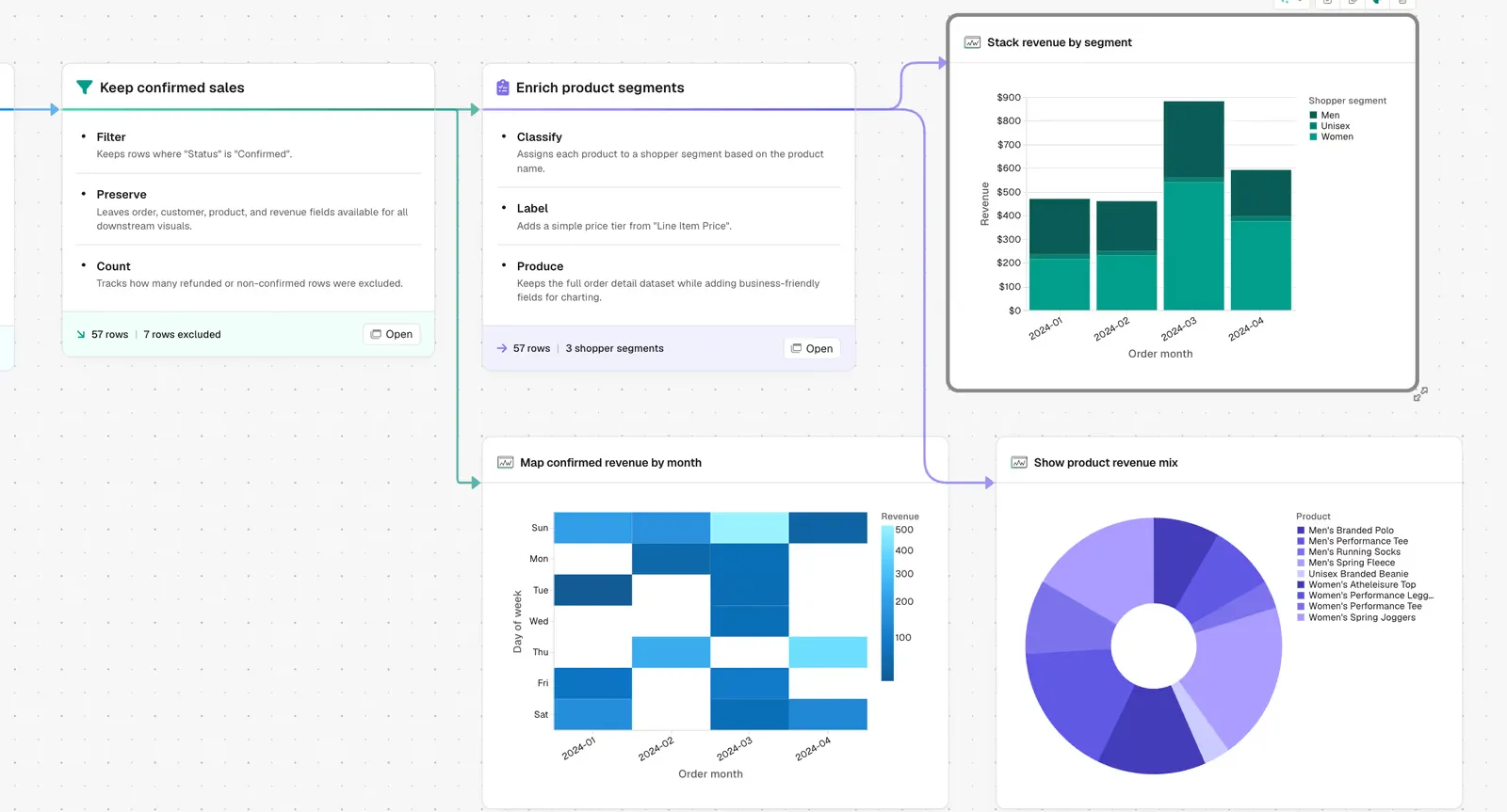
1. Inspect the data. Parabola reads the schema, column types, and a sample of values to understand what kind of data it is working with before asking a single question.
2. Ask six clarifying questions, one at a time. Which dataset to pull from. What dimension to group by. What metric to aggregate. Which field to sort on and in which direction. Which two or three chart types fit the data best. What brand colors to use.
3. Build the summary step. Aggregate the data by the chosen dimension, calculate the chosen metric, and prepare a clean output table.
4. Build the sort step. Order the rows by the chosen sort field so the chart reads in the right direction from the start.
5. Build the chart steps. Each chart type gets its own step, with your brand colors applied and titles inferred from the column names and aggregation logic.
6. Polish the layout. Axis labels, legend placement, and column ordering cleaned up so the output is ready to share, not just technically correct. There is also a Parabola-Suggested variant of this prompt that skips the question sequence and lets Parabola decide grouping, chart type, and layout from context, useful when you want a first draft in one shot.