.UD-kr4lR.png)


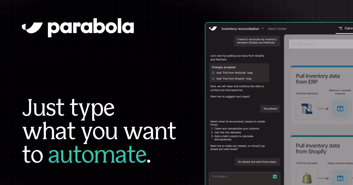
Introducing the New Parabola
We've rebuilt the entire experience from the ground up. It's 100x faster to go from idea to outcome—and radically easier to get started.
Learn more
Insights on automation, operations, and building smarter workflows.
We've rebuilt the entire experience from the ground up. It's 100x faster to go from idea to outcome—and radically easier to get started.


.D9cLGFrX.png)

.m1OdgmiY.png)
.xigZli8H.png)
.Dz56SY-c.png)
.D1aj0dks.png)
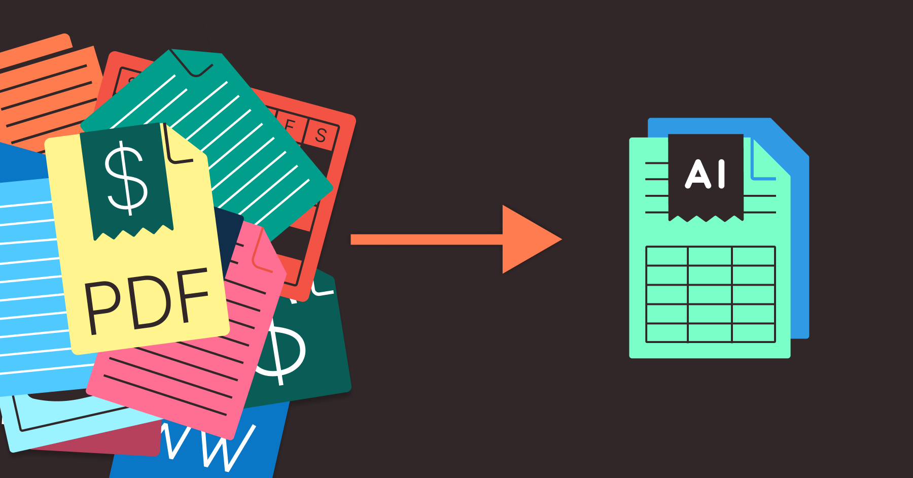
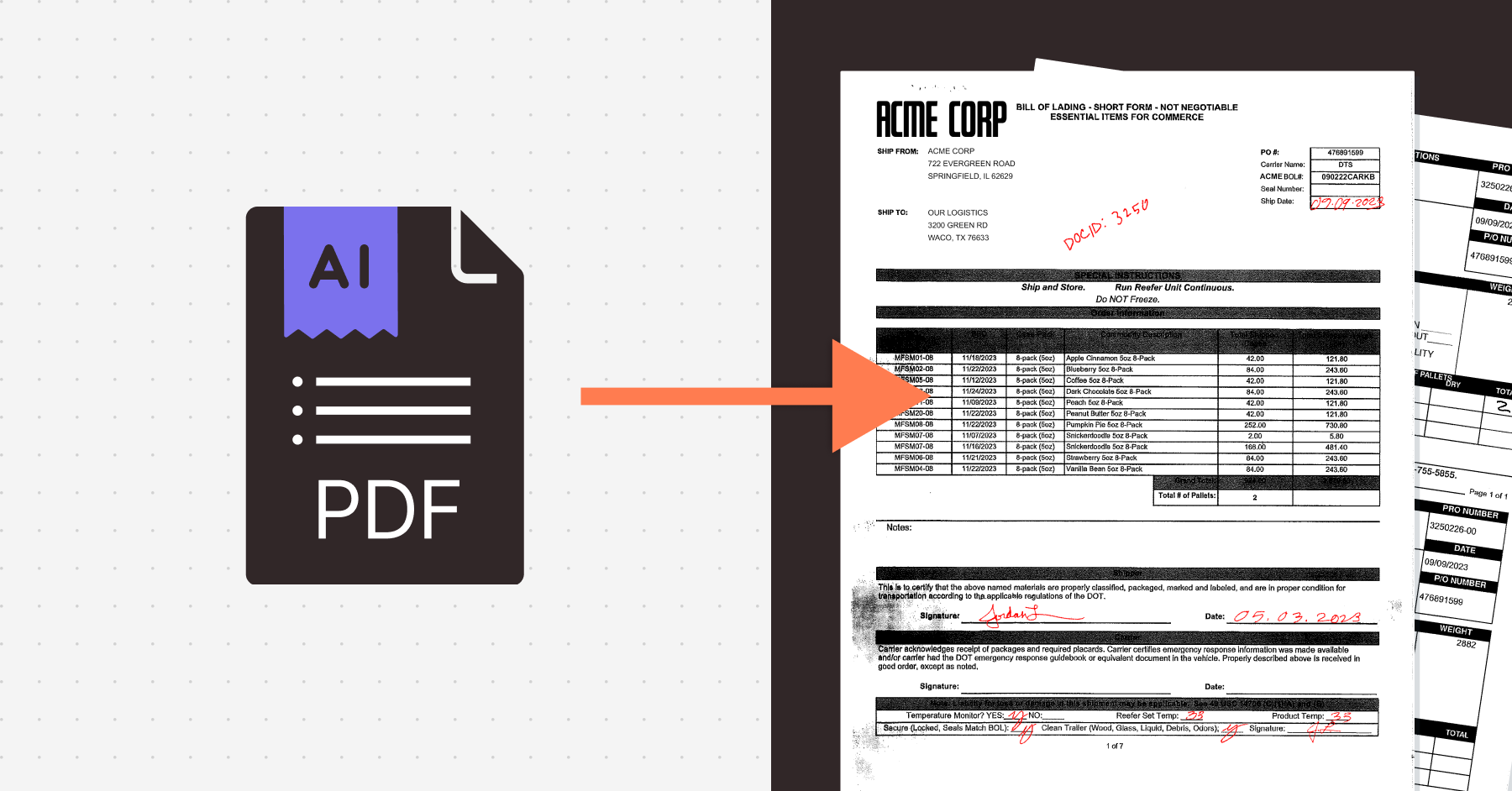
![How to Parse PDFs Effectively: Tools, Methods & Use Cases [Updated for 2026]](/_astro/aHR0cHM6-6838ca85bc3e324718c8d03c_663aa974c481f753374a7379_pdf-parsing.CNcHzdPa.png)


![Excel Automation: 9 Essential Methods to Save Time, Reduce Errors, and Streamline Your Workflows [Updated for 2026]](/_astro/aHR0cHM6-6838ca9553f95445bed85868_663ab4c52929ff8f6c6d641b_excel-functions.OsNxF-SB.png)
.7oWx9Sks.png)