What's new in Parabola?
Fix
Clearer errors when a NetSuite import runs long
A Pull from NetSuite step pulling a very large saved search could run out of time and then wrongly tell you to re-authorize. It now reports the real cause, a timeout from too much data, and suggests adding a filter or a narrower date range. NetSuite imports are also faster, pulling more rows per request so large searches finish sooner.
New
Introducing Artifacts — interactive, shareable applications powered by your data
Artifacts are custom, interactive, shareable applications built agentically with your Flow data. Think dashboards, pivot tables, visual summaries, charts, or even recommended actions. Choose from thousands of visualizations and filters with a single prompt. Style them however you want, including with your company branding. When you’re ready to share, Parabola generates a link so you and your team can dig into the data together.
Improvement
See who owns a saved account
The Saved accounts modal used to select credentials for integration steps now shows the email of the person who connected each account, so it’s clear who owns a shared credential when you’re choosing one for a step.
Improvement
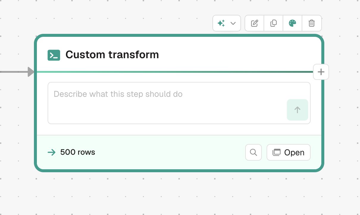
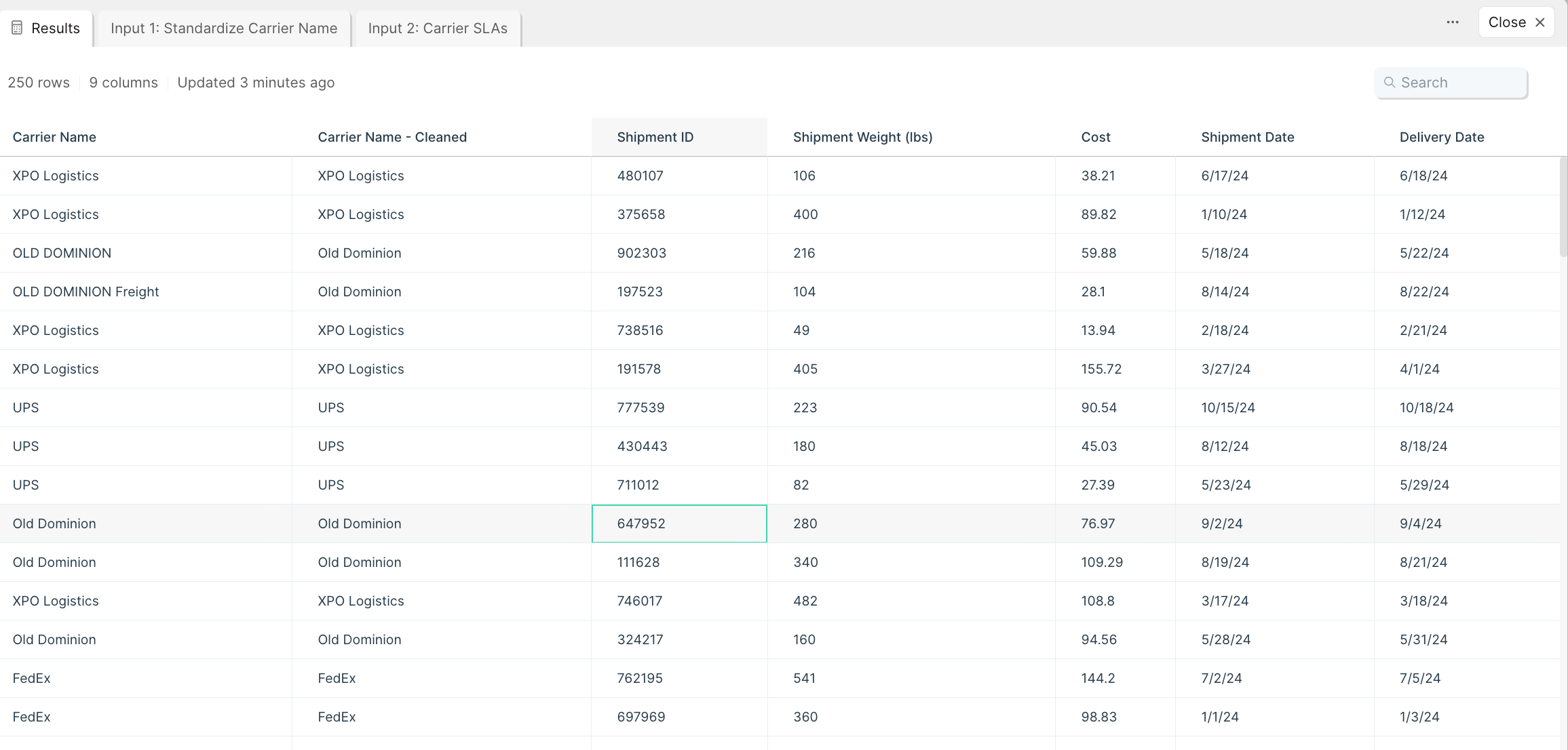
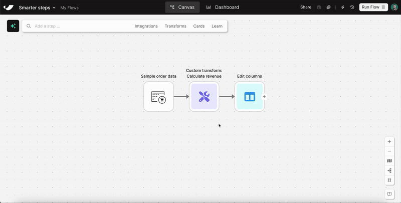
A more powerful Custom Transform step
New Custom transform steps now run on the same framework that Prowork uses to build Flows. Add the step, describe the transform you want in its prompt box, and Prowork writes and runs the code for you. It’s more capable than the previous Custom transform.
Improvement
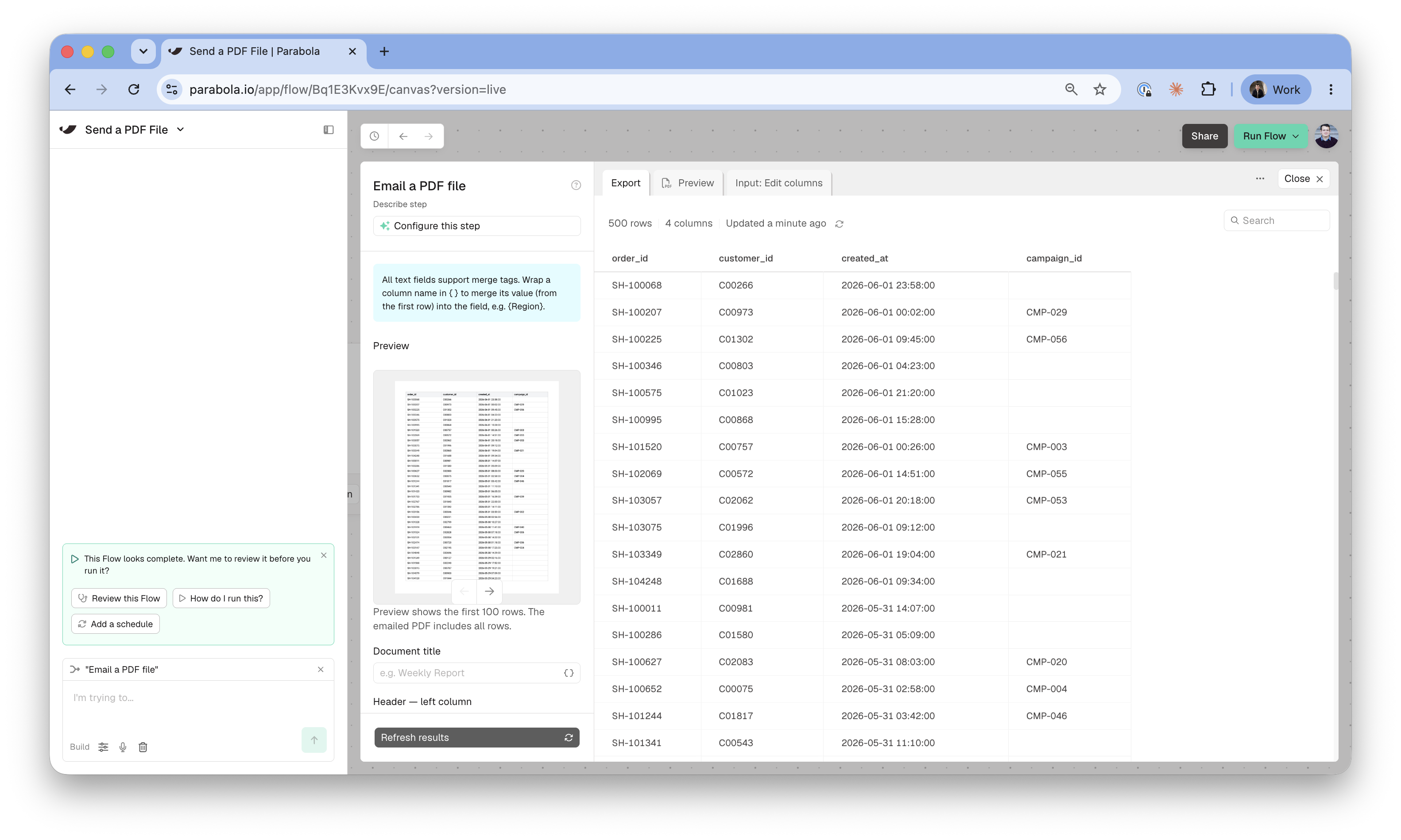
Improvements to the Email a PDF step
The Email a PDF step picked up a few upgrades. You can add line breaks in the email body, drag to reorder header and footer lines, and preview up to 1,000 rows before you send. If a merge tag points at a column that isn’t in your data, the step now flags it before it runs instead of failing silently.
Improvement
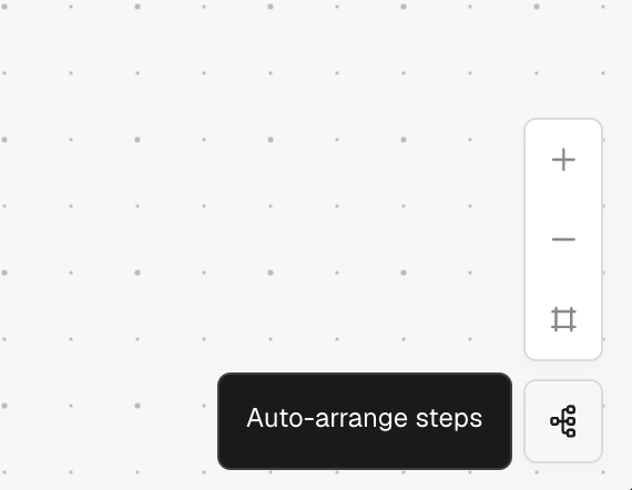
Turn auto-arrange on or off from the canvas
A new Auto-arrange steps toggle sits with the zoom controls in the bottom-right of the canvas. Click it to tidy your Flow’s layout, and to turn auto-arrange mode on or off.
New
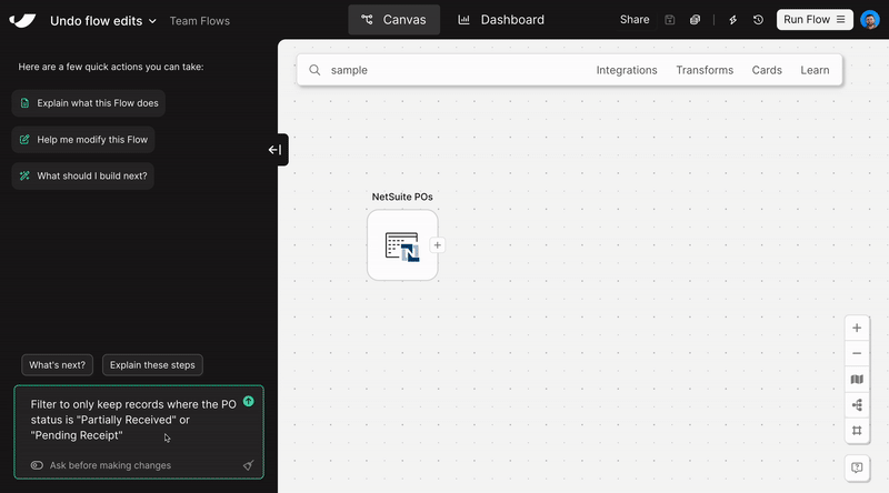
Attach files to Prowork
You can now drag files into the Prowork chat and have it read them to understand your data and process. Prowork can also add an attached file to the canvas as a source step. Supports DOCX, CSV, MD, JSON, PDF, XLSX, images, and more. Use the paperclip icon in the Prowork chat composer to directly attach files. Multiple files can be attached to a single message. Read more.
Improvement
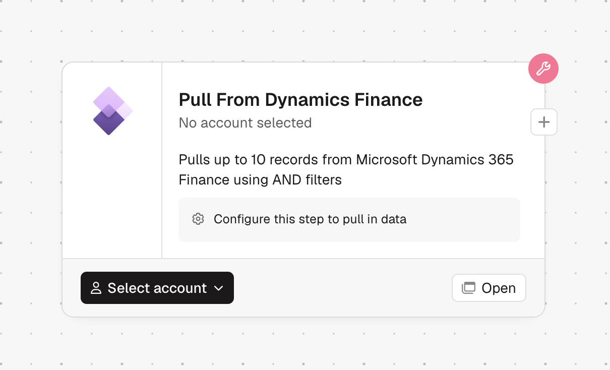
Automatic step descriptions that reflect what your step does
Integration steps now show an AI-written description based on how you’ve set them up. Descriptions update in the background when you change a step’s settings, and any description you’ve written yourself is left untouched.
Fix
Tidier trigger rows
The triggers panel no longer squeezes long email addresses, webhook URLs, and schedule descriptions into overlapping rows. Rows now grow to fit, long values shorten with the full text on hover, and error and empty states are cleaner.
Improvement
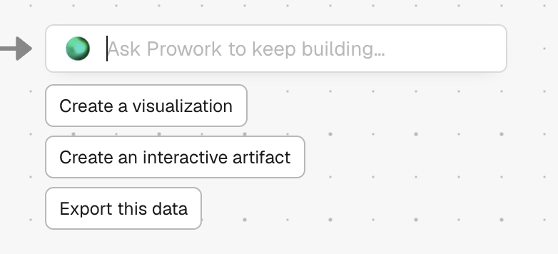
Build from the canvas with Prowork
The plus button on a step now opens a Prowork prompt with quick starters like “Create a visualization” or “Export this data,” so you can describe what you want next instead of picking from a step list. Right-clicking a step to visualize it, or right-clicking the canvas to add a step, now prompts Prowork the same way.
Fix
Clearer colors for category charts
Charts that color by an unordered category, like region or status, now use a distinct color for each value instead of shades of one color. Ranked buckets, like age ranges, still use a graded color scale.
New
Find a Flow by its trigger address
Search the Flows page using an inbound email address, webhook URL, or file queue URL to instantly find the flow it triggers. Handy when you've got the trigger address in hand but can't remember which flow it belongs to. Works across Home, My Flows, All Flows, Starred, and Team Flows.
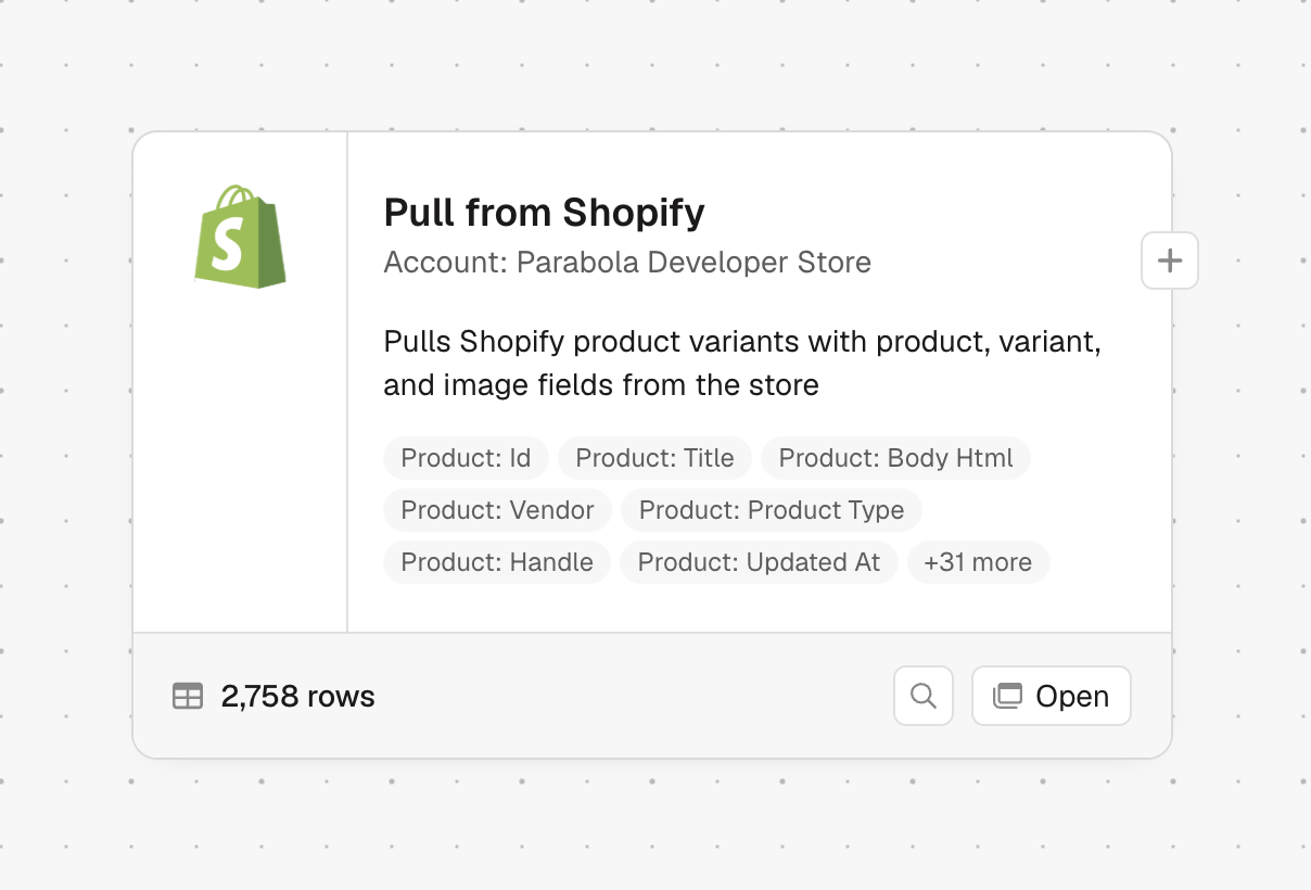
New
Set up integrations right on the canvas
Integration steps are larger and show a description and a sample of their columns. You can browse their data and configure them directly on the canvas. Add a new integration step to get the updated experience; existing integration steps keep their current size.
New
Email a PDF from a Flow
The new Email a PDF file step can create a PDF from your data and email it automatically. You can preview the PDF, which includes a table of the input data, add headers and footers, include custom logos or signatures, and insert values from the first row of your table.
New
Trace where your data came from
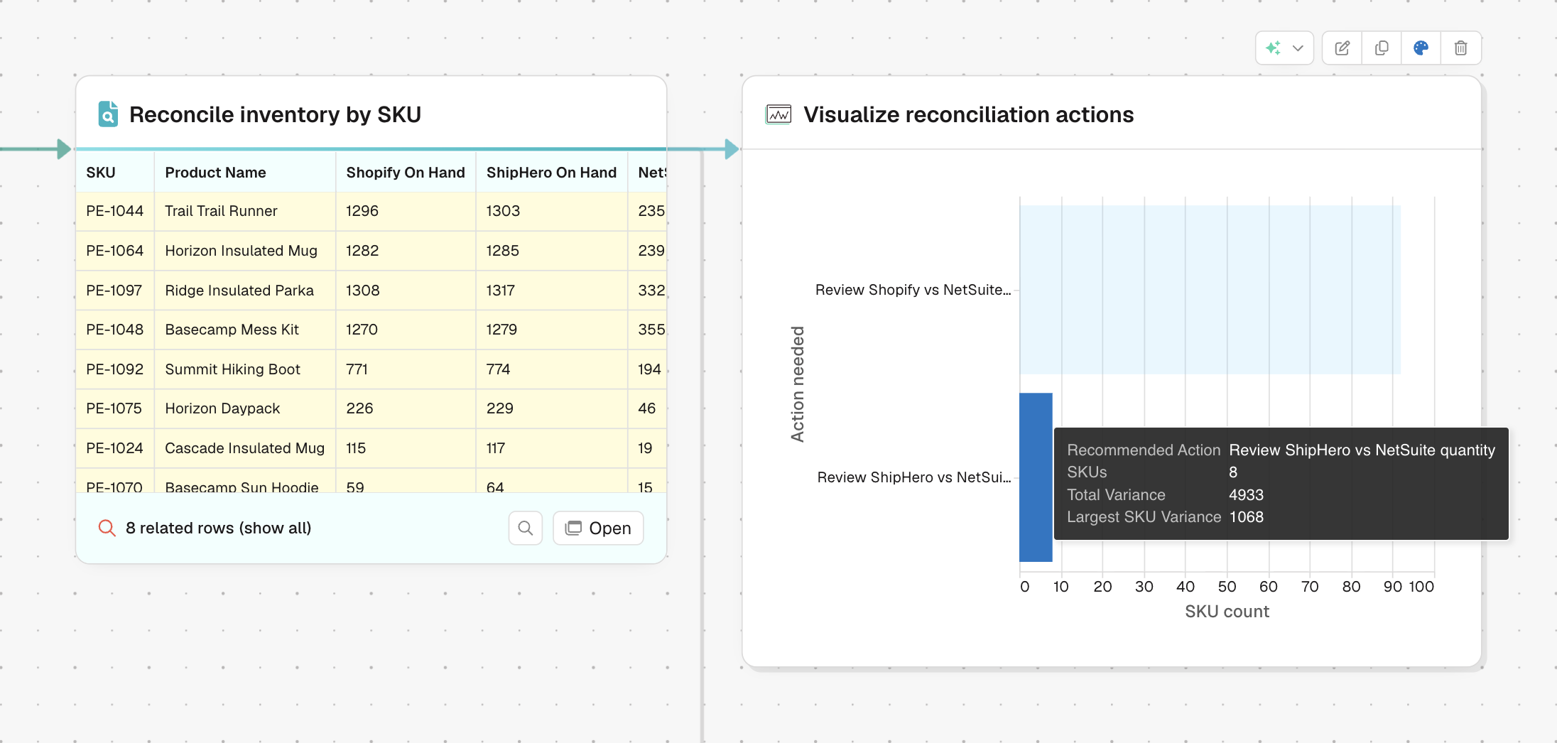
Introducing Data Tracing. Click a row to see which upstream rows contributed to it, then follow the path across connected steps to understand where a value came from and how it changes across your entire Flow. Works great with agentic visualizations!
Improvement
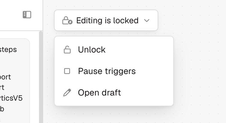
Updated design for the Flow status indicator
Messages like View only, Refresh needed, and Editing is locked now appear as a compact status pill next to the Prowork agent. The pill keeps the canvas clear while still showing the actions available for that Flow.
New
A new SharePoint file picker
Pull from SharePoint now uses a native file picker, so you can browse SharePoint directly instead of searching by site and drive first. The step also supports larger CSV and Excel files.
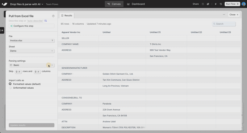
Improvement
Pull larger Excel files, including every sheet
The Pull from Excel file step has been rebuilt for larger workbooks. New Excel uploads can handle files up to 1 GB, and you can pull every sheet into one stacked table with the sheet name included on each row.
Fix
Improved loading of large tables of results
Large step result tables load smoother while scrolling and more clearly show that more results are being fetched.
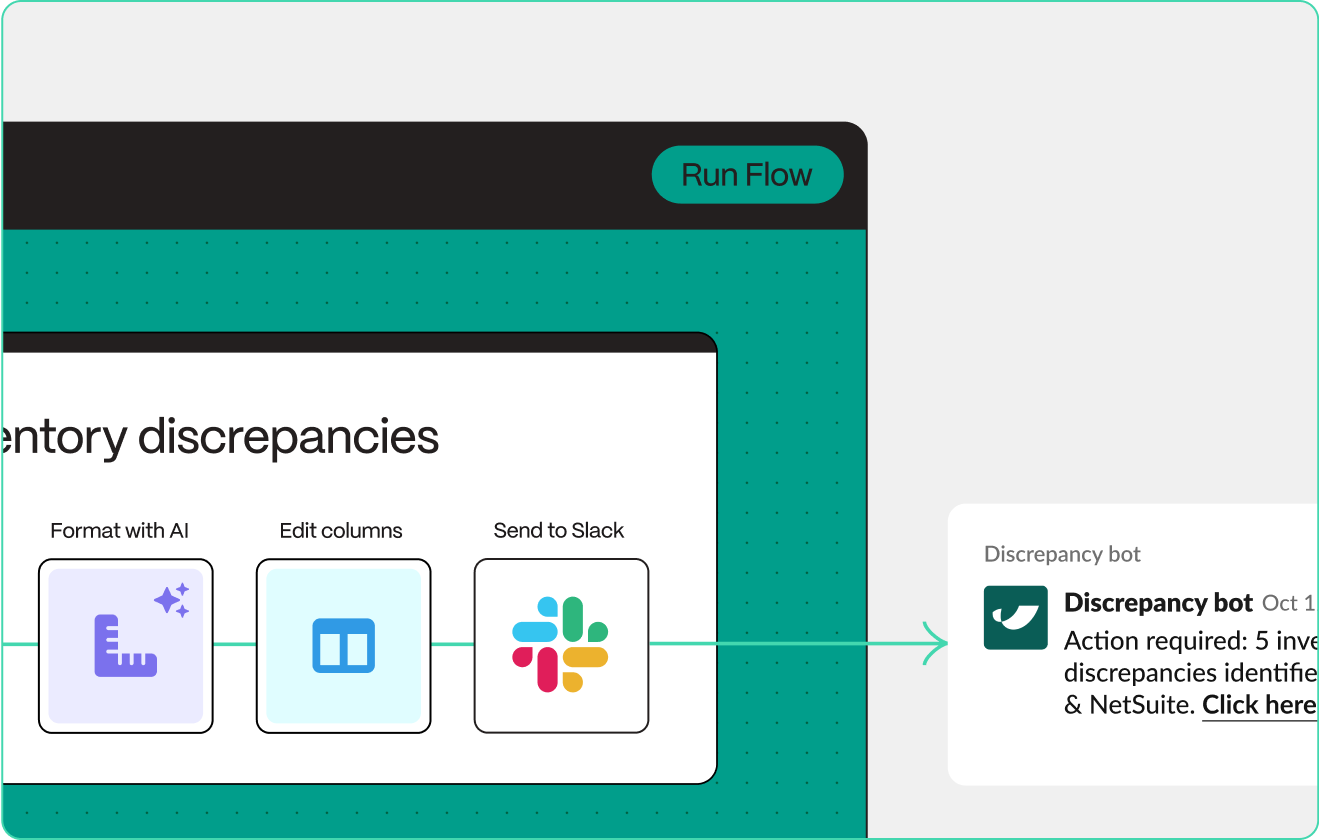
Improvement
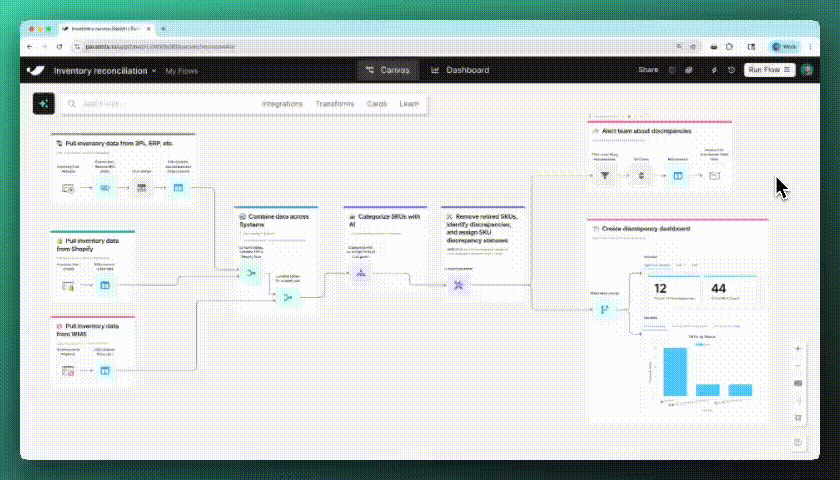
Sample data now tells one connected story
The “Use sample data” step now uses a unified, fictional company across its examples, with datasets grouped by team. Some datasets include hidden discrepancies, so you can try reconciliation and investigation workflows with realistic test data.
Improvement
Improved layout for Prowork Flows
New Flows now start with auto-arrange turned on, so steps stay organized as the Prowork agent builds or updates a Flow. If you move a step yourself, auto-arrange turns off and can be re-enabled.
Improvement
Improved Flows page filtering
The filters on the Flows page have been improved and now use your local timezone when filtering for Today or Yesterday. New filters have been added for Status — “Triggers paused” and “Has not run”.
New
An updated design for Prowork
Parabola Flows have been redesigned for Prowork. Updated navigation, chat sidebar, and theme deliver all of the same features in a beautiful layout that helps you focus on the task at hand. Initially, all Flows will use this “light” theme. Additional themes in progress!
Improvement
Find the right Flow faster
The filters on the Flows page have been updated to a more compact design. New filters have been added for Status (Schedule paused, last run succeeded, last run failed), Last run time (Today, Yesterday, Last 7, 14, 30, 90 days) and Last edit time (Today, Yesterday, Last 7, 14, 30, 90 days). These filters are also accessible on team flows and in folders.
New
Personalize your profile with avatars and colors
You can now upload a profile photo, pick a color for your initials avatar, and remove a photo whenever you want. Your avatar updates everywhere across Parabola right away.
Improvement
A cleaner settings experience
My Profile and Billing & Usage have a refreshed layout, with settings grouped into clear sections and one place to check your usage. Saving a change now confirms with a quick toast.
New
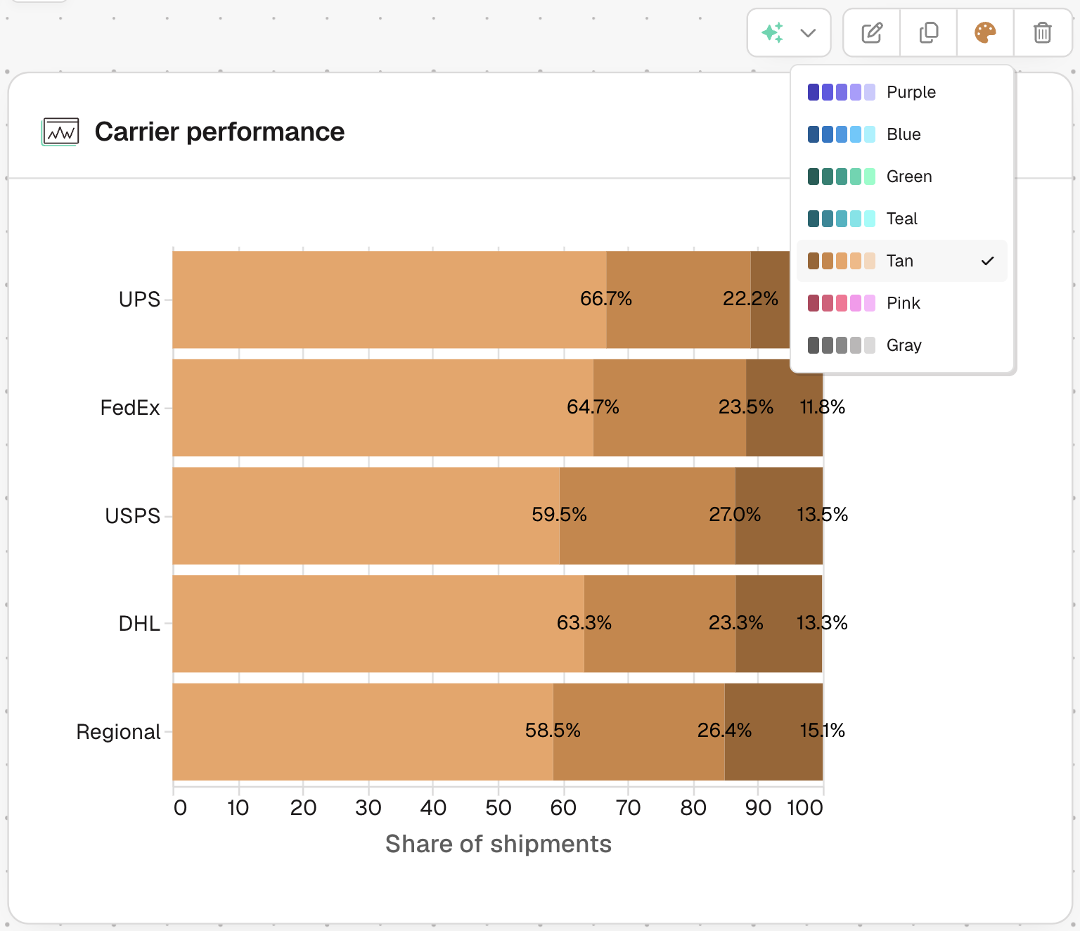
Restyle your charts in one click
AI generated charts and visualizations now support color themes. Open the theme picker on any chart to recolor it instantly, and new charts pick a fitting theme on their own. If a chart already uses its own custom colors, it stays exactly the way you set it.
New
Build visualizations just by chatting
We've built a new way to visualize your data in Parabola. Now, when you chat with the AI sidebar, you can create beautiful visualizations of your data. Any chart you can dream of, you can now add to your Flows.
Improvement
Clearer empty states on Flows pages
Empty folders and Flows pages now have clearer blank states.
New
A brand new parabola.io
We redesigned our homepage from the ground up. The new parabola.io is faster, sharper, and better reflects how teams are actually using Parabola today. Take a look around!
New
New prompt library
We launched a new prompt library - a collection of ready-to-use prompts you can bring straight into your Flows. Browse by use case, grab a prompt, and start building immediately.
New
New Ramp integration
Parabola now integrates natively with Ramp. Pull your transaction data, reimbursements, and card spend directly into Parabola — no CSV exports or manual downloads. Connect your Ramp account and start building in minutes.
Improvement
Faster file pickers for SharePoint and OneDrive
The SharePoint and OneDrive file dropdowns now sort by most recently modified, and won't re-run the search once you've picked a file.
Improvement
Generate CSV step now handles larger data
The Generate CSV file step can create much larger CSVs without running into memory limits.
Improvement
Rebuilt Generate Excel file step
The Generate Excel file step has been rebuilt from the ground up with better formatting fidelity and significantly faster runs on large workbooks.
New
Ask questions to the AI chat without making changes to a flow
The AI chat sidebar now has two modes: Build and Ask. Switch to Ask mode to explore a Flow, ask questions, and plan - without the AI making any changes. Flows automatically open in Ask mode when you have view-only access.
Even better: viewers can now use the AI chat sidebar too. Whether you're troubleshooting a teammate's Flow or reviewing a process, you can ask the AI about what's happening without needing edit access.
New
Pull from QuickBooks Online
A new native QuickBooks Online integration. Pull invoices, customers, transactions, and more directly into your Flows.
Improvement
Refreshed Flows page
The Flows page got a visual refresh - cleaner layout, updated icons, and better visual hierarchy to help you find what you need faster. A few usability wins too: checkboxes are now always visible for bulk actions, you can rename a Flow right from the list, and sharing icons now clearly distinguish between team-shared and org-shared Flows.
We also fixed a bug where filters weren't working on Team and Folder pages - those are fully functional now.
Improvement
File upload progress bar
Uploading large files now shows a live progress bar, so you can see exactly how we're progressing through the file upload.
New
Flow version history
Browse and restore prior versions of any flow from the new Version History panel. We've also backfilled older Flows, so you'll have meaningful history available right away. Version history includes any edits made in your Flows, so you can see who edited each Flow and go back in time. Version history is available to our customers on our Advanced and Enterprise plans.
Improvement
HubSpot Contacts upgraded to V3
The Pull from and Push to HubSpot Contacts steps now use HubSpot's V3 API ahead of the V1 sunset. No action required.
New
Navigate between steps without leaving the results view
You can now jump directly to a step's inputs and outputs while viewing its results - no need to close and click around the canvas. We also added step history: a dropdown and arrow controls that let you quickly revisit recently viewed steps. Think of it as a back button for your Flow.
Improvement
Faster, more reliable CSV uploads
Uploading CSV files from the canvas is now faster and more reliable, especially for large or unusually formatted files.
Improvement
Automatic layout of AI-built flows
When the AI chat sidebar builds a Flow for you, it now automatically runs auto-layout, so the flows it builds arrive neatly organized out of the box.
New
Send to NetSuite is now available
The Send to NetSuite step is now available to all customers on Advanced and Enterprise plans. Create, update, upsert, or transform records.
Fix
Newlines preserved in email attachments
The Email a file attachment step now respects newlines in the email body, so multi-paragraph templates render the way you wrote them.
New
Pull data from NetSuite with SuiteQL
Use the Pull from SuiteQL (NetSuite) step to access data in your NetSuite account using SuiteQL queries.
New
Domain allowlist for API steps
Enterprise admins can now restrict which external domains Flows are allowed to pull data from or push data to via the API steps.
New
Restrict integrations to credential owners
Org Admins can now set any integration to "Restricted" from the Integration Management page. When an integration is restricted, only the user who owns the credentials used to authorize it can edit the step's settings. Teammates who open a shared flow with a restricted step will see a read-only view, with the option to switch to their own credentials or create a new authorization. This ensures that only the authorized user can control what data is imported or exported through an integration they've set up.
New
Integration Management page for Org Admins
Org Admins on Advanced and Enterprise plans can now control which integrations are available across their organization from a new Integration Management page. Set any integration to enabled, restricted, or disabled. Restricted integrations limit step editing to the credential owner, while disabled integrations block usage entirely.
Improvement
Stop the AI chat mid-response
You can now stop the AI chat sidebar while it's working. Hit the stop button to cancel a response mid-stream - no more waiting for it to finish if you realize you need to change direction.
New
Stream audit logs to your SIEM
Enterprise teams can now stream Parabola audit logs in real time to their own infrastructure for ingestion into SIEM tooling. Get full visibility into user authentication, flow modifications, access events, and more.
Improvement
Auto-layout now works with cards
The auto-layout button now supports flows that use cards. Hit the auto-layout button in the bottom corner of the flow canvas to instantly organize even your most complex flows - cards and all.
New
New Parabola docs experience
We've launched a completely redesigned documentation site at parabola.io/docs. Search across all of our documentation, ask questions with "Ask AI," and enjoy a cleaner, faster browsing experience. A new home for Parabola University with new content coming very soon!
New
Access invoices and receipts on the billing page
All invoices and receipts are now available directly on the billing page - no more waiting for PDFs to be sent manually. Admins will also see a new banner when invoices are past due, with a direct link to take action.
New
Talk to chat sidebar
You can now talk to the chat sidebar using your voice. Chat with Parabola's AI builder out loud for a faster, more natural building experience. Currently available in Chrome browsers.

New
Pin cells, rows, and columns in the result view
Click any cell to highlight its row, or click a column header to highlight the entire column. Highlights are durable — they stick as you scroll and navigate, making it easier to track specific data across large datasets.
Improvement
Export XML files via FTP
The Send to FTP step now supports XML as an export file type. Place your XML content in a single column, and the step handles the rest - including merge tags for dynamic file names and folder paths, validation to catch errors before export, and the ability to export up to 50 files per run.
Fix
Flow queue panel fix
We fixed an issue where pausing and then clearing a flow's run queue would permanently hide the queue panel, locking you out from resuming. The panel now stays visible whenever the queue is paused, so you can always resume.
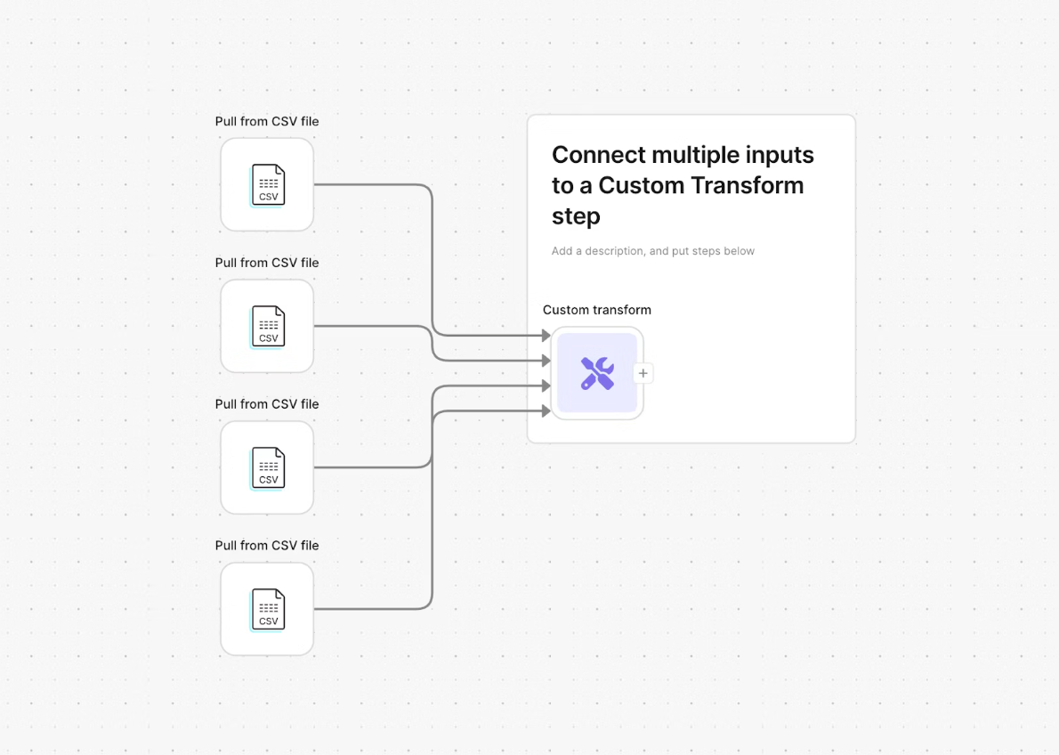
Improvement
Custom transform step now supports multiple inputs and locked columns
The Custom transform step just got two big upgrades. Steps can now accept up to 5 input tables, making it easier to work across multiple datasets in a single step. You can also lock output columns in place so that regenerating or editing your logic won't change the structure of your results.
Improvement
Format numbers now reads accounting format
The Format numbers step can now read accounting-formatted numbers like ($100) and transform them into any other format. No more workarounds with Find & replace. If you're working with accounting data, format it first with this step and then use it throughout your flow.
Improvement
Step placemats now available throughout the flow building experience
Step placemats make flow building faster: drop a step onto a placemat and arrows connect instantly. Previously only available when dragging from the step search bar, placemats now appear whenever you're moving disconnected steps around the canvas.
Improvement
Deleting steps automatically reconnects the flow
When you delete a step, we now automatically reconnect the surrounding steps. Delete B from A → B → C and we'll reconnect A → C for you.
Fix
Send Email by Row column variables error
We fixed an issue with the Send Email by Row step where emails would fail if your data cells contained curly brackets {}. We also improved error messages to now show exactly which variable is missing and where it's located, making troubleshooting easier.
Improvement
Parabola now builds with GPT-5.2
We updated our AI chat sidebar to use GPT-5.2. You can expect faster and more accurate replies!
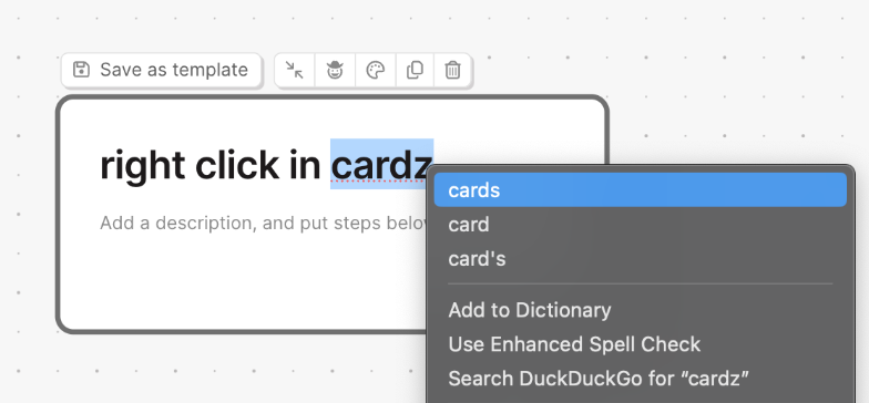
Improvement
Access native browser context menus on cards
You can now access your standard browser context menu by right-clicking text within cards. Use it to quickly copy/paste, correct spelling, or use browser extensions directly on your card text.
New
Restrict visibility for sensitive Looker fields
Credential owners can now take an additional step to hide sensitive Looker fields from the broader team. Simply check the new visibility toggle to ensure fields like Client Data remain private while still allowing your team to use the account on their flows.
Fix
Superbar hotkey is back
The "S" hotkey is back in action. Press "S" at any time to instantly open the Superbar and search for steps.
Fix
Microsoft Dynamics double-calculation fix
Resolved a bug where the Microsoft Dynamics step would occasionally calculate twice when opened for configuration. We’re also rolling out system-wide improvements to prevent redundant refreshes across other steps soon.
Fix
Parabola Table naming
We fixed a bug where Parabola Table names weren’t saving correctly, causing them to appear as “Uninitialized table” in dropdown menus. Your tables will now correctly display their assigned names everywhere they appear.
Improvement
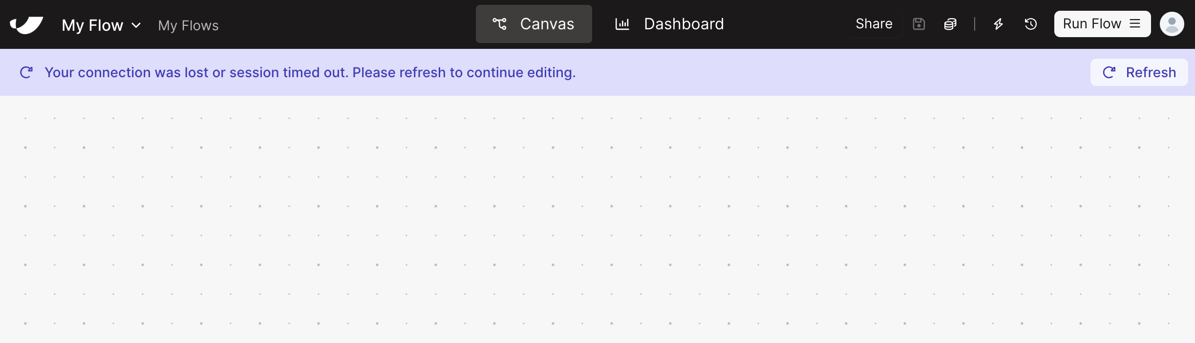
Improved inactivity handling
If you’ve been away from your flow for a while, we’ll no longer automatically kick you back to the Flows page. Instead, you’ll see a helpful banner prompting you to refresh the page so you can pick up exactly where you left off.
Improvement
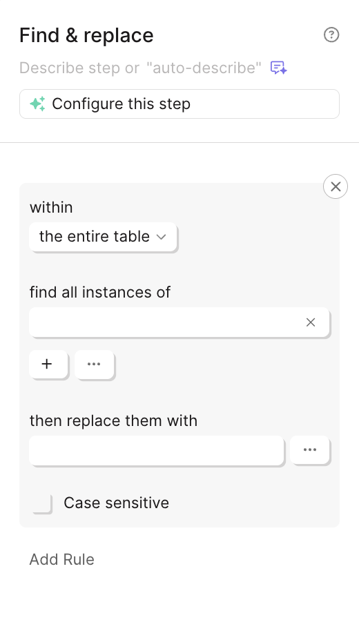
Larger Find & Replace input
The Find & Replace text boxes are finally bigger! You now have much more room to see exactly what you’re searching for and what you’re replacing it with.
Improvement
A better scrolling experience
We’ve made two key updates to help you navigate your flows more smoothly:
- Permanent scrollbars on results: We’ve made the horizontal scrollbar permanent so you can seamlessly navigate large datasets—especially helpful for non-trackpad users.
- Canvas "Swipe-to-Exit" protection: We’ve addressed an issue where scrolling horizontally on the canvas and step results view could accidentally trigger a "back" gesture and exit your flow. Now, you can move around your step results and canvas freely without losing your spot.
Improvement
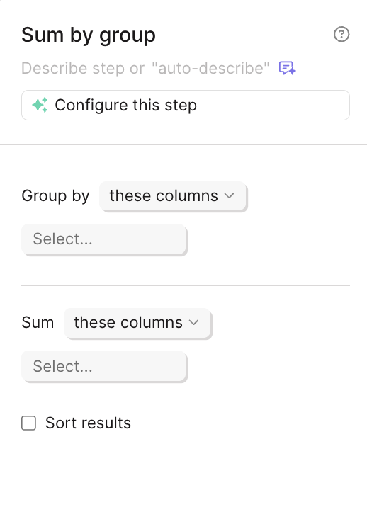
Intuitive configuration for Sum & Average by Group
We’ve swapped the configuration settings in the Sum by Group and Average by Group steps to better align with how you intuitively build. This small change makes these steps faster and more logical to set up.
Improvement
Instant access to duplicated flows
When you duplicate a flow, Parabola will now automatically open the new copy in a separate tab.
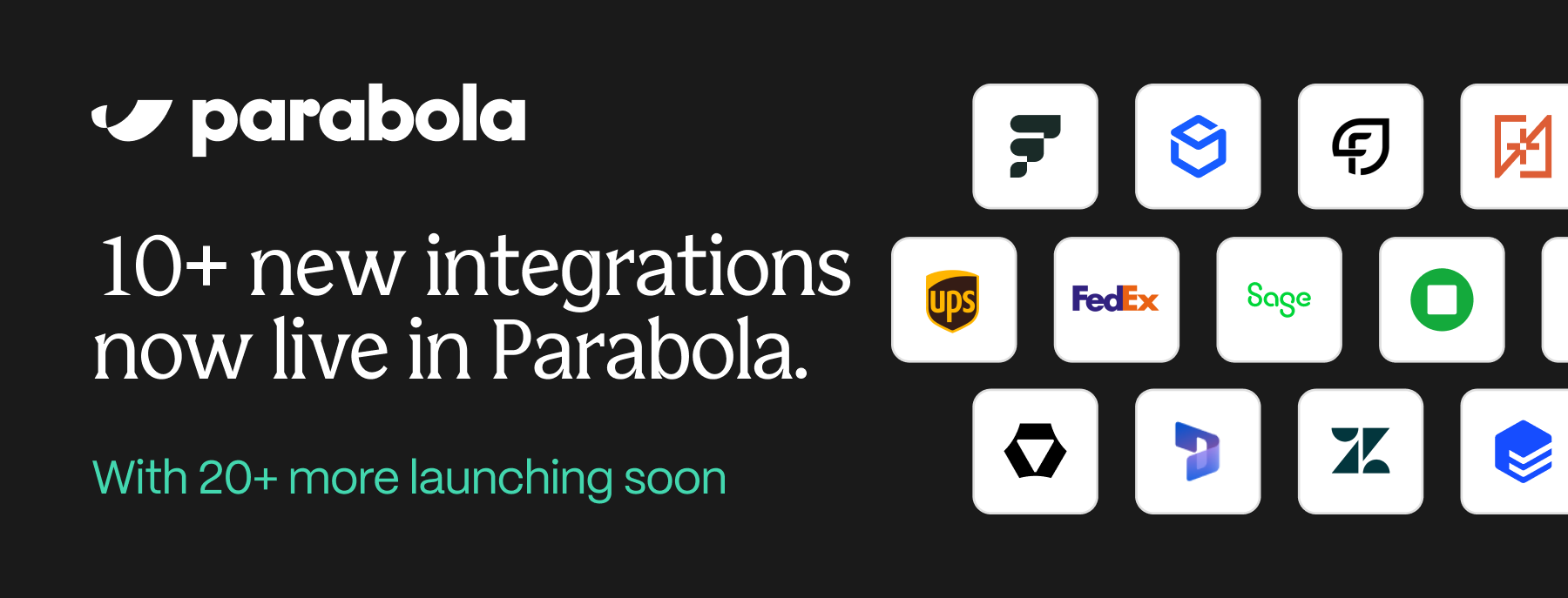
New
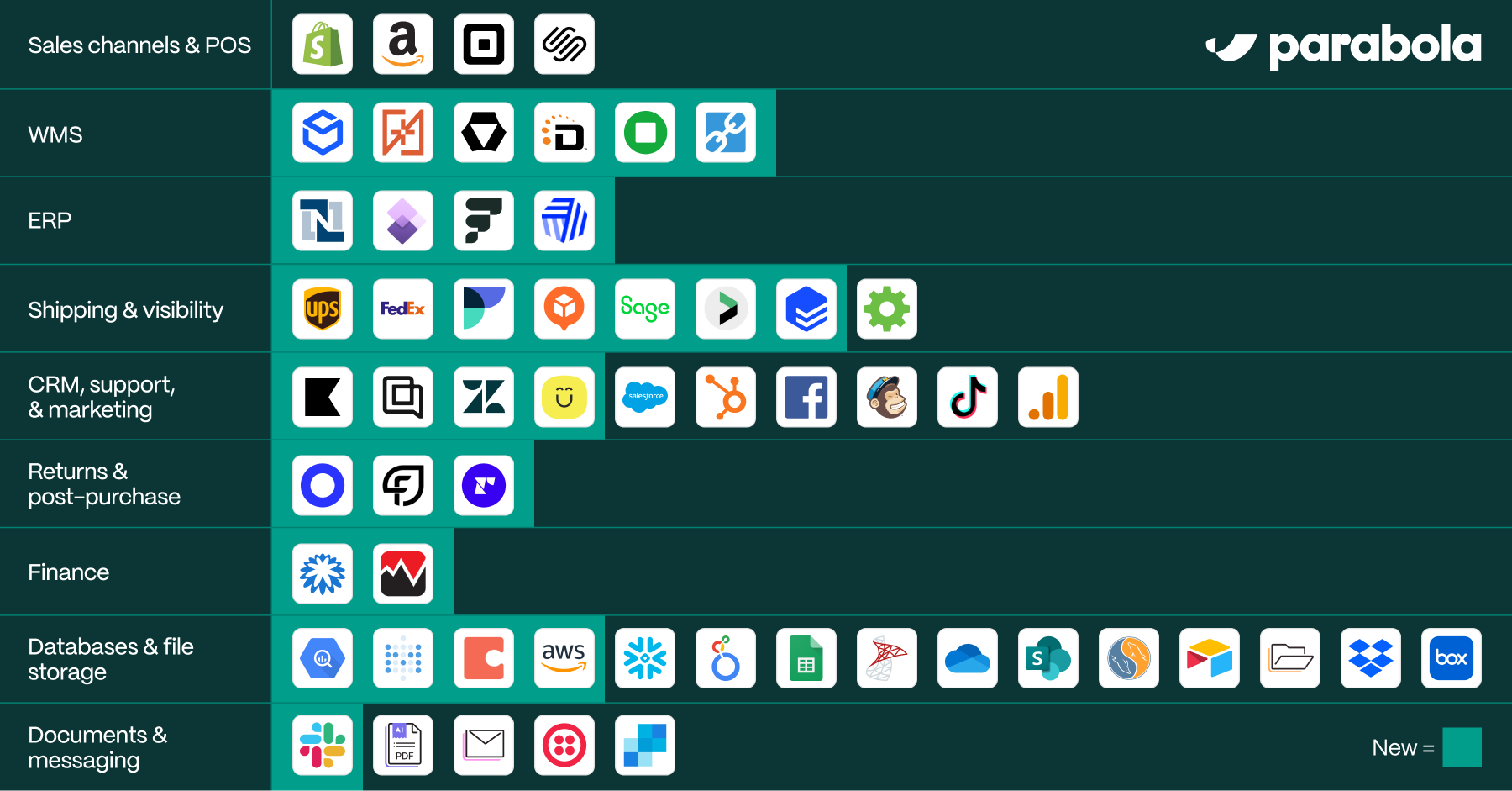
30+ new integrations, now live
Connecting the tools you rely on continues to get easier. Find key integrations in the latest batch of releases, including:
- ERP: Cin7, Send to NetSuite
- Shipping & visibility: AfterShip & Flexport
- Support & marketing: Kustomer, Gorgias, Klaviyo
- Returns & subscriptions: Loop, Recharge
- Finance: Coupa, Live Currency Conversion
- Data: Metabase, Coda, Send to Redshift
- WMS: DCL Logistics
Just search for the integration in Parabola to get started. Check out our docs for more integration-specific info, and explore the full list of recent releases below.
Improvement
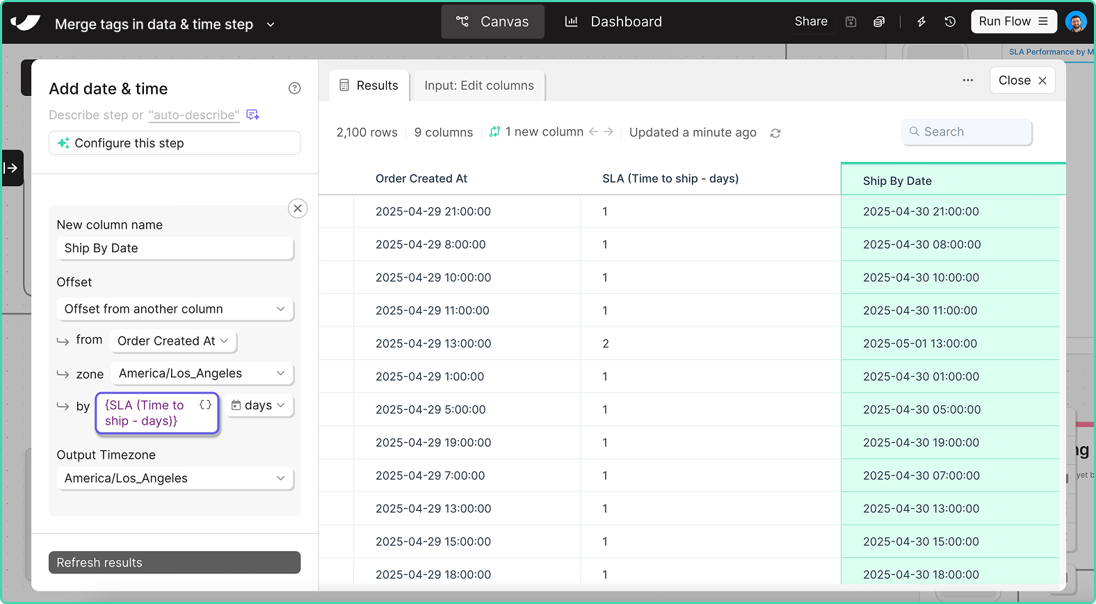
Calculate dates dynamically
In the Add date & time step, you can now use a {merge tag} to dynamically calculate dates based on the value in another column.
This is especially useful for SLA analysis: calculate your “Ship by date” by offsetting the “Order date” based on the number of “Days to ship.”
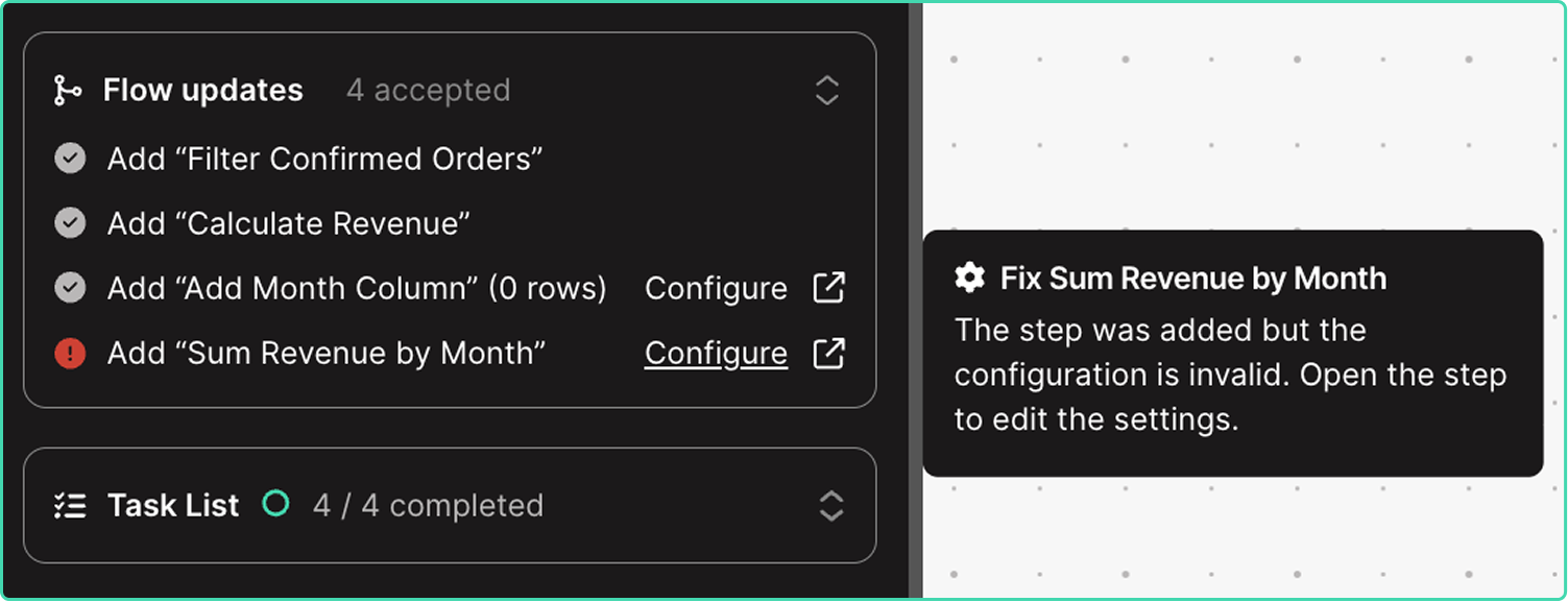
Improvement
Enhanced visibility into agent updates
The easiest way to build in Parabola is by sending chat messages, prompting Parabola to add and update steps directly on the canvas. You can now track the status of AI-implemented changes in the chat and immediately take action on steps requiring updates.
New
10+ new integrations, now live
Accessing operational data should be fast and easy. To bring that aspiration to life, we’re excited to introduce 13 new integrations with 20+ more launching before EOY:
- ERPs: Fulfil and Microsoft Dynamics (Finance & Operations)
- Carriers & shipment tracking: Fedex, UPS, EasyPost, and Jitsu
- WMSs: ShipMonk, ShipBob, Stord, InfoPlus
- Return platforms: Frate Returns
- Ticketing: Zendesk
- PO management: Sage Supply Chain Intelligence
Click here to explore docs & demos.
New
🔊 30+ new integrations are coming to Parabola
Once your data is connected, building flows in Parabola becomes pretty magical. And as you connect more sources, your flows become more powerful and informed.
But that first step—connecting your sources—is often the hardest step in the process.
Over the next two months, we're rolling out 30+ highly-requested integrations spanning ERPs, return platforms, WMS systems, data warehouses, and CX tools.
Up first: use our new UPS and Fedex integrations to track shipments, store historical data for scorecarding, and action on errors and exceptions in real-time.
Want to keep up with the launches? Follow Parabola on LinkedIn to stay in the loop.
Improvement
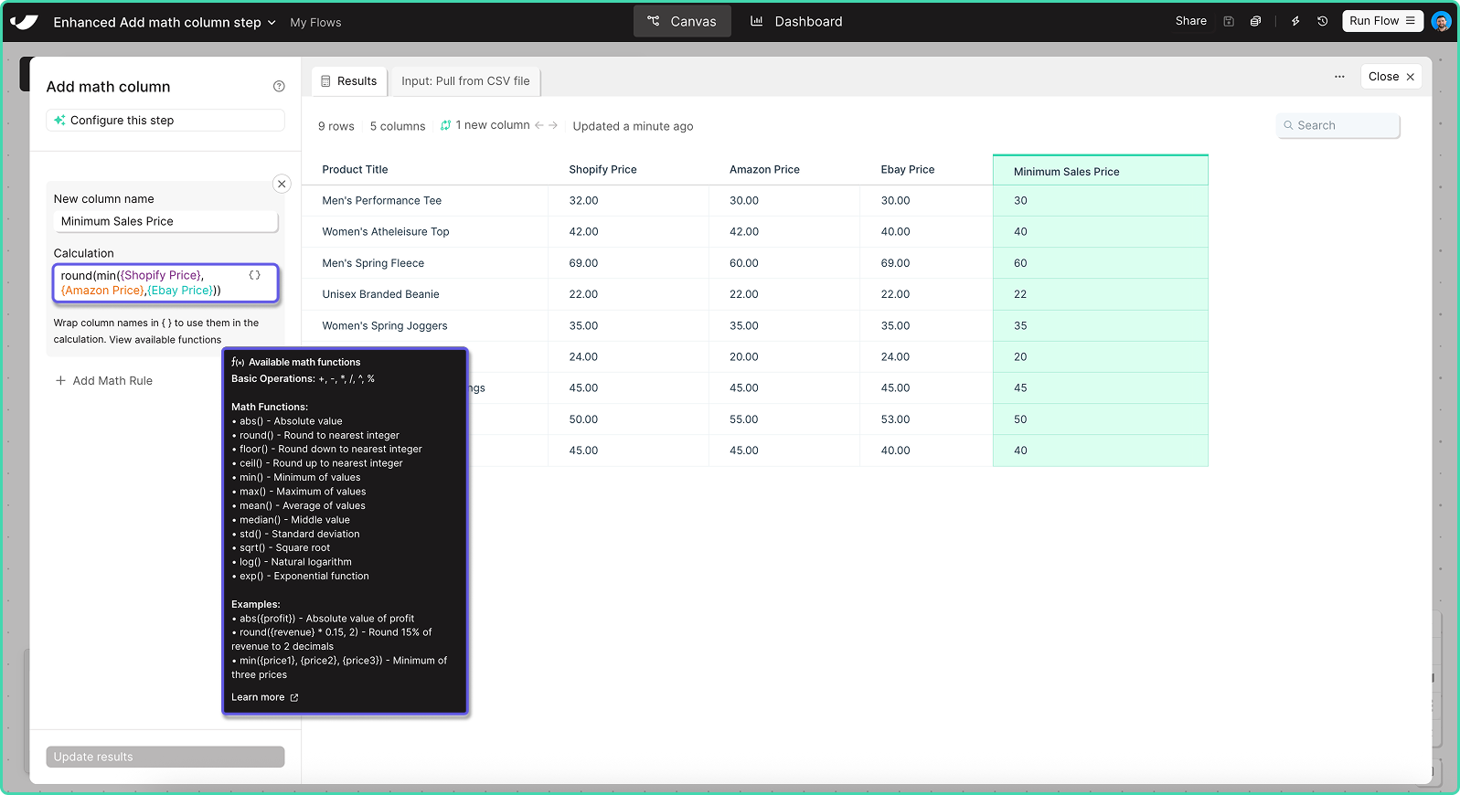
Perform advanced math calculations
We’ve upgraded the Add math column and Add if/else column steps to support more complex formulas. You can now perform advanced calculations using new functions like abs(), round(), min(), max(), mean(), median(), std(), and more.
Improvement
Prevent failing flows from pausing
Within a flow’s settings, you can now set a flow to continue running even after 10 consecutive failed runs.
Improvement
Send unbranded emails from Parabola
Within the “Email a file attachment” step, you can now use a plain text option to remove Parabola branding from the body of an email.
Improvement
Dynamically name Google Drive files
You can now insert merge tags in the “Send to Google Drive” to dynamically name files as they’re created.
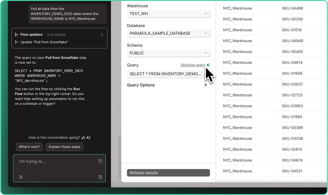
New
Write and optimize queries with AI
Across all database steps, you can now “Write” and “Optimize” queries using plain language. Skip the SQL headaches and let Parabola handle your query complexity.
Improvement
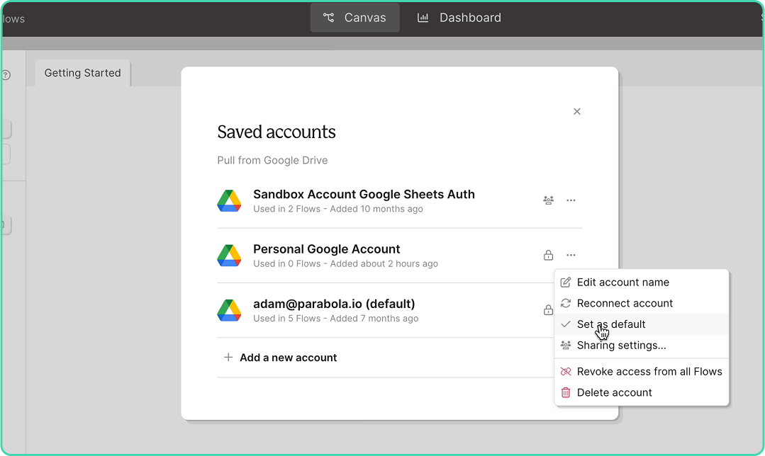
Quickly connect your go-to accounts
After saving an integration account, users can now specify a “default” account across their integrations. Once set, your default account is automatically selected every time you drop a new step in any flow.
Note: Defaults are set at the user-level, so every user can select their own defaults.
Improvement
Build with AI every step of the way
Say goodbye to the blank canvas. Describe what you need or choose a use case, and let AI help you execute tasks with smart, contextual suggestions guiding you from start to finish.
New
Real-time updates, straight to Slack
With our new Send to Slack step, you can connect your systems to Slack in seconds to keep tabs on the important data running throughout your stack.
Automatically DM users or send channel updates, include CSV files and images, and customize messages with variables to share the right data, at the right time.
Check out the announcement post to learn about how brands like Bandit and Vacation Inc. are putting this step to work!
Improvement
Connectivity for XLSB and XLSM files
You can now import .XLSB and .XLSM files using the Pull from Excel and Extract from email steps—expanding the collection of supported file formats.
Improvement
Intuitively combine datasets
A long-standing behavior has been updated: arrows connected to the Combine tables step can now be disconnected and reattached without breaking the step configuration. This means smoother adjustments when reorganizing upstream steps, regardless of connection order.
Improvement
More resilient and flexible FTP connections
The Pull from FTP step now runs successfully even when folders are empty—using headers from the last file processed. The Send to FTP step also supports a new dynamic file naming option: {timestampDash}. Learn more here.
New
Connect your flow with the web
Parabola can now search the web to give you more accurate, informed answers. Get up-to-date intel on API docs, error codes, third-party data nuances, and more so you can build faster without jumping between tabs.
-small-4.gif)
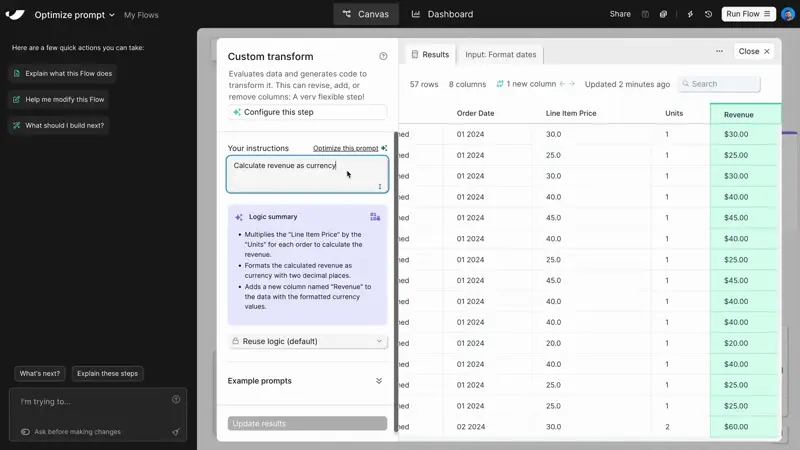
Improvement
Optimize prompts and trust your Custom transforms
The Custom transform step just got three major upgrades. Use the new Optimize this prompt✨ button to instantly improve your prompts and improve results. Now 3x more reliable with clearer, more actionable error messages so you can fix and fine tune faster.
Learn more in the new Parabola University lesson.
New
Stop flow runs and get back to building
You can now cancel a flow mid-run and make updates instantly. If you spot a mistake or a run takes longer than expected, hit the “Stop run” button and get back to building without the wait.
Improvement
Spot changes instantly
Parabola now highlights exactly what changed in each step. New and edited columns are automatically spotlighted in a refreshed data grid, so you can easily follow your data with less scrolling and searching.
New
Tidy flows with a click
With the new auto-layout button, you can instantly organize your flow—making it easier to manage and share with teammates.
Improvement
Vibe-automate flows with more control
Parabola makes real-time updates to your flows as you chat, often adding multiple steps after a single message. Build without fear using the new “Undo” button, available in chat after every flow update.
New
Clean and structure Excel files with AI
Turn messy spreadsheets into clean, structured tables. Try it out in the Extract from email step or when uploading an Excel file.
New
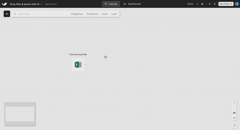
Drag-and-drop file upload
Skip the “Pull from” steps. Just drag a file onto the canvas—Excel, PDF, CSV, or JSON—and your data’s ready to go.
Improvement
Smoother chat experience
We’ve made a few improvements to make our new AI chat interface feel easier to use. Plus, send messages directly from the canvas and use the shortcut [ to open and close the sidebar.